-
NI Community
- Welcome & Announcements
-
Discussion Forums
- Most Active Software Boards
- Most Active Hardware Boards
-
Additional NI Product Boards
- Academic Hardware Products (myDAQ, myRIO)
- Automotive and Embedded Networks
- DAQExpress
- DASYLab
- Digital Multimeters (DMMs) and Precision DC Sources
- Driver Development Kit (DDK)
- Dynamic Signal Acquisition
- FOUNDATION Fieldbus
- High-Speed Digitizers
- Industrial Communications
- IF-RIO
- LabVIEW Communications System Design Suite
- LabVIEW Electrical Power Toolkit
- LabVIEW Embedded
- LabVIEW for LEGO MINDSTORMS and LabVIEW for Education
- LabVIEW MathScript RT Module
- LabVIEW Web UI Builder and Data Dashboard
- MATRIXx
- Hobbyist Toolkit
- Measure
- NI Package Manager (NIPM)
- Phase Matrix Products
- RF Measurement Devices
- SignalExpress
- Signal Generators
- Switch Hardware and Software
- USRP Software Radio
- NI ELVIS
- VeriStand
- NI VideoMASTER and NI AudioMASTER
- VirtualBench
- Volume License Manager and Automated Software Installation
- VXI and VME
- Wireless Sensor Networks
- PAtools
- Special Interest Boards
- Community Documents
- Example Programs
-
User Groups
-
Local User Groups (LUGs)
- Aberdeen LabVIEW User Group (Maryland)
- Advanced LabVIEW User Group Denmark
- ANZ (Australia & New Zealand) LabVIEW User Group
- ASEAN LabVIEW User Group
- Automated T&M User Group Denmark
- Bangalore LUG (BlrLUG)
- Barcelona LabVIEW Local User Group (BarVIEWona LUG)
- Bay Area LabVIEW User Group
- Bordeaux Atlantique LabVIEW User Group - BATLUG
- The Boston LabVIEW User Group Community
- British Columbia LabVIEW User Group Community
- Budapest LabVIEW User Group (BudLUG)
- Chennai LUG (CHNLUG)
- Chicago LabVIEW User Group
- Cleveland LabVIEW User Group
- CLUG : Cambridge LabVIEW User Group (UK)
- CSLUG - Central South LabVIEW User Group (UK)
- Dallas Fort Worth (DFW) LabVIEW User Group
- OKC LabVIEW User Group
- Delhi NCR (NCRLUG)
- Denver - ALARM
- DMC LabVIEW User Group
- DutLUG - Dutch LabVIEW Usergroup
- Middle East LabVIEW Local User Group (MELUG)
- Gainesville LabVIEW User Group
- GLA Summit - For all LabVIEW and TestStand Enthusiasts!
- GUNS
- Houston LabVIEW User Group
- High Desert LabVIEW User Group
- Highland Rim LabVIEW User Group
- Huntsville Alabama LabVIEW User Group
- Hyderabad LUG (HydLUG)
- Indian LabVIEW Users Group (IndLUG)
- Ireland LabVIEW User Group Community
- ItalVIEW - Milan, Italy LabVIEW+ Local User Group
- Israel LabVIEW User Group
- LabVIEW-FISICC
- LabVIEW GYM
- LabVIEW LATAM
- LabVIEW User Group Nantes
- LabVIEW Team Indonesia
- LabVIEW - University of Applied Sciences Esslingen
- LabVIEW User Group Berlin
- LabVIEW User Group Central Europe (LUG CE)
- LabVIEW User Group Meeting Austria (LUGMA)
- LabVIEW User Group Euregio
- LabVIEW User Group Munich
- LabVIEW Vietnam
- London LabVIEW User Group
- Long Island NY LabVIEW User Group
- Louisville KY LabView User Group
- LUGG - LabVIEW User Group at Goddard
- LUGE - Rhône-Alpes et plus loin
- LUGNuts: LabVIEW User Group for Connecticut
- LUG of Kolkata & East India (EastLUG)
- LVUG Hamburg
- Madison LabVIEW User Group Community
- Madrid LabVIEW Local User Group (MadLUG)
- Mass Compilers
- Midlands LabVIEW User Group
- Milwaukee LabVIEW Community
- Minneapolis LabVIEW User Group
- Montreal/Quebec LabVIEW User Group Community - QLUG
- NASA LabVIEW User Group Community
- Nebraska LabVIEW User Community
- New Zealand LabVIEW Users Group
- NI UK and Ireland LabVIEW User Group
- NOBLUG - North Of Britain LabVIEW User Group
- NOCLUG
- NORDLUG Nordic LabVIEW User Group
- North Oakland County LabVIEW User Group
- Norwegian LabVIEW User Group
- NWUKLUG
- RT LabVIEW User Group
- Orange County LabVIEW Community
- Orlando LabVIEW User Group
- Ottawa and Montréal LabVIEW User Community
- Pasadena LabVIEW User Group
- Philippines LabVIEW Local User Group (FilLUG)
- Phoenix LabVIEW User Group (PLUG)
- Poland LabVIEW Local User Group
- Politechnika Warszawska
- PolŚl
- Portland Oregon LabVIEW User Group
- Rhein-Main Local User Group (RMLUG)
- Rhein-Ruhr LabVIEW User Group
- Romandie LabVIEW User Group
- Romania LabVIEW Local User Group (RouLUG)
- Rutherford Appleton Laboratory (STFC) - RALLUG
- Serbia LabVIEW User Group
- Sacramento Area LabVIEW User Group
- San Diego LabVIEW Users
- Saxony LabVIEW User Group (SAXLUG)
- Sheffield LabVIEW User Group
- Silesian LabVIEW User Group (PL)
- South East Michigan LabVIEW User Group
- Southern Ontario LabVIEW User Group Community
- South Sweden LabVIEW User Group
- SoWLUG (UK)
- Space Coast Area LabVIEW User Group
- Stockholm LabVIEW User Group (STHLUG)
- Swiss LabVIEW User Group
- Swiss LabVIEW Embedded User Group
- Sydney User Group
- Taiwan LabVIEW User Group (TWLUG)
- Top of Utah LabVIEW User Group
- TU Delft LabVIEW User Group (TUDLUG)
- Turkiye LabVIEW Local User Group (TurkLUG)
- UKTAG – UK Test Automation Group
- Utahns Using TestStand (UUT)
- UVLabVIEW
- Valencia LabVIEW Local User Group (ValLUG)
- VeriStand: Romania Team
- WaFL - Salt Lake City Utah USA
- Washington Community Group
- Western NY LabVIEW User Group
- Western PA LabVIEW Users
- West Sweden LabVIEW User Group
- WPAFB NI User Group
- WUELUG - Würzburg LabVIEW User Group (DE)
- Yorkshire LabVIEW User Group
- Zero Mile LUG of Nagpur (ZMLUG)
- 日本LabVIEWユーザーグループ
- [IDLE] LabVIEW User Group Stuttgart
- [IDLE] ALVIN
- [IDLE] Barcelona LabVIEW Academic User Group
- [IDLE] Brazil User Group
- [IDLE] Calgary LabVIEW User Group Community
- [IDLE] CLUG - Charlotte LabVIEW User Group
- [IDLE] Central Texas LabVIEW User Community
- [IDLE] Grupo de Usuarios LabVIEW - Chile
- [IDLE] Indianapolis User Group
- [IDLE] LA LabVIEW User Group
- [IDLE] LabVIEW User Group Kaernten
- [IDLE] LabVIEW User Group Steiermark
- [IDLE] தமிழினி
- Academic & University Groups
-
Special Interest Groups
- Actor Framework
- Biomedical User Group
- Certified LabVIEW Architects (CLAs)
- DIY LabVIEW Crew
- LabVIEW APIs
- LabVIEW Champions
- LabVIEW Development Best Practices
- LabVIEW Web Development
- NI Labs
- NI Linux Real-Time
- NI Tools Network Developer Center
- UI Interest Group
- VI Analyzer Enthusiasts
- [Archive] Multisim Custom Simulation Analyses and Instruments
- [Archive] NI Circuit Design Community
- [Archive] NI VeriStand Add-Ons
- [Archive] Reference Design Portal
- [Archive] Volume License Agreement Community
- 3D Vision
- Continuous Integration
- G#
- GDS(Goop Development Suite)
- GPU Computing
- Hardware Developers Community - NI sbRIO & SOM
- JKI State Machine Objects
- LabVIEW Architects Forum
- LabVIEW Channel Wires
- LabVIEW Cloud Toolkits
- Linux Users
- Unit Testing Group
- Distributed Control & Automation Framework (DCAF)
- User Group Resource Center
- User Group Advisory Council
- LabVIEW FPGA Developer Center
- AR Drone Toolkit for LabVIEW - LVH
- Driver Development Kit (DDK) Programmers
- Hidden Gems in vi.lib
- myRIO Balancing Robot
- ROS for LabVIEW(TM) Software
- LabVIEW Project Providers
- Power Electronics Development Center
- LabVIEW Digest Programming Challenges
- Python and NI
- LabVIEW Automotive Ethernet
- NI Web Technology Lead User Group
- QControl Enthusiasts
- Lab Software
- User Group Leaders Network
- CMC Driver Framework
- JDP Science Tools
- LabVIEW in Finance
- Nonlinear Fitting
- Git User Group
- Test System Security
- Developers Using TestStand
- Online LabVIEW Evaluation 'Office Hours'
- Product Groups
- Partner Groups
-
Local User Groups (LUGs)
-
Idea Exchange
- Data Acquisition Idea Exchange
- DIAdem Idea Exchange
- LabVIEW Idea Exchange
- LabVIEW FPGA Idea Exchange
- LabVIEW Real-Time Idea Exchange
- LabWindows/CVI Idea Exchange
- Multisim and Ultiboard Idea Exchange
- NI Measurement Studio Idea Exchange
- NI Package Management Idea Exchange
- NI TestStand Idea Exchange
- PXI and Instrumentation Idea Exchange
- Vision Idea Exchange
- Additional NI Software Idea Exchange
- Blogs
- Events & Competitions
- Optimal+
- Regional Communities
- NI Partner Hub
-
 GerdW
GerdW
 on:
Event handling Problem
on:
Event handling Problem
-
 Thoric
on:
create a (right click) menu in a picture
Thoric
on:
create a (right click) menu in a picture
-
 cacalderon
on:
LabVIEW GUI Gallery
cacalderon
on:
LabVIEW GUI Gallery
-
 kongmingpeng
on:
Font Sizes in LabVIEW - Conversion Utility VI
kongmingpeng
on:
Font Sizes in LabVIEW - Conversion Utility VI
-
 Sibin
on:
Infotainment system UI Developed with Labview
Sibin
on:
Infotainment system UI Developed with Labview
-
OptiJohn
on:
Menu bar shode be hidden in exe
-
 Ben
on:
Adding new UI objects to the front panel (and even link data) on Run-Time :)
Ben
on:
Adding new UI objects to the front panel (and even link data) on Run-Time :)
-
robertocsp
on:
An alternative to Loading Animation
-
CJW1800
on:
Loading Animation (remake of the VS 2012 Installer Screen)
-
CodePeasant
on:
Advanced Resizable UIs: Multicolumn Listboxes
Resizable UI’s in LabVIEW
- Subscribe to RSS Feed
- Mark as New
- Mark as Read
- Bookmark
- Subscribe
- Printer Friendly Page
- Report to a Moderator
Introduction
Often as I open new software and the user interface pops up, I make a few typical clicks around, and I can almost immediately recognize it as a LabVIEW application. It’s funny how as a LabVIEW developer, I can recognize just from a user interface alone and some minor interaction that it has been written in LabVIEW. In the past, I found this true with other development platforms; although this is no longer as obvious. So, what is one of the things that made me suspicious of it being written in LabVIEW besides my familiarity with the common controls/indicators?
The screen would not resize.
It seems that generally speaking there is an opinion that in LabVIEW it just isn’t easy or worthwhile to design a nicely laid out, resizable UI. There aren’t very many good examples or documentation available, but it is really quite simple to accomplish. Resizable UI’s give a great feel to clients and give your software added professionalism at very little cost to developers. There is one caveat to this though, it should be considered up front at design time. Completing software without this in mind and trying to convert a UI to become resizable is typically a nightmare and should be avoided when possible. This is most especially true with complex UIs.
So, how is it done?
(After reading this please check out my follow up blog: Advanced Resizable UIs: Multicolumn Listboxes)
Planning
The most important step in making a UI resizable is some up front planning. Typically, we do some mock ups of how we anticipate the user interface to look and feel. This is a good time to plan which aspects you want to resize, and which you do not.
Elements to Scale
Elements you wish to resize or not resize should be grouped into sections.
In a LabVIEW application, the following elements typically should resize:
- Graphs/Charts
- Multicolumn Listboxes (extra code often required)
- Image Acquisition
- Tab Controls
- Subpanels (extra code often required)
The following elements generally should not resize:
- Text, Numeric, Boolean controls/indicators
- Buttons
- Static images
- Enums, Ring control/indicators
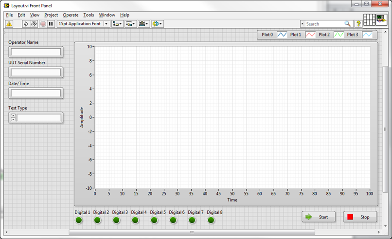
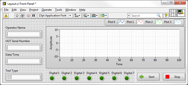
Keep in mind these are just general recommendations, not rules. See the image below for my sample layout. Notice I have grouped elements such as text inputs, Boolean indicators, and buttons which I do not want to change size.
In this example, the only element I want to scale as the UI resizes is the graph.
Splitters
Now it’s time to add one of the more underutilized elements on the front panel palette – splitters. These can be found under the “Containers” palette in both Modern and System sections. Adding a splitter to your VI will create a hierarchy of “Panes” on your front panel. Each pane can be considered a section of your front panel that can have separate resizing settings from the rest of the UI.
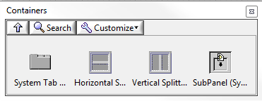
There are horizontal and vertical splitters, and which you choose first is more important than you might think. It depends on your intended layout, but using my example it is obvious we want all of my text inputs to stay on the left as well I may want to leave some room below for future additions. As well, I want to keep my digital indicators in line with the left side of the graph. In order to keep the entire left side usable and clean, we should start with a vertical splitter.
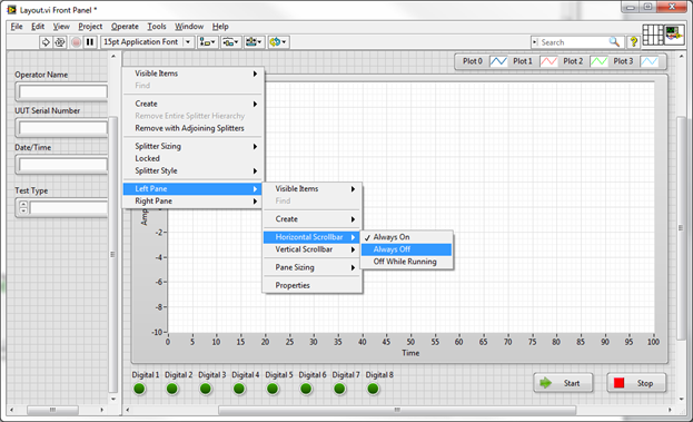
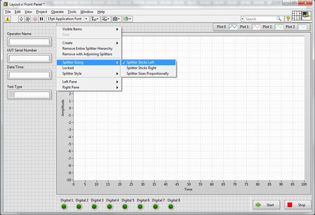
Drag a splitter onto the front panel and section off the left text boxes from the graph as shown below. At this point, it’s going to look a little sloppy with scroll bars everywhere. Simply right click on the splitter bar, drill down to the pane you are concerned with and turn off each scrollbar to clean things up.
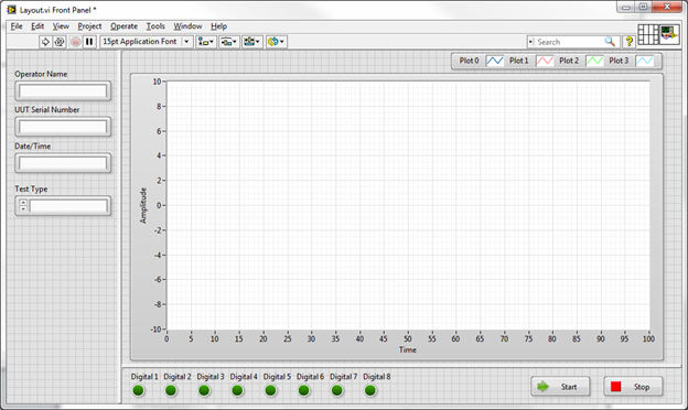
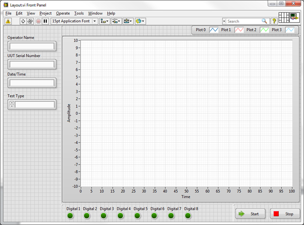
Repeat the same process for a horizontal splitter to section off the bottom digital inputs and buttons. Your screen should look as shown below when you are done:
Looks better now, but the splitters are a bit thick by default. It’s a little tricky to do, but you can shrink down the splitters to be about 1 pixel wide and almost invisible by grabbing the resize terminals in the middle of the splitter when you hover the mouse over it.
The next step that was not obvious before is relating to the buttons. We really would like the buttons to stay on the right side of the screen as it resizes, and keep the digital indicators on the left side of the screen in line with the graph. That will keep things looking clean as it resizes. How can we accomplish this? Add another splitter. Drop a vertical splitter just to the left of the buttons.
Next we need to define which way each pane sticks, grows, and shrinks. This is all configurable from the right click menus on each splitter. By default, each pane will stick to the top left corner and will not resize when dragged. These default settings are good for our left pane, and our digital indicator pane. For the buttons, we want slightly different behaviour to keep the buttons on the right side of the screen.
Configure all the splitters as listed below:
- Right click on the left splitter and select Splitter Sizing -> Splitter Sticks Left
- Right click on the bottom horizontal splitter and select Splitter Sizing -> Splitter Sticks Bottom
- Right click on the bottom vertical splitter and select Splitter Sizing -> Splitter Sticks Right
If you resize the screen now you’ll see the desired behaviour. There is one last step, which allows the graph to resize. In order to do this, simply right click on the graph and select “Fit Control to Pane”.
That’s it. Now resize the screen all you want, it will always lay out nicely. To add more controls and indicators with their own behaviour, just keep adding splitters as necessary.
Your screen should now look like this:
Minimum Screen Size
Once you have set up your UI, it’s generally a good idea to compress it down until it’s as small as possible while still being usable and set a minimum screen size. This will ensure users don’t make the window smaller than you ever intended (which can introduce some odd bugs in the LabVIEW layout).
Accomplish this with the following steps:
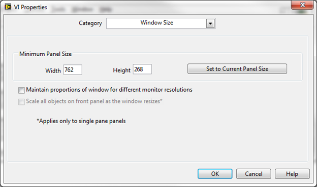
- Shrink the window down as small as reasonably possible without covering up any controls/indicators/labels
- Go into VI Properties -> Window Size and click “Set to Current Panel Size” and click OK.
Conclusions and Next Steps
This was a simple demonstration for creating a simple, professional looking and scalable user interface. These concepts can be extended into much more complex interfaces involving tab controls, subpanels, XControls, etc. These more advanced topics are covered in my next blog: Advanced Resizable UIs: Multicolumn Listboxes.
Graham Beauregard

You must be a registered user to add a comment. If you've already registered, sign in. Otherwise, register and sign in.
