LabVIEW Idea Exchange

cancel
Showing results for 
Search instead for 
Did you mean: 
JackDunaway

LabVIEW IDE Overhaul

Status: Declined
To address this particular LabVIEW IDE change, this iteration almost exactly was presented to users of LabVIEW 8.0 Beta. The feedback received at that time was so strongly negative and it in fact influenced the decision to leave this out of the product. We still hear the same negative feedback from our worldwide users today so we will not be changing to this IDE experience. We are continually researching different ways users interact with software and are always open to ideas but in this instance we have tried it in the past and users did not respond well.

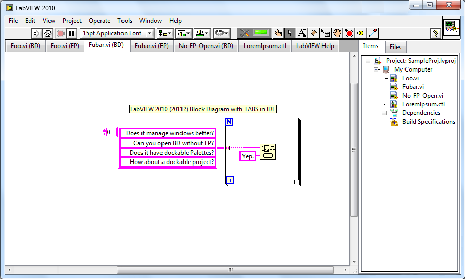
1. Allow for "Tabbed Browsing" of VI's to better manage windows.

2. Allow for the BD to be open independent of the FP.

3. Allow dockable palettes... dock to either the edge of the screen, or to the top bar (pictured below) of LabVIEW.

4. As a bonus, consider being able to open PDF's, txt's, and html's in tabs also for Help and documentation.

5. Finally, allow the project tree to be docked into the IDE.


Please, add your own IDE upgrade ideas in this discussion - illustrations will be especially helpful here. If it's a major enough idea, create a new idea!


LabVIEW2010.png

29 Comments
JackDunaway
Trusted Enthusiast
This has completely flown under my radar until today: LabVIEW Notebook. See a demo by Christina (YouTube warning, your corporate filters like mine may block that site), and here's her announcement on Eyes on VIs
asbo
Member

I'd really like to see #2 happen.

Yakov
Member

What I would like to see is completely customazible tool bar.

I'd like to be able to put any main menu item on to the tool bar.


labme
Member

...I read all the post to see if someone posted about LV Notebook. ... You did, Jack!

I have to say: I don't like it!

I have many subVIs in my projects that have a small size and their specific positions. Opening all these subVIs takes a screen or more and would never fit in a tabbed window!

That brings me to the multi screen workplace. It would be hard to arrange it on different resolutions... Would we have multiple IDE windows of one LV instance? One for BDs and one for FPs? ...


I think it would be great to have at least different symbols for BD and FP in the Windows taskbar. Additionally your VI icons! (with another border around the icon for BD or grayed out.) Please support these two ideas! ..And not IDE. Use Visual Studio if it has to be integrated in a grid for you! 😉


btw: I use a vertical taskbar in the middle of my two screens, except if I want to spread a window over both screens. Then I would minimize or move the taskbar. I don't spread a window over both screens often - different resolutions give a unclean cut.

G-Money
NI Employee (retired)
Status changed to: Declined
To address this particular LabVIEW IDE change, this iteration almost exactly was presented to users of LabVIEW 8.0 Beta. The feedback received at that time was so strongly negative and it in fact influenced the decision to leave this out of the product. We still hear the same negative feedback from our worldwide users today so we will not be changing to this IDE experience. We are continually researching different ways users interact with software and are always open to ideas but in this instance we have tried it in the past and users did not respond well.
BASE10
Member

Such a shame that NI gave up on this idea so readily. Sometimes you have to piss off you established users for a while while they get used to a new UI. People get used to a system when they have used it for a long time. They find ways of organising their work and living with the shortcomings, they get annoyed when all that effort get's undermined. Take the change of MS Office (and others) to the ribbon UI. At first I was just annoyed at not being able to find the buttons I wanted, it took me quite a while to adjust. In hindsight however, it was a much needed rationaliseation of a bloated and outdated UI and really I wouldn't want to go back.


While there is much to be admired about labview, for example excellent hardware integration and huge range of toolkits, the whole UI is straight out of the nineties. It seems to have become bloated with features added over the years. It has not grown with screen resolution. The style is riddled with inconsistancies.


This may be insulting/arrogant but it sometimes feels like the developers/core users are stuck in a time bubble and haven't used any other software in the last 5 years. It's way behind other IDEs in most (UI related) respects.


A good UI should be easy for new users to get to grips without slowing down or limiting experianced users. These two goals are not contradictory. Good UI design is not easy, but if NI stick with things the way they are it won't be good in the long run.


I really hope that Notebook becomes availiable in some form. I think that more of you will find yourselves using it in the future than may realise it now.


If I where to be cynical (I am) I'd say that a negative response was what NI subconciously wanted to hear since getting a UI overhaul like this to work seamlessly would be a massive and expensive undertaking.

Please please please revisit this decision!


Best regards,
Ambrose.


Edit: Just read Aristos old post regarding the failed UI trial, it comfirms all my suspicions. It sounds like a big part of the reason that users didn't like it was that it was broken and had undesireable behaviour. This is not a fundemental problem with the idea, although it may be a very difficult one depending on exactly how the internals of LV currently work. I suspect that there isn't enough abstraction between the UI code and the "core" code to make this easy, although I say this without any authority whatsoever.


sdubrul
Member

Too bad this is declined. I would love to see a more productive IDE enviroment. Tabs are awesome and used in many other IDE's to handle multiple open files.

tst
Knight of NI Knight of NI
Knight of NI

FWIW, NI's interpretation of "declined" is not necessarily the same as yours. I understand the text above makes it look like "we tried it. It didn't work. We're not going to try again", but you can find some examples of NI experimenting with the behavior of the IDE (like the notebook demo linked above or the LV web UI builder), so the fact that it's declined doesn't mean it won't ever happen.


If you want a good example, you can look at the request for a home edition of LV, which was declined a few years back, but which has now been marked as completed, since NI came out recently with a home license. Essentially, from the NI perspective "declined" appears to mean either "no, we won't do it" or "no, we're not going to do it in the next couple of years, but who knows what would happen after that" or "no, we're not going to do that, but we might do something different which serves the same purpose". Users quite naturally tend to read it as the first option.


___________________
Try to take over the world!
chris_d754
Member

Yes, I hope tst is correct. An IDE like the one Jack proposed would be AMAZING. So much cleaner, so much simpler to use. No longer would I need to resize my block diagrams, no longer looking for the right window buried beneath 20 other windows. The UX would be just so much better.