From Friday, April 19th (11:00 PM CDT) through Saturday, April 20th (2:00 PM CDT), 2024, ni.com will undergo system upgrades that may result in temporary service interruption.

We appreciate your patience as we improve our online experience.

LabVIEW Idea Exchange

cancel
Showing results for 
Search instead for 
Did you mean: 
JackDunaway

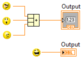
Default Option: Do NOT Place Front Panel Terminal as Icon

Status: Declined
When the Icon view as added to LabVIEW, it was a decision to make this option be default for the benefit of new users. While there are definitely strong opinions on which is better (icon or terminal), overall the feedback from new users globally are that icons are preferred until they reach a certain LabVIEW proficiency and then the environmental option in Tools>>Options is turned off. The decision to have icons as default is still valid for our users. The ability to turn this off and that this option preference will be carried over via ini file if you upgrade LabVIEW appear to be logically solutions. The issue though of converting existing icons into terminals on a larger scale than just one at a time is something R&D is currently investigating.

The default LabVIEW environment option should not show terminals as an icon. 


IconTerminals.png

38 Comments
Intaris
Proven Zealot

One of the best LV pictures I've ever seen.....


I got a laugh out of that and when I was finished, I gave some Kudos  because you're right.

tst
Knight of NI Knight of NI
Knight of NI

I agree it's annoying, but I'm not at all sure that NI needs to change this, because the default options should always take new users into consideration more than experienced users.


I don't know if terminals as icons are good for new users (NI might have feedback on this), but I do know that advanced users will have a much easier time changing this, especially if they import the INI key from their old version.


___________________
Try to take over the world!
JackDunaway
Trusted Enthusiast

tst,


Good point about new users, but let me convince you otherwise. To me, it makes sense to completely AXE either one or the other. THAT'S what's confusing to new users (why does your code not look like mine?, the new user asks). The first step, however, is to set the smaller terminal as the default in LabVIEW 2010.


And then NUKE the icon terminal in 2011.


Regards,

Jack

tst
Knight of NI Knight of NI
Knight of NI

I know that there are some advanced users who also like them, although I could never understand why. And be careful what you ask. For all you know, NI could decide to axe the one YOU like.


How's this for a compromise - add an environment option with three options:


1. Show all as terminals.

2. Show all as icons.

3. Maintain display setting per terminal (what happens today).


One of the first two will be the default and will mean that on a certain instance of LabVIEW, all terminals will be displayed the same, regardless of how they were created. This will at least mean that new users won't have the problem you brought up (although they will probably have the problem of terminals overlapping each other, because they were put near each other as terminals and now they're bigger).


___________________
Try to take over the world!
JackDunaway
Trusted Enthusiast

tst,


Haha, axe the one I like, I actually thought of that when I was typing! Actually, I would dig that! I am "for" standardization enough to forfeit the smaller terminal. Eventually, I could erase its usefulness from memory.


Although, if one had to be chosen, I would hope the majority votes on keeping the smaller.


I like the idea of an IDE preference better than today's "per terminal" setting. I am against the idea, because it's yet another preference in a long list of preferences, where the root problem is being skirted. 


Bottom line, the order of my preferences:


1. Only allow smaller terminal (nuke the icon terminal)

2. Only allow icon terminal (nuke the smaller terminal)

3. tst's proposed IDE prefs

4. Keep it like it is 


(Note: there's a HUGE gap in preference between 1&2!) 


Cheers,

Jack

AristosQueue (NI)
NI Employee (retired)

> For all you know, NI could decide to axe the one YOU like.


Nuking the small icons is the more likely scenario... it has been discussed. 😉 


The irony is that the visual feedback of the large FPTerms should become more useful, not less, as you advance in your LV programming. The large  FPTerms display an icon that allows you to:


1) See whether a terminal is a typedef or not, and recognize which typedef it is.

2) See which class an FPTerminal represents

3) Identify the conpane used for a strict VI refnum terminal

4) For a control refnum, see which control type is being referenced

5) Identify different types of DAQ refnums

etc.


The large icons were first introduced by some folks in R&D working on helping new users. The large icons came about as a result of feedback from new users in training courses. They complained that the association between what they dropped on the front panel and what appeared on the block diagram was nebulous. At first I didn't like these new icons because they had no useful information once you got past the "this color means string and this color means numeric" part of the learning curve. But my team (which at the time was looking for ways to make the diagram give more feedback about what was going on in a VI without having to constantly flip back and forth from BD to FP) saw that we could use these same icons to help a problem that was being observed with early beta testing of LV classes -- namely that all the FPTerms were identical, and the more that a user decided to use objects almost exclusively (as is true in many other programming languages) the harder it became to keep things straight on the diagram. So we walked through a whole bunch of higher level features of LV, stuff well beyond the new user stage, and put all of that information into the icons. With that change, a lot of experienced users began finding the large icons actually had value.


The size of the icons is still something of an issue. But VIs that start with those icons from the outset look very clean, and (my personal observation, not something I can assert more than annecdotally) it appears that the large icons encourage "inputs on left, outputs on right", which is a programming practice we generally encourage advanced users to adopt, and avoid FPTerms inside structures unless they really are building a VI intended for user interface.


The maintaining of the existing terminals is a concession to the inability to mutate the older diagrams in a way that didn't completely reshape those diagrams. If we just changed the terminals between versions, wires would get all bent up, structures would grow... it wasn't at all clean back in 8.0 when the large terms first appeared. But the Diagram Cleanup Tool keeps getting better every release, and that means that if we get a lot of pressure to pick one FPTerm or the other, it could very well be that we pick the large ones and let the DCT handle making the diagrams pretty after mutation. Yes, I can already hear the hyperventilating and screaming from existing LV developers should we ever make such a change, which makes the probability of it happening very very small. I'm just saying which direction we would probably jump if users collectively really begged us. 


Are you still sure you want to kudos this idea? 🙂


PS: I -- and I think others in R&D -- would be very open to making it a whole VI toggle, by the way, rather than a per terminal setting.

Message Edited by Aristos Queue on 06-16-2009 08:43 AM
Intaris
Proven Zealot

I didn't know that about Typedefs and so on.


Nugget?

PJM_Labview
Active Participant

I would not be pleased to see the small icon go away.


Personnally, I never use the large one (except for LVOOP).


PJM


vipm.io | jki.net

altenbach
Knight of NI

At least let us select several terminals at once and allow "right-click...view as icon" on the entire group. 😄


tst
Knight of NI Knight of NI
Knight of NI

What's funny is that NI already had this idea from the start. If you look at this image from an early version (0.36 beta), you can clearly see the knob and the chart are represented as icons, not as their data type).


Icons.PNG


___________________
Try to take over the world!