- Subscribe to RSS Feed
- Mark Topic as New
- Mark Topic as Read
- Float this Topic for Current User
- Bookmark
- Subscribe
- Mute
- Printer Friendly Page
Contour Color Legend Modification
11-20-2017 06:37 PM
- Mark as New
- Bookmark
- Subscribe
- Mute
- Subscribe to RSS Feed
- Permalink
- Report to a Moderator
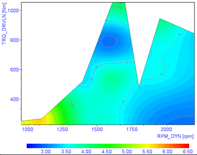
I'm trying to set up the color legend for a contour plot in REPORT and am struggling to get things set up how I want it. In the example, I'm showing BSNOx vs. engine rpm and torque. I want the color legend to go from 3 to 7 in 0.5 increments so that the legend will display the labels 3.0, 3.5, 4.0, 4.5, 5.0, 5.5, 6.0, 6.5, and 7.0. I can almost get this to work by setting the Z-axis scaling from 3 to 7, set the color labels to "Single value", "Boundary values", and label every 8th symbol, however, this still omits the value 7, and all of the labels are shifted to the right of where they should be:
What I'd like to see is something more like this:
I also want to be able to manipulate the min/max and interval of the color legend via script so that I can use this report layout for different channels (i.e. BSNOx, BSFC, BTE, etc) and create even intervals that make sense and are readable. I'm struggling finding any options or code that will allow me to set up the symbol labels and adjust them this way. I've attached the sample data and report .TDR files that I'm using. Any help would be appreciated.
11-21-2017 05:08 PM
- Mark as New
- Bookmark
- Subscribe
- Mute
- Subscribe to RSS Feed
- Permalink
- Report to a Moderator
Hi meatballosaurus,
I've been playing around with this all day, and the closest I could get was to set the axis to go from 3 and 7.57 with a label at every 7th symbol. It's not quite the behavior you are looking for, but it gets fairly close.
I'm going to look into additional options to customize the Legend, but this may be either a bug or an idea that should be submitted to the Idea Exchange (i.e. improved customizability of Legend).
11-21-2017 05:59 PM
- Mark as New
- Bookmark
- Subscribe
- Mute
- Subscribe to RSS Feed
- Permalink
- Report to a Moderator
Thanks for looking into this. The customization of the color legend is becoming a bit frustrating in general and could use a bit more development. I've been able to get the legend text parameters in the placement I like now, but I can't get the overall scale to be set manually. I was able to do this by not using the Color Legend in the "3D Axis Definition" dialog
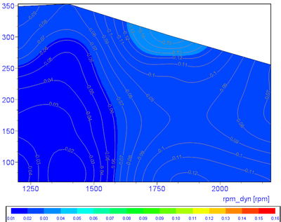
But then the legend is very coarse and is limited to starting and ending exactly with the data (i.e. if the max data value is 0.16, you can not have the legend go up to 1). Also, I thought the color palette was 64 colors so I would have expected the legend to use 64 symbols, but in the data I was working with, there was only 16 symbols. This also only works if you set "Label at every nth symbol" to 1. I can make the color scale more refined if I manually set the global color palette count to 64 in the script with
Set oMyReportObj = Report.Settings.GlobalColorPalette1
oMyReportObj.Count = 16
oMyReportObj.ScaleValueBegin = 0
oMyReportObj.ScaleValueEnd = 1
But the scale value begin and end lines don't seem to do anything to the start/end of the legend scale.
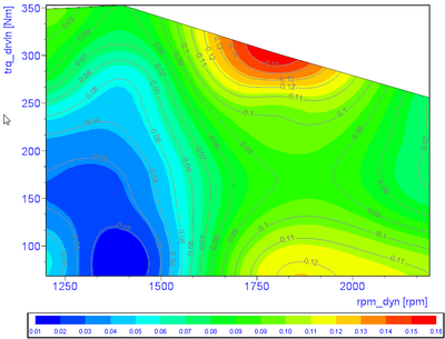
The other weird thing is that if I change the Z-axis scaling to Manual and set the Begin and End to 0 and 1 respectively (see picture below), the contour color will behave in the picture above which would correspond to a color palette of 0 to 1. However, after the report refreshes a second time, the Z-axis scale is set back to a Begin/End of 0.01/0.16 (for my particular case where the min data value is 0.01 and max data value is 0.16) without me doing anything.
Needless to say I've spent most of the day on this and am not really getting anywhere. I seem to be back to where I started; here is with the global palette set to 64 lines and the legend displaying every 8th symbol, but the palette is supposed to be from 0 to 1:
11-22-2017 11:56 AM
- Mark as New
- Bookmark
- Subscribe
- Mute
- Subscribe to RSS Feed
- Permalink
- Report to a Moderator
Hi,
So looking at this more closely, I think I'm getting a better understanding of how DIAdem processes the "Label at every nth symbol" and what we're seeing here.
It looks like DIAdem is using the Contour values associated with each symbol boundary. When you select to use every N-th element, it automatically reads the lower interval of the boundary. However it displays that lower bound at the location of the upper bound of the interval, which results in this shifted display to the right. This explains both the incorrect alignment of color, plus we can infer that the upper boundary condition isn't inherently included unless it happens to be one of the N-th elements.
I've filed CAR 677505 to address the misalignment. As for a workaround, I think the best option would be to set up your own Contour Table. If you go into the Curve Parameters: Characteristic Diagram dialog box, you can choose to select Colors from the contour table. By setting up your own contour table with items spaced out only as far as you need, you'll be able to get more granular control of how the various intervals in the Color Legend will appear.
11-27-2017 08:44 AM
- Mark as New
- Bookmark
- Subscribe
- Mute
- Subscribe to RSS Feed
- Permalink
- Report to a Moderator
Thanks for submitting the CAR. It would be nice when they fix that to also add an option to force the first and last element as well as every N-th element.
I thought about the contour table as well, but there are a couple things that make that option not very appealing to me. I'm already using the contour table to manually set my isolines so the table itself is relatively coarse compared to say a 64 color palette. I could use the table for the colors and then set isolines automatically but I like having control over that too. Perhaps another nice feature would be to have the option for separate tables for the colors and the isolines.
11-28-2017 10:00 AM
- Mark as New
- Bookmark
- Subscribe
- Mute
- Subscribe to RSS Feed
- Permalink
- Report to a Moderator
Hi meatballosaurus,
I think that would be a great feature to mention in the DIAdem Idea Exchange if you haven't done that already. R&D monitors this forum for ideas to implement in newer versions of DIAdem. You can add your idea there or see if someone else has already mentioned it and give that post kudos.
Nice username by the way!
Applications Engineering
National Instruments
11-28-2017 10:15 AM
- Mark as New
- Bookmark
- Subscribe
- Mute
- Subscribe to RSS Feed
- Permalink
- Report to a Moderator
11-27-2018 10:15 AM
- Mark as New
- Bookmark
- Subscribe
- Mute
- Subscribe to RSS Feed
- Permalink
- Report to a Moderator
Hello meatballosaurus I have the exact same problem (I'm also plotting the same engine parameters)...
Did you ever find a work around to make the color scale work properly?
11-27-2018 10:42 AM
- Mark as New
- Bookmark
- Subscribe
- Mute
- Subscribe to RSS Feed
- Permalink
- Report to a Moderator
Not really, I've just kind of settled with a less than ideal layout while I wait for them to implement improved functionality. In the link above to the idea exchange they responded saying they will consider this for future versions.
Below is how I set it up for the legend to go from 190 to 250 with isolines every 5:
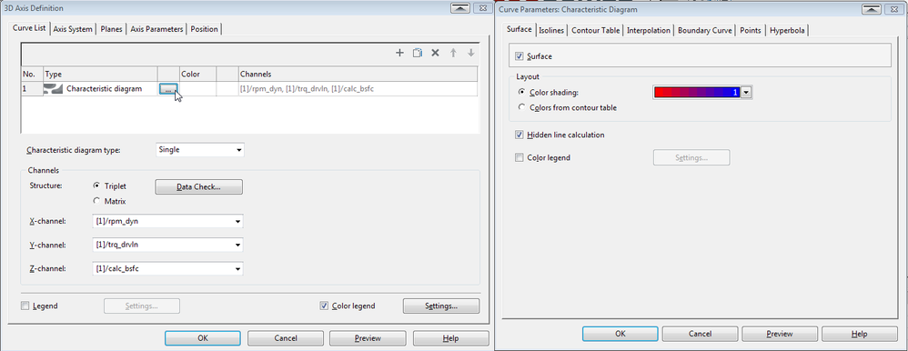
I ended up turning off the color legend for the characteristic diagram (click the 3 dots in the curve list - left picture; uncheck box next to color legend in right picture):
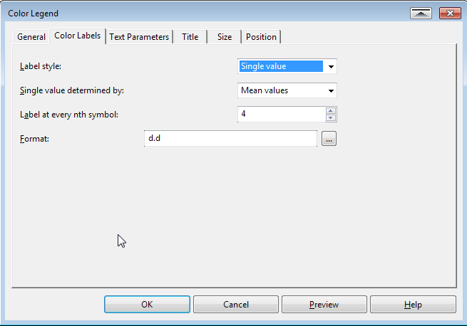
Then also check the "Color Legend" box in the bottom of the left picture. In the settings next to that I set it up per the following settings where I adjust the "Label every nth symbol" setting to get the desired spacing.
Then in the Axis Parameters dialog, I set the Z-axis settings to the range that I want:
The result is this:
11-27-2018 03:06 PM - edited 11-27-2018 03:07 PM
- Mark as New
- Bookmark
- Subscribe
- Mute
- Subscribe to RSS Feed
- Permalink
- Report to a Moderator
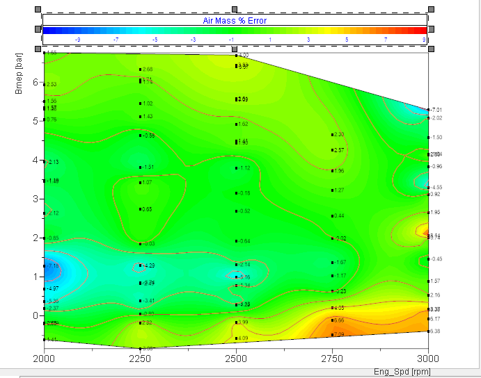
Thank you for the response. That's more or less what I've settled on as well, with a couple changes. I set the number of colors in the color pallet to 60 so the interpolation looks smooth, and selected 6 for the "Label at every nth symbol". This gives whole numbers in the color scale, but still doesn't place the numbers in the correct position. (The chart below is a -10 to +10 scale.)
It would be nice if the color chart used a floor function for boundary values < 0 and a ceiling function for boundary values >0.




![2018-11-27 08_32_43-DIAdem - [REPORT_ MotoringWindup_ECL.TDR].png 2018-11-27 08_32_43-DIAdem - [REPORT_ MotoringWindup_ECL.TDR].png](https://forums.ni.com/t5/image/serverpage/image-id/238100i27CC942F3038EBF4/image-size/large?v=v2&px=999)
![2018-11-27 08_34_52-DIAdem - [REPORT_ MotoringWindup_ECL.TDR].png 2018-11-27 08_34_52-DIAdem - [REPORT_ MotoringWindup_ECL.TDR].png](https://forums.ni.com/t5/image/serverpage/image-id/238102iA4D56C6E295CAC82/image-size/medium?v=v2&px=400)
