- Subscribe to RSS Feed
- Mark Topic as New
- Mark Topic as Read
- Float this Topic for Current User
- Bookmark
- Subscribe
- Mute
- Printer Friendly Page
Bar graph cut in half on ends of the x axis
Solved!05-31-2017 08:50 AM
- Mark as New
- Bookmark
- Subscribe
- Mute
- Subscribe to RSS Feed
- Permalink
- Report to a Moderator
I have a bar graph that basically cuts the bars in half on both ends of the x-axis. How can I make the whole bar show up without adding additional years? Thanks.

Solved! Go to Solution.
05-31-2017 09:28 AM
- Mark as New
- Bookmark
- Subscribe
- Mute
- Subscribe to RSS Feed
- Permalink
- Report to a Moderator
You set the X-scale range a little large to include the first and last bar and specify the marker values you want to be shown.
Ben
05-31-2017 09:51 AM
- Mark as New
- Bookmark
- Subscribe
- Mute
- Subscribe to RSS Feed
- Permalink
- Report to a Moderator
Thanks Ben. I tried that by specifying the min and max at 2013 and 2017, respectively. I then have an array with 2014, 2015 and 2016 in it writing to the xscale.markervals array and it shows 2013 and 2017 on the x-axis. I don't want the 2013 and 2017 to show, just the entire bar graphs. Any ideas on what else I need to do?


05-31-2017 09:54 AM
- Mark as New
- Bookmark
- Subscribe
- Mute
- Subscribe to RSS Feed
- Permalink
- Report to a Moderator
Try to right-click the X-Axis
Marker Spacing >>> Arbitrary
Ben
05-31-2017 10:05 AM
- Mark as New
- Bookmark
- Subscribe
- Mute
- Subscribe to RSS Feed
- Permalink
- Report to a Moderator
Thanks Ben. It still shows 2013 and 2017 on the ends.
05-31-2017 11:03 AM
- Mark as New
- Bookmark
- Subscribe
- Mute
- Subscribe to RSS Feed
- Permalink
- Report to a Moderator
I do not see a quick fix.
Ben
05-31-2017 11:25 AM
- Mark as New
- Bookmark
- Subscribe
- Mute
- Subscribe to RSS Feed
- Permalink
- Report to a Moderator
If you can rule out the user changing the X-scale with zooming you can use something like what I posted in this thread.
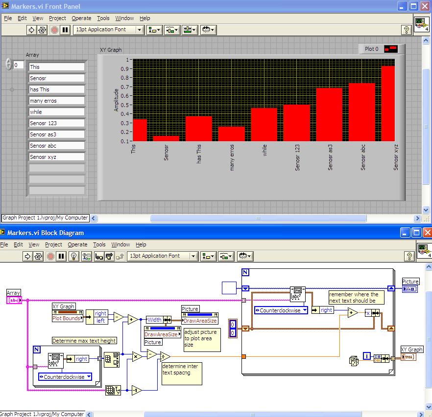
make the first and last string blank.
Ben
05-31-2017 11:36 AM
- Mark as New
- Bookmark
- Subscribe
- Mute
- Subscribe to RSS Feed
- Permalink
- Report to a Moderator
I'd need the vi, with data to check but.... set the scale max and min to 2016.5 and 2013.5 and play with the minor tick marker increment and tick marker styles
"Should be" isn't "Is" -Jay
06-27-2017 07:40 AM
- Mark as New
- Bookmark
- Subscribe
- Mute
- Subscribe to RSS Feed
- Permalink
- Report to a Moderator
Sorry for the long delay. I had to pull off and work on something else. Here is a simple example.
06-27-2017 09:14 AM
- Mark as New
- Bookmark
- Subscribe
- Mute
- Subscribe to RSS Feed
- Permalink
- Report to a Moderator
To add to this, you get a skinny bar if there is only one bar graph.
