-
Analysis & Computation
305 -
Development & API
2 -
Development Tools
1 -
Execution & Performance
1,033 -
Feed management
1 -
HW Connectivity
115 -
Installation & Upgrade
268 -
Networking Communications
183 -
Package creation
1 -
Package distribution
1 -
Third party integration & APIs
293 -
UI & Usability
5,503 -
VeriStand
1
- New 3,099
- Under Consideration 5
- In Development 2
- In Beta 0
- Declined 2,642
- Duplicate 716
- Completed 342
- Already Implemented 114
- Archived 0
- Subscribe to RSS Feed
- Mark as New
- Mark as Read
- Bookmark
- Subscribe
- Printer Friendly Page
- Report to a Moderator
Make Example Finder Resizable!
I find the Example Finder to be a terrible eyesore. Really. It's to the point that I don't even like to open it up--I'd rather type in search terms on the NI Community and hope someone has posted the code there, or some similar code.
My major beefs with Example Finder:
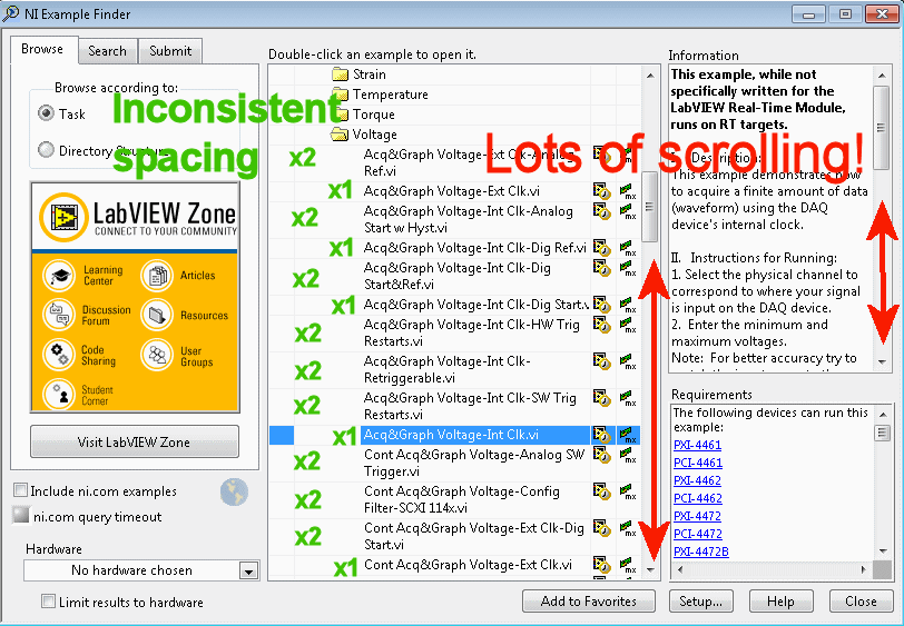
1. Line spacing is inconsistent. Some examples have long titles that extend onto a second line, some don't. (See green in image.) I would prefer to use the horizontal space on my monitor by resizing the window horizontally, so that everything fits on one line.
It's nice the word order is consistent among examples. However, it's not that helpful because we can't make use of this consistency by resizing the window. For instance--your eyes will dance around trying to find the differences between these next four DAQmx examples:
Cont Acq&Graph Voltage- Int Config
Filter- SCXI114x.vi
Cont Acq&Graph Voltage- Ext Clk- Dig
Start.vi
Cont Acq&Graph Voltage- Ext Clk.vi
Cont Acq&Graph Voltage- Int Clk-
Accessory Status-PXIe-4300.vi
Now, watch how it all becomes much more clear when you allow the window to stretch out, so there's one example per line:
Cont Acq&Graph Voltage- Int Config Filter- SCXI114x.vi
Cont Acq&Graph Voltage- Ext Clk- Dig Start.vi
Cont Acq&Graph Voltage- Ext Clk.vi
Cont Acq&Graph Voltage- Int Clk- Accessory Status-PXIe-4300.vi
2. Lots of scrolling to compensate. Before I open an example, I try to glean some information from it by reading the "Information" section--but it's hard to keep track of things with all the scrolling (see red in the above image).
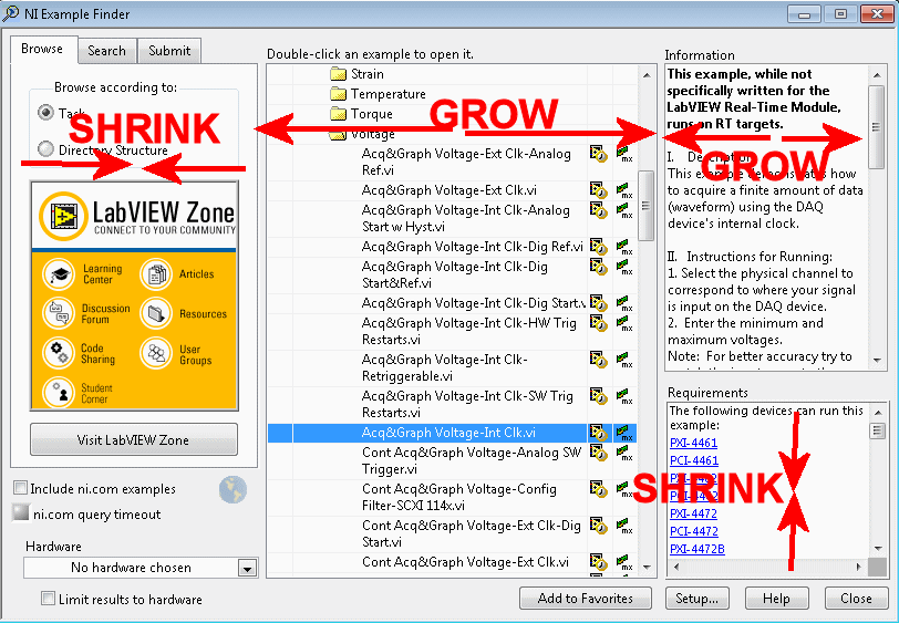
To minimize scrolling, we should have flexible sub-windows within the main Example Finder window. Maybe I would want to give the majority of the window room to example VI titles, and less room to that huge "LabVIEW Zone" image I never click on. Or maybe I'd minimize the extensive list of hardware the examples pertain to, and give more horizontal room to the "Information" column in the upper-right. The point is, however I resize the Example Finder for my use, it should stay that way every time I load it up.
Here's hoping! Please let me know what y'all think.
You must be a registered user to add a comment. If you've already registered, sign in. Otherwise, register and sign in.


National Instruments will not be implementing this idea. We are not planning on making further changes to the current Example Finder user interface.