From Friday, April 19th (11:00 PM CDT) through Saturday, April 20th (2:00 PM CDT), 2024, ni.com will undergo system upgrades that may result in temporary service interruption.

We appreciate your patience as we improve our online experience.

LabVIEW Idea Exchange

cancel
Showing results for 
Search instead for 
Did you mean: 
James@Work

Eliminate Palette Space added with LV2016

Status: New

After reading Restore High Contrast Icons I procrastinated as long as possible before installing LV2016.  When I finally did, I was disappointed by the additional space required for the palettes; all of them!  I have been using LabVIEW since 5.0 and switched to an Icon view of the palettes shortly after getting comfortable with the graphics.  Now, I have to move my mouse further to get to each sub-menu and VI selection.  It's a waste of developer's time and apparently done for absolutely no good reason except to make a change; very similar to the washed out icons.

This extra space needs to be removed or at least an option provided to set the spacing back to the condensed spacing always available.

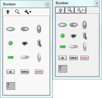
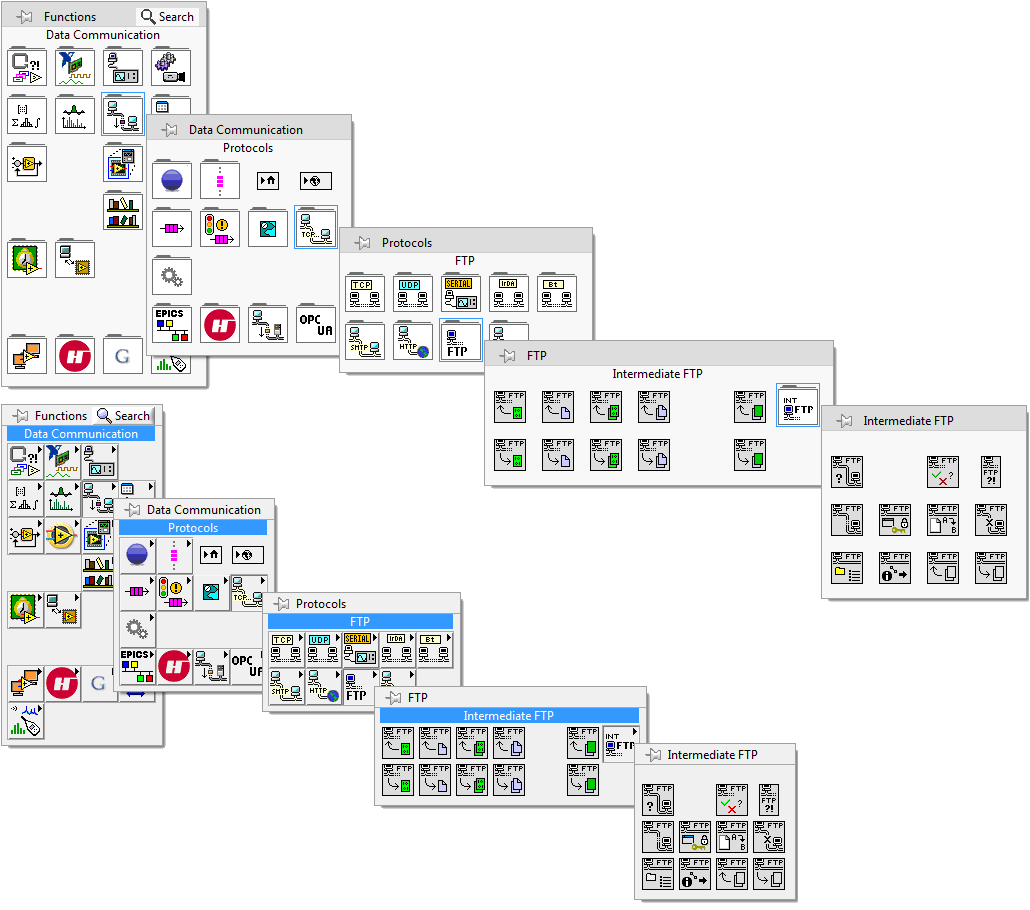
These images to show the relative size of the palettes LV2016 vs. 2015.

Controls Palette

ControlsPalette

BoolenPalette

Functions Palette

FunctionsPalette.png

ArrayPalette


Yes, this might seem trivial, until you think about traversing several palettes to get to your needed VI.


FTPPalette

*Random example, if one were doing FTP development they'd pin the menu.

** The original size of the above graphic is 1030 pixels wide; less than 800 for 2015.


Quit messing with what works and has become the standard with regards to options.  At least when that ridiculous "default" setting for icons instead of terminals was introduced we could undo the setting in Options

It seems that NI has hired some non-G experts to mess up the interface simply so they can enumerate all the "great" improvements they've made.  Or, was all the extra space to make sure newbies couldn't miss the folder tab, since connecting the "right arrow" on an icon to it being a sub-folder would be too difficult for children?


Tech Advisor - Automation
LabVIEW 5.0 - 2020
27 Comments
Michael_78
Active Participant

I totally agree, and NI is not listening to us. I dislike LV2016 and only use it when I have to for certain clients.  I work on a portable laptop andeals the 2016 palettes do not fit on screen without a scroll bar.  I use quick drop whenever I can but I often have to use functions I don't know the name of so stuck with palettes. How do unnecessary folder icons fit in line with a flat, clean UI style?  It seems a backwards move which proves to me it is change for the sake of change.

AristosQueue (NI)
NI Employee (retired)

> Quit messing with what works and has become the standard with regards to options.


[Speaking as part of LV R&D] We do not lightly mess with these things. Many of us are heavy G users as well. In this case, we were messing with something that often does not work. As monitor resolutions have made pixels smaller, those icons have gotten physically smaller. The rate of misclick has gotten significantly higher. This reduction in pixel size is a significant problem across all of LabVIEW -- terminals, regions of front panel controls, etc. We have an entire UI rewrite in progress (announced at NIWeek last year) driven by that issue. This was one place where we could restore some room to the icons that had been lost over time without waiting for that rewrite.


While we were at it, we made the folders much easier to distinguish from droppable nodes, and got the arrow off of the icon. Yes, the folder is more intuitive and harder to miss when scanning the palettes.


I am not downplaying your concerns -- any UI change causes real, legitimate problems for some user who relied upon the previous behavior. We try to make changes that help more users than they hinder. Sometimes we maintain Tools>>Options settings to go back to previous styles, but maintaining many options paths is expensive and error prone (one of the code paths inevitably gets less testing), so sometimes we make a judgement call as to which way we believe will benefit the most users. That is what happened in this case.


The deep palette issue that you are mentioning is largely addressed by two existing features:  QuickDrop and pinned palettes. By using ctrl+space, the bulk of our heavy users avoid use of the palettes most of the time. For those things that are in deep palettes where a user is less familiar with the API, we observe them pinning the palettes. Both of those avoid the long chain of pull-rights (except for the very first time that a pinned palette is accessed). The shortcut palettes (the ones you see when you right click on a node) also give an easy way to dive deep without the many pull-rights issue. Perhaps you could use those features more and avoid this problem yourself?


As noted elsewhere, the color of the primitives is being discussed in light of user feedback. I do not know what the outcome of that discussion will be. With sufficient customer pressure, this decision might also be revisited. You are the first I've heard to negatively comment on this change, but your post may prompt others.


[Taking off my NI hat and putting on my LV user hat] Personally, I like the change. But that's purely a personal decision... I wasn't one of the developers who worked on the palette change.

crossrulz
Knight of NI

Personally, I like the folder look.  It looks cleaner.  It is more obvious, especially in pallets with heavy icons (I have missed the arrows multiple times over the years).  Was the spacing a bit much?  Possibly.  Enough for me to worry about?  Not really.  Now the washed-out icons is a different story.  I gave that idea a kudos as soon as I saw it.


GCentral
There are only two ways to tell somebody thanks: Kudos and Marked Solutions
Unofficial Forum Rules and Guidelines
"Not that we are sufficient in ourselves to claim anything as coming from us, but our sufficiency is from God" - 2 Corinthians 3:5
James@Work
Member

Yes AQ, I've been using QD and know how to pin palettes.

And, I understand Millennials and younger cannot take time to learn anything; if it's not given or obvious, it's impossible.  So, the look of a folder might make sense, however, that change didn't require all the extra space.

FoldersView.png

However, saying this was necessary due to misclicks seems very unlikely; unless someone is trying to program LabVIEW using a touch screen.  Ha! Ha!

And, if misclicks were actually a problem for some few users, they could simply show labels to space everything out.  So there's already a fix for the "misclick" issue that had never been mentioned on the Idea Exchange.

LabelsOn.png

So, in reality all of these little changes to LV2016 were to try to get us long-time users prepared for NG; I've been on the CAB for years.  And, similarly, those developers don't want to here negative feedback on that UI either; resistance is futile!!

Tech Advisor - Automation
LabVIEW 5.0 - 2020
Hooovahh
Proven Zealot

For now I agree with OP.  My Advanced File Functions palette went from roughly 103,000 pixels to 367,000 pixels (from 242x429, to 657x559) when pinned.  A point I brought up at the 2016 beta.  That palette takes up more than 3 times the space previously.  Does it get 3 times less mistaken clicks?  Not by me, but it does cause more mouse movement, and more things to get hidden behind palettes and subpalettes.


That being said I'm still on a 1080 monitor.  I have yet to see a 4K monitor in our office so I'm unsure if when I get one my opinion will change because I do agree that pixel density in monitors has changed a lot over the years.  Unnecessary white space on my palette, and unnecessary white space on the forums makes like a poor use of space.

X.
Trusted Enthusiast
Trusted Enthusiast

While I am not very concerned by this particular change, I'll note that the Tools palette has not been touched. And THAT ONE could used some extra space or resizing...

What AQ is referring to is this:


Screen Shot 2017-04-18 at 13.23.42.png

I don't know how to turn off the captions, but I could imagine that this design could lead to some interesting layout issue in a deeply nested menu. Not mentioning the lack of context (the menus higher up are collapsed as you can see).

But what do I know? I have display contrast issues apparently...

X.
Trusted Enthusiast
Trusted Enthusiast

I actually answered my one question:


Screen Shot 2017-04-18 at 14.05.10.png

It doesn't work.

AristosQueue (NI)
NI Employee (retired)

I do not comment on the next platform yet. I do not work on UI for it, and until it is released to a wider range of users, I don't have enough customer visits to comment on it. I leave such commentary to others from NI for the time being.


Some changes have been put into the current product to align with the next one, but the folders and palette spacing wasn't one of those. It was designed to make the current palettes more usable.


You'll note that this idea is not declined, despite my post earlier. It's open to get more information on the change. as James@Work points out in the follow-up post, we could have the folder outlines without as much space as we added. We may back some of that out. It is too late to make any changes for LabVIEW 2017, but we can keep an ear open for 2018.

X.
Trusted Enthusiast
Trusted Enthusiast

As a matter of fact, no one from NI is commenting on the next platform.

Go and visit the Next Gen community and try to find a single substantial response to the questions and feedback there. After the initial willingness to acknowledge comments, the developers went silent,  as if they could not care less to address serious user concerns.

The results: no one yet has explained what in the defunct WebUI environment, which was adapted to a bare-bone LV 3.1 experience on the web, is adapted to graphical, multi window development of the future (not mentioning the present).

However, there sure is some intense brainstorming on whether an icon should be slightly darker on the left than on the right, or whether a gray level of 76,76,76 is preferable to one of 59,59,59 (just making up these figures, but this is the gist of the poll I was invited to participate in regarding icon design).

I suppose this is all a matter of display contrast tweaking...

MichaelBalzer
Active Participant

I agree the spacing is a bit too much. A 1px or 2px border around the folders and icons would be more appropriate. That said, I was never a fan of the zero spacing around folders when text wasn't visible, so I always had icon + text enabled.


With icon + text enabled in LV2016, the increased spacing leads to partially obscured windows / palettes. Compare the two screens below showing a typical work flow I use when setting up a bunch of file IO. LV2016 uses a lot more real-estate for very little gain. It's by no means a deal breaker, but is kind of annoying.


lv2015_spacing.jpg


lv2016_spacing.jpg


The point about misclicks is interesting, though as was pointed out by James@Work, simply enabling the icon + text for the palettes immediately addresses that problem.


Certified LabVIEW Architect
Unless otherwise stated, all code snippets and examples provided
by me are "as is", and are free to use and modify without attribution.