-
Analysis & Computation
305 -
Development & API
2 -
Development Tools
1 -
Execution & Performance
1,027 -
Feed management
1 -
HW Connectivity
115 -
Installation & Upgrade
267 -
Networking Communications
183 -
Package creation
1 -
Package distribution
1 -
Third party integration & APIs
289 -
UI & Usability
5,456 -
VeriStand
1
- New 3,061
- Under Consideration 4
- In Development 4
- In Beta 0
- Declined 2,639
- Duplicate 711
- Completed 336
- Already Implemented 114
- Archived 0
- Subscribe to RSS Feed
- Mark as New
- Mark as Read
- Bookmark
- Subscribe
- Printer Friendly Page
- Report to a Moderator
A Better "List Unsaved Changes"
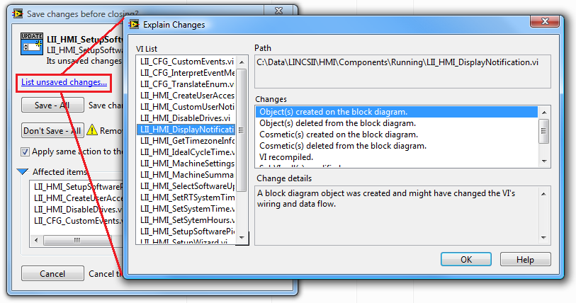
This is a neat tool I have only recently begun using heavily, but there are some big drawbacks that I would like corrected:

1. The window is not resizeable. As you can see, virtually all of my VI names overflow the "VI List". Also, I would like to see "Changes" have more line items vertically. (Similar idea: Allow Find All to be Resized)
2. I cannot double click the VI's in "VI List" to open that VI. More often than not, I want to check out those VI's to see if the "changes" are legit.
3. I would further like to be able to double click each line item in "Changes" and have the BD zoom and focus on that change, just like it does when you "Tools > Compare > Compare VIs..."
4. This window is modal, so I can't even do #2 - make it floating. (Another modal window woe: Make Build Error Window Floating, Not Modal where I explain a brute-force-screenshot workaround).
5. A huge help would be if the list of "changed" VIs could be shorter in the first place just by using the Do Not Save Option
These five ideas are just some basic UI improvements that would make this feature much more usable and powerful.
You must be a registered user to add a comment. If you've already registered, sign in. Otherwise, register and sign in.
