- Subscribe to RSS Feed
- Mark Topic as New
- Mark Topic as Read
- Float this Topic for Current User
- Bookmark
- Subscribe
- Mute
- Printer Friendly Page
xy graph deleting areas with no plots
04-01-2022 02:46 AM
- Mark as New
- Bookmark
- Subscribe
- Mute
- Subscribe to RSS Feed
- Permalink
- Report to a Moderator
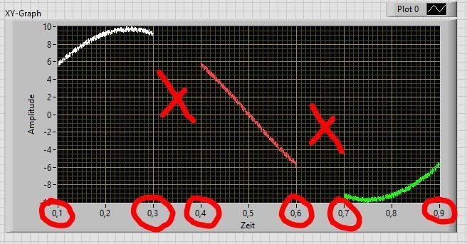
is it possible to clear/delete areas in a xy graph where no plots are displayed, the time axis should show the original times of signal sections, so that I can line up extracted signal sections without gaps (the gaps are normal about 1 second!)?
thanks in advance
04-01-2022 04:36 AM
- Mark as New
- Bookmark
- Subscribe
- Mute
- Subscribe to RSS Feed
- Permalink
- Report to a Moderator
No. Graphs are not able to manage scales with holes. At the very minimum, you should hide the inbuilt scale and use a Picture indicator to draw the scale yourself, which is by no means an easy task, although not impossible.
-------------------
LV 7.1, 2011, 2017, 2019, 2021
04-01-2022 05:27 AM
- Mark as New
- Bookmark
- Subscribe
- Mute
- Subscribe to RSS Feed
- Permalink
- Report to a Moderator
Or go 100% picture control of course.
You'll loose interactivity, but you might not need it.
You can give each plot it's own X scale. Use Marker Values[], offset and muliplier, you can tweak the values shown. However, the first and last markers are always added...
Or, hide the X scale and don't show any X scale. Instead, keep a record of the time at each sample and show the original time as the user moves a cursor.
Or show the time in another plot... Not as nice as a scale, but functional.
It feels to me you can make a more intuitive user interface, but it's hard to help when you know all the details.
04-01-2022 10:58 AM
- Mark as New
- Bookmark
- Subscribe
- Mute
- Subscribe to RSS Feed
- Permalink
- Report to a Moderator
You probably need to define what you mean by "clear" and "holes". If all sections and gaps are the same length and you only want a single marker in the center of each segment, that should be easy to do with the current capabilities. (Defining markers). Of course the x-axis will no longer be linear in x (just in segments).
It also almost seems like your x-axis points are spaced equally. This means you don't even need an xy graph!
Can you attach a simple VI so we don't need to start from scratch. Would it be sufficient if all visible traces have the same color or do you really want to switch color with each segment?
04-01-2022 11:33 AM
- Mark as New
- Bookmark
- Subscribe
- Mute
- Subscribe to RSS Feed
- Permalink
- Report to a Moderator
@altenbach wrote:
If all sections and gaps are the same length and you only want a single marker in the center of each segment, that should be easy to do with the current capabilities. (Defining markers). Of course the x-axis will no longer be linear in x (just in segments).
Here's a quick illustration of what I meant (these are waveform graphs, not xy graphs):
(One problem are the edge markers. Please vote for this old idea! )
04-02-2022 07:51 AM
- Mark as New
- Bookmark
- Subscribe
- Mute
- Subscribe to RSS Feed
- Permalink
- Report to a Moderator
the segments have the same length and can have the same color, but the gals have not the same length, it is important that the original x-axis values (time) are displayed.
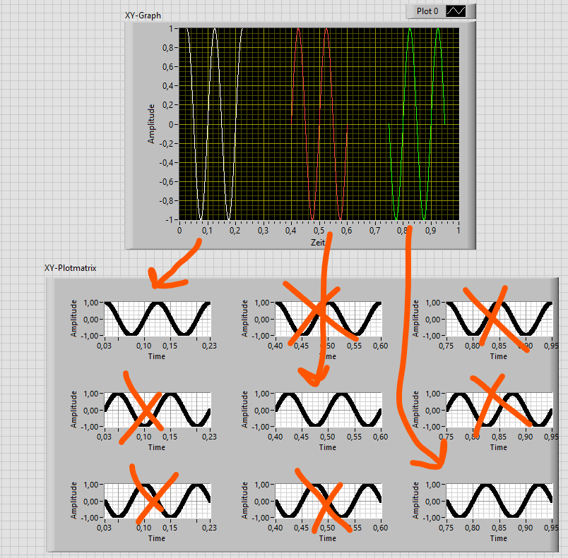
i also tried the xy-plotmatrix, but all combinations are displayed here, i only need the diagonal graphs, is there a way to display only these?
i attached a simple VI (LabVIEW 2020)
04-04-2022 02:52 AM
- Mark as New
- Bookmark
- Subscribe
- Mute
- Subscribe to RSS Feed
- Permalink
- Report to a Moderator
@kuegerls wrote:i also tried the xy-plotmatrix, but all combinations are displayed here, i only need the diagonal graphs, is there a way to display only these?
If it's OK to have this data in separate graphs, then it's absolutely no problem.
Simply split and put it in 3 graphs. Set the X Scale with offset and multiplier (or use a waveform data type).
If you want a single X scale with gabs, then the answer is no.
04-04-2022 03:00 AM
- Mark as New
- Bookmark
- Subscribe
- Mute
- Subscribe to RSS Feed
- Permalink
- Report to a Moderator
i don't always have 3 sections, the number varies, a solution to create graphs programmatically would be helpful (like the xy-plot matrix but only the diagonal elements)
04-04-2022 03:05 AM
- Mark as New
- Bookmark
- Subscribe
- Mute
- Subscribe to RSS Feed
- Permalink
- Report to a Moderator
If you can guess a maximum number of graphs, you can create as many Graph indicators as you need, then show-hide-move-resize them accordingly.
-------------------
LV 7.1, 2011, 2017, 2019, 2021
04-04-2022 03:25 AM
- Mark as New
- Bookmark
- Subscribe
- Mute
- Subscribe to RSS Feed
- Permalink
- Report to a Moderator
@kuegerls wrote:
i don't always have 3 sections, the number varies, a solution to create graphs programmatically would be helpful (like the xy-plot matrix but only the diagonal elements)
This isn't OoTB functionality that you're looking for.
The solution is going to be a compromise between functionality and programming effort. You can probably get this to work at least 95% of what you want, but we don't know where to compromise. Only you do.
For instance, in stead of showing all graphs, you can show just 1 and let the user browse through segments with a scrollbar. But we have no way to know if that is acceptable.
A picture control as X Scale would be able to do everything you're asked for (so far). It won't be easy, but I'm sure more then one of us have done similar things several times.
Maybe if you should share your ideal GUI and why it's ideal, and maybe where you'd be swilling to compromise, I'm sure we can make this work.


