- Subscribe to RSS Feed
- Mark Topic as New
- Mark Topic as Read
- Float this Topic for Current User
- Bookmark
- Subscribe
- Mute
- Printer Friendly Page
format x axis into days of the week
03-13-2013 11:37 AM
- Mark as New
- Bookmark
- Subscribe
- Mute
- Subscribe to RSS Feed
- Permalink
- Report to a Moderator
Hi, i hope someone can help me with this!
I wish to change the x axis to days e.g. Monday Tuesday.. however I do not know how to go about doing it.
After every 10th point in the array, i wish to put "Monday" on the x-axis and after next 10 points"Tuesday"
anyone can help me with this.
thanks alot in advance!=)
03-13-2013 02:29 PM
- Mark as New
- Bookmark
- Subscribe
- Mute
- Subscribe to RSS Feed
- Permalink
- Report to a Moderator
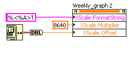
You can do it like this:
The first line tells the scale to display the day name, the second tells it there are 10 points for each day (it's in seconds) and the third tells it when the first point of the graph is. You could get rid of the second and third properties if you included the timing data as part of the graph (open the context help window and hover over the graph's terminal to see the data type for an XY graph, which includes the X data).
___________________
Try to take over the world!
03-14-2013 04:54 AM
- Mark as New
- Bookmark
- Subscribe
- Mute
- Subscribe to RSS Feed
- Permalink
- Report to a Moderator
Hi thank you for your suggestion! However as I am not using timing data as part of the graph, I do not need to use timestamp. In fact, I am using extracted data from a database and plot wavefrm to it. I have attached a VI to better show my problem. I have been searching forum and testing out for very long but still couldnt find the solution to it. Do help me out with this!! Thanks alot in advance!
03-14-2013 05:26 AM
- Mark as New
- Bookmark
- Subscribe
- Mute
- Subscribe to RSS Feed
- Permalink
- Report to a Moderator
Sorry, Pls ignore my previous msg.
From my database, one day there will be 48 data from 0-23hr hence, one week there will be 336 data. Array to my graph can change,therefore total data to be plot changes as well. X axis is to adjust automatically depending on the size of array. I need to set 0-336 as Week 1, 336 - 672 as Week 2 of the month. How do I go about doing it while x-axis adjust automatically? I have attached my VI to better illustrate my issue. As my VI is linked to a database, the VI could not be operated.
03-14-2013 09:14 AM
- Mark as New
- Bookmark
- Subscribe
- Mute
- Subscribe to RSS Feed
- Permalink
- Report to a Moderator
That VI doesn't really help, but here's a basic modification which shows you how you can at least clean up some of the code. It's unnecessarily complicated. It also shows how you can convert the data to be absolute time, but I would suggest using an XY graph instead of the WF graph and giving each point its own X value. That way you won't have to deal with all those conversions.
As for the months, you can use the %<%U>T format, which shows a week number, but that always starts at zero, not at one. If you want more customization than that, you could try building your own graph. There are some VIs in the picture control palette which allow you to do this and some examples which show how to use them. This will allow you to create a scale with whatever text you want.
In general, your code is not very efficient. If you want, you could try looking at some of these tutorials.
___________________
Try to take over the world!

