- Subscribe to RSS Feed
- Mark Topic as New
- Mark Topic as Read
- Float this Topic for Current User
- Bookmark
- Subscribe
- Mute
- Printer Friendly Page
chart problems
Solved!09-19-2019 05:17 AM
- Mark as New
- Bookmark
- Subscribe
- Mute
- Subscribe to RSS Feed
- Permalink
- Report to a Moderator
Folks - this chart problem is driving me crazy. I've stripped my problem down to the bare essentials here, saved it in LV12, hope y'all can open it. All I want to do is (sounds SO simple):
1) See my data in Scope Mode, but only 'sweep' once, displaying the entire 'run' in one 'picture'.
2) Set the X-axis as starting at 0, and ending in, say, 5.00 'seconds'. So in the example, I have 500 points to display, corresponding to 2 milliseconds per data point.
I totally don't understand the strange X-axis stuff that's happening. After running it, I look at the chart X-axis properties - it shows these weird values for the range, even tho I set them explicitly with the property node. I DON'T want this behavior of running several 'sweeps' - I want to see the entire 'run' in one 'sweep. I'm seeing interaction (undocumented?) between my data 'lenght' and the chart history length - don't understand that.
And BTW, why can't I Duplicate Scale for the Y-axis? I sure would appreciate some help with this. Am I missing some NI chart documentation somewhere? I've searched the examples, can't find anything that fits - paul
Solved! Go to Solution.
09-19-2019 05:36 AM - edited 09-19-2019 05:37 AM
- Mark as New
- Bookmark
- Subscribe
- Mute
- Subscribe to RSS Feed
- Permalink
- Report to a Moderator
1. To clear the history, wire an empty array to the property node. Writing 500 0's will pre-fill the chart with 500 data points which is why it doesn't start at 0 when you start writing your data to it.
2. The chart history length is the length of the chart history buffer...as you've set this to 500, the data will start to shift (first in, first out) and the X-scale starts to increase after writing 500 points. The chart history is also maintained between runs of your VI (but you initialise the history, so that's fine).
3. To display two plots on the chart, you need to wire in a 2D array. Wiring a 1D array will append everything in the array to Plot 0. To plot your 0/1/0 and your random number as separate plots, you need an additional build array before the waveform chart.
See the attached/fixed VI which I think does what you expect.
09-19-2019 09:34 AM
- Mark as New
- Bookmark
- Subscribe
- Mute
- Subscribe to RSS Feed
- Permalink
- Report to a Moderator
I find X/Y charts easier to understand as I have full control over every aspect of the chart. But they have the drawback of begin a bit more complex because you have to handle your own chart history with shift registers.
So I tend to stick them inside what we used to call an "action engine" or "Functional Global Variable" to keep my diagram looking neat.
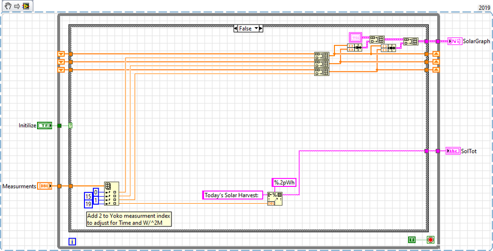
Here is an example.
You can't see the Initialize TRUE case in the picture, but at the start of my program and every night at midnight I call the True case to clear the chart and reset the X-Axis.
Otherwise I just send it an array of measurement data with the first element being a time stamp (for the X-axis) when I want to update it.
=== Engineer Ambiguously ===
========================
09-19-2019 12:25 PM
- Mark as New
- Bookmark
- Subscribe
- Mute
- Subscribe to RSS Feed
- Permalink
- Report to a Moderator
All you need is a plain waveform graph. Charts are not the right display for your application.
09-19-2019 06:38 PM
- Mark as New
- Bookmark
- Subscribe
- Mute
- Subscribe to RSS Feed
- Permalink
- Report to a Moderator
Guys - Well, Sam_Sharp solved my problem (I should have realized that to display 2 'traces' I'd a 2D array). Much thanks to all - paul
09-19-2019 09:00 PM
- Mark as New
- Bookmark
- Subscribe
- Mute
- Subscribe to RSS Feed
- Permalink
- Report to a Moderator
As I said, a chart IS the wrong indicator here. You have a fixed number of points known from the start of the program and there is absolutely no reason to rotate in new data in complicated data structures of a chart containing lots of internal functionality. The secret to efficient code is inplaceness. You can allocate the full 2D data (two plots) once at the start of the program (as NaN, which will not show!), then replace with data as it arrives, all displayed in a plain old graph. Once you configure xmin, xmax, and dx, these value are stored with the VI, no need to set them with every run. If you still want to set the axis, all you need to set is dx as 1/n and leave it at autoscale, the rest will fall into place since the number of graphed points is constant.


