ni.com is currently undergoing scheduled maintenance.
Some services may be unavailable at this time. Please contact us for help or try again later.
- Subscribe to RSS Feed
- Mark Topic as New
- Mark Topic as Read
- Float this Topic for Current User
- Bookmark
- Subscribe
- Mute
- Printer Friendly Page
Polar Plots
11-12-2022 03:07 PM
- Mark as New
- Bookmark
- Subscribe
- Mute
- Subscribe to RSS Feed
- Permalink
- Report to a Moderator
Morning/Evening Gurus (*delete as appropriate),
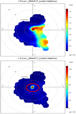
Is it possible to generate polar plots like the one in the attached? I have three inputs, a direction, a radial position and 3rd value for the colour scale (wind direction, windspeed then a gas pollutant from a weather station). I am basically looking for a Labview equivalent of Openair, if that means anything.
Thanks in advance
11-12-2022 03:51 PM - edited 11-12-2022 03:52 PM
- Mark as New
- Bookmark
- Subscribe
- Mute
- Subscribe to RSS Feed
- Permalink
- Report to a Moderator
I am sure you could just use an intensity graph and map your data into the grid accordingly Using interpolation for missing grid points..
You can use "plot images" feature to overlay the circular scales, etc.)
Similarly, you can use a 2D picture indicator.
Do you have some typical data?
11-12-2022 04:46 PM
- Mark as New
- Bookmark
- Subscribe
- Mute
- Subscribe to RSS Feed
- Permalink
- Report to a Moderator
Either way, you need to map your data into a rectangular grid (which is also the case of your example images). For an example of overlaying grid lines and markers, have a look here.
11-20-2022 04:35 PM
- Mark as New
- Bookmark
- Subscribe
- Mute
- Subscribe to RSS Feed
- Permalink
- Report to a Moderator
Hi All,
Thanks for the info,and sorry for the slow response in replying. I was out of office last week.
I'll have a look at the thread and also try and post some data as an example.
Paul
11-25-2022 09:28 AM
- Mark as New
- Bookmark
- Subscribe
- Mute
- Subscribe to RSS Feed
- Permalink
- Report to a Moderator
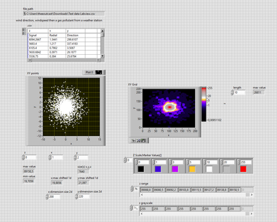
Got some data together in between teaching undergrads! This would be the sort of thing, with a signal, a radial position and a direction. Would this work on your example code?
11-25-2022 12:38 PM - edited 11-25-2022 12:39 PM
- Mark as New
- Bookmark
- Subscribe
- Mute
- Subscribe to RSS Feed
- Permalink
- Report to a Moderator
Hi Pablo,
@MancPablo wrote:
This would be the sort of thing, with a signal, a radial position and a direction.
Something like this:

Now you need to implement an interpolation algorithm to "fill" the blank space between your data samples…
11-30-2022 11:17 AM
- Mark as New
- Bookmark
- Subscribe
- Mute
- Subscribe to RSS Feed
- Permalink
- Report to a Moderator
11-30-2022 11:26 AM
- Mark as New
- Bookmark
- Subscribe
- Mute
- Subscribe to RSS Feed
- Permalink
- Report to a Moderator
11-30-2022 03:41 PM
- Mark as New
- Bookmark
- Subscribe
- Mute
- Subscribe to RSS Feed
- Permalink
- Report to a Moderator
You could check this toolkit out
I don't know if it will solve your problem but it has some handy plots you can make.
12-01-2022 03:46 PM - edited 12-01-2022 03:48 PM
- Mark as New
- Bookmark
- Subscribe
- Mute
- Subscribe to RSS Feed
- Permalink
- Report to a Moderator
@alexderjuengere wrote:
@GerdW wrote:
Now you need to implement an interpolation algorithm to "fill" the blank space between your data samples…
the easiest way is to accumulate a 2d Histogram with rectangular or square 'bins'
it is common to smooth the flat square bin with a 2d Gaussian Kernel as shown here:
https://forums.ni.com/t5/Machine-Vision/gaussian-filter/m-p/2443278#M38836


