ni.com is currently undergoing scheduled maintenance.
Some services may be unavailable at this time. Please contact us for help or try again later.
- Subscribe to RSS Feed
- Mark Topic as New
- Mark Topic as Read
- Float this Topic for Current User
- Bookmark
- Subscribe
- Mute
- Printer Friendly Page
Plot multiple y axis from csv file
Solved!06-05-2019 11:40 PM
- Mark as New
- Bookmark
- Subscribe
- Mute
- Subscribe to RSS Feed
- Permalink
- Report to a Moderator
Hi All,
I have the attached csv file. And I want to be able to plot the first column as the x axis, and the second two columns as two separate y axis on the one xy plot.
I am not sure why my coding is not working.
Thanks in advance.
Solved! Go to Solution.
06-05-2019 11:43 PM
- Mark as New
- Bookmark
- Subscribe
- Mute
- Subscribe to RSS Feed
- Permalink
- Report to a Moderator
Go into your graph's property settings. Go to Plots page. make sure your 2nd plot is set for the 2nd Y-axis. Right now they are both assigned to the 1st Y-axis.
Use Block Diagram Cleanup to straighten your wires.
06-05-2019 11:51 PM
- Mark as New
- Bookmark
- Subscribe
- Mute
- Subscribe to RSS Feed
- Permalink
- Report to a Moderator
Thanks for the quickreply RavensFan.
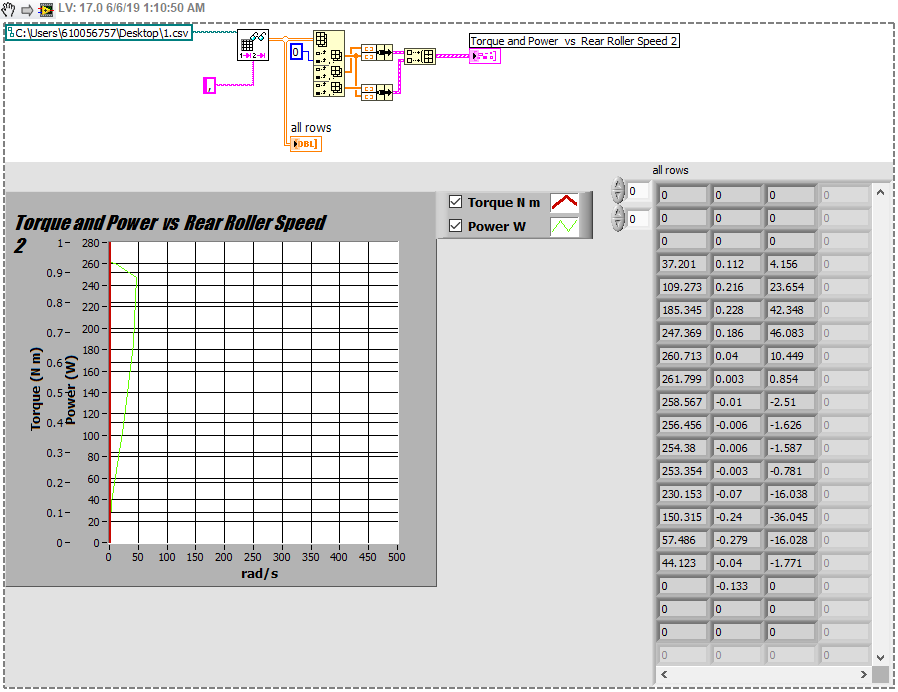
However, I thought they were on different axis? Please see screenshots of properties
06-06-2019 12:11 AM - edited 06-06-2019 12:19 AM
- Mark as New
- Bookmark
- Subscribe
- Mute
- Subscribe to RSS Feed
- Permalink
- Report to a Moderator
I swear the first time I opened your code, it looked like the properties weren't set that way. But after your message, I closed and reopened and checked again. They were.
I do see problems with your Read Spreadsheet file function.
1. You are only reading 3 rows. Delete that 3 constant.
2. You don't have a constant set for delimiter. Unwired it defaults to a tab. You need to add a string constant and put a comma in it.
3. Your index array is picking Rows 0, 1, and 2. You want to pick Columns 0, 1 and 2.
When I fix those things, I see two lines and both stretch the full length of the Y axis, each on its own with different Y scales.
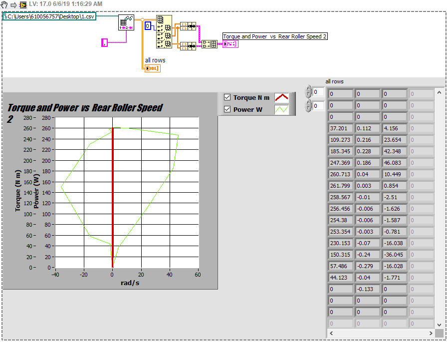
EDIT: Actually something is odd about the way you wired your data. Your column 0 became the Y axis for both,. And columns 1 and 2 become X axes. When I go and fix your auto-scale issues on the graphs, your graph axially looks like the second chart. I think you mixed up your X and Y columns. Make sure you understand how your data is saved in your file, and understand the differences between rows and columns, and the order that you bundle the arrays to make a plot.
After fixing X and Y axes so they all auto-scale
06-06-2019 01:44 AM
- Mark as New
- Bookmark
- Subscribe
- Mute
- Subscribe to RSS Feed
- Permalink
- Report to a Moderator
Those steps sorted it!
I had my inputs to the bundles the wrong way round, looks much better now.
I really appreciate your help with this issue, thank you!


