- Subscribe to RSS Feed
- Mark Topic as New
- Mark Topic as Read
- Float this Topic for Current User
- Bookmark
- Subscribe
- Mute
- Printer Friendly Page
Logging timer
09-05-2016 09:39 AM - edited 09-05-2016 09:45 AM
- Mark as New
- Bookmark
- Subscribe
- Mute
- Subscribe to RSS Feed
- Permalink
- Report to a Moderator
Hey guys and girls
I am pretty new to labview and need some assistance. I want to be able to choose how often I want the data to be logged. If it is every second or every ten seconds. My next question is. When I start logging why is the graph delayed? As if it is too much for it to process?
Thans alot
09-05-2016 11:21 AM
- Mark as New
- Bookmark
- Subscribe
- Mute
- Subscribe to RSS Feed
- Permalink
- Report to a Moderator
In your Program, you have a While loop with a DAQ Assistant (which gathers data and presents it for further processing, a series of Indicators (including two charts) which show the data, and a function (controlled by a Boolean called "Star Logging" -- I'm guessing the "t" is missing) to write the data to a Measurement File.
LabVIEW uses the Principle of Data Flow, which, among other things, says that the While loop cannot "loop" (and take more data, update its display, etc.) until everything in the loop that should run does run. Initially, with Logging off, you only had acquisition and display in the loop. Now you turn Logging on, which (at least the first time, when files are opened) adds additional steps that much be completed before the While loop can finish and start the next "loop". Hence the apparent slowdown (it's not "apparent" -- you just need more time to do these things in a serial fashion).
Bob Schor
09-05-2016 02:02 PM - edited 09-05-2016 02:09 PM
- Mark as New
- Bookmark
- Subscribe
- Mute
- Subscribe to RSS Feed
- Permalink
- Report to a Moderator
Hey Bob!
Thanks for the answer. Appreciate it alot.
Do you know a way to make an option so I could choose how often the data is logged? Another problem I have is that when I start the program I want the start / date from when I started logging and how much time has passed in minutes under the wavefrom graph. What happens when I start the program is that it shows the current time. I am gonna upload what I have made so far and you will probably notice another problem I am trying to solve with tabs and how to avoid duplicating everything. I wan to be able to choose if I want to log all the data from every sensor or just to log the data from one sensor.
Thanks!
09-05-2016 04:00 PM
- Mark as New
- Bookmark
- Subscribe
- Mute
- Subscribe to RSS Feed
- Permalink
- Report to a Moderator
So let me help you with one part of your problem/question, namely how to use a Waveform Chart. When you use the Dreaded DAQ Assistant, and its Evil Twin, the Dynamic Wire (I recently said I'd stop calling them that, but I'm having a hard time resisting), you are (without, probably, realizing this) saving your data in something resembling the Waveform, a Cluster that includes the Start Time (as a Time Stamp), the sampling interval (in seconds), and an array of Dbls representing the samples. These are the default Data that a Waveform Chart expects.
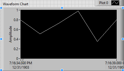
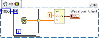
Here is a simple "do-it-yourself" Waveform. I generate 1000 random numbers (my data), and bundle them into Waveform using the Build Waveform function on the Waveform Palette. Notice I wired 1 into dt (meaning the data are generated at the rate of 1/sec), and left t0, the Start Time, undefined. Here's the VI and the Waveform Chart it generated:

The second is easier to answer. Recall that I didn't define t0, the Start Time. So LabVIEW used the standard "Default Value", which in this case is 0. But a TimeStamp of 0 really means "Midnight on Jan 1, 1904, GMT", and since I'm in a GMT-5 time zone, it comes out around 7pm New Years Eve, 1903.
Let's fix everything. Start by right-clicking the Chart. In the Drop-down list, choose X Scale (which is what we want to "fix"), and choose "Properties". Before dealing with the Scale tab, let's deal with Display Format (because we don't want it to tell us about New Years Eve).
Notice that the X Axis (Time) is showing as "Absolute Time", which means "0 = New Years, 1904". Change this to "Relative Time", where 0 means "Start Time". Now look at the Graph -- you should see Time in Hours and Minutes, probably 00:16 (16 minutes = 1000 seconds, more or less). While you were on Display Format, you can also change the Time format to HH:MM:SS, which you might like even better.
Now go to the Scales tab. Look at Maximum and Minumum. It probably say 999 and 994. Change it to 1000 and 0. Now look at the Chart. Much better.
Bob Schor
09-06-2016 12:13 PM
- Mark as New
- Bookmark
- Subscribe
- Mute
- Subscribe to RSS Feed
- Permalink
- Report to a Moderator
Hey Bob
Even if I make the graph as u suggested it does not show how much time has passed since I started receiving data from my sensor? Is there something I am missing? (probably alot) 😄
Thanks once again.
09-06-2016 07:08 PM
- Mark as New
- Bookmark
- Subscribe
- Mute
- Subscribe to RSS Feed
- Permalink
- Report to a Moderator
@DP123 wrote:
Even if I make the graph as u suggested it does not show how much time has passed since I started receiving data from my sensor?.
Sure it does. The X axis, if "relative time", is the time since start. Remember the example of 1000 points at 1/sec? The numbers go from 0:00 to 16:40, and 16 minutes 40 seconds = 1000 seconds. [Note that I didn't really wait 1000 seconds -- that's the advantage of simulating the time].
Bob Schor
09-14-2016 08:34 AM
- Mark as New
- Bookmark
- Subscribe
- Mute
- Subscribe to RSS Feed
- Permalink
- Report to a Moderator
Hey Bob
Sorry I have not responded sooner but I was busy trying to get my hardware working for my project.
What I wanted on the x-axis was:
Example lets say that the experiment had been running for 1 hour 25 min before the program was stopped:
Start time / date: End time / date:
15:29 16:54
14/9/2016 14/9/2016
or
0 85 min
Thanks Bob
Greetings
DP

