- Subscribe to RSS Feed
- Mark Topic as New
- Mark Topic as Read
- Float this Topic for Current User
- Bookmark
- Subscribe
- Mute
- Printer Friendly Page
How to increase xy-graph performance
Solved!03-31-2016 07:01 AM
- Mark as New
- Bookmark
- Subscribe
- Mute
- Subscribe to RSS Feed
- Permalink
- Report to a Moderator
Hello,
I am running a continuous data acquisition with a NI-PCI 6133 (4x AI channel @ 2,5MS/s each) on a WIN 7 PC (LabView FDS 2012). Inside a while loop I am able to acquire 2000 samples per loop from each channel with a stable loop performance of around 1,25kHz. Out of this data I am calculating 24 values which will be shown on 6 xy-graphs (4 values on each graph). The data acquisition runs up to 2 minutes.
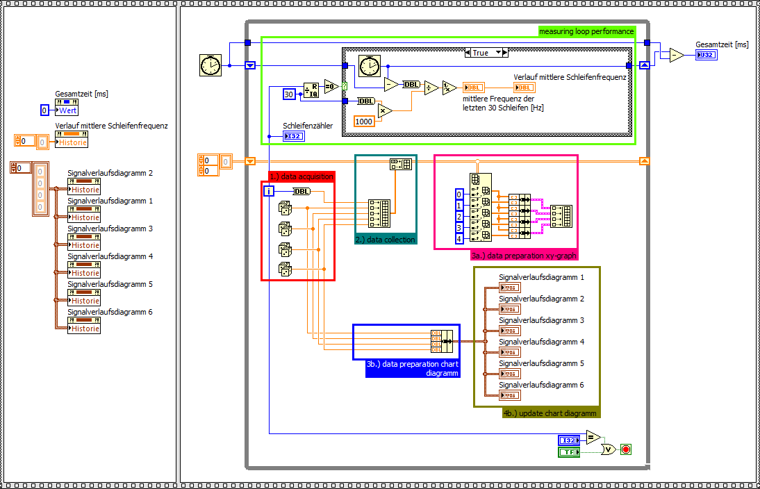
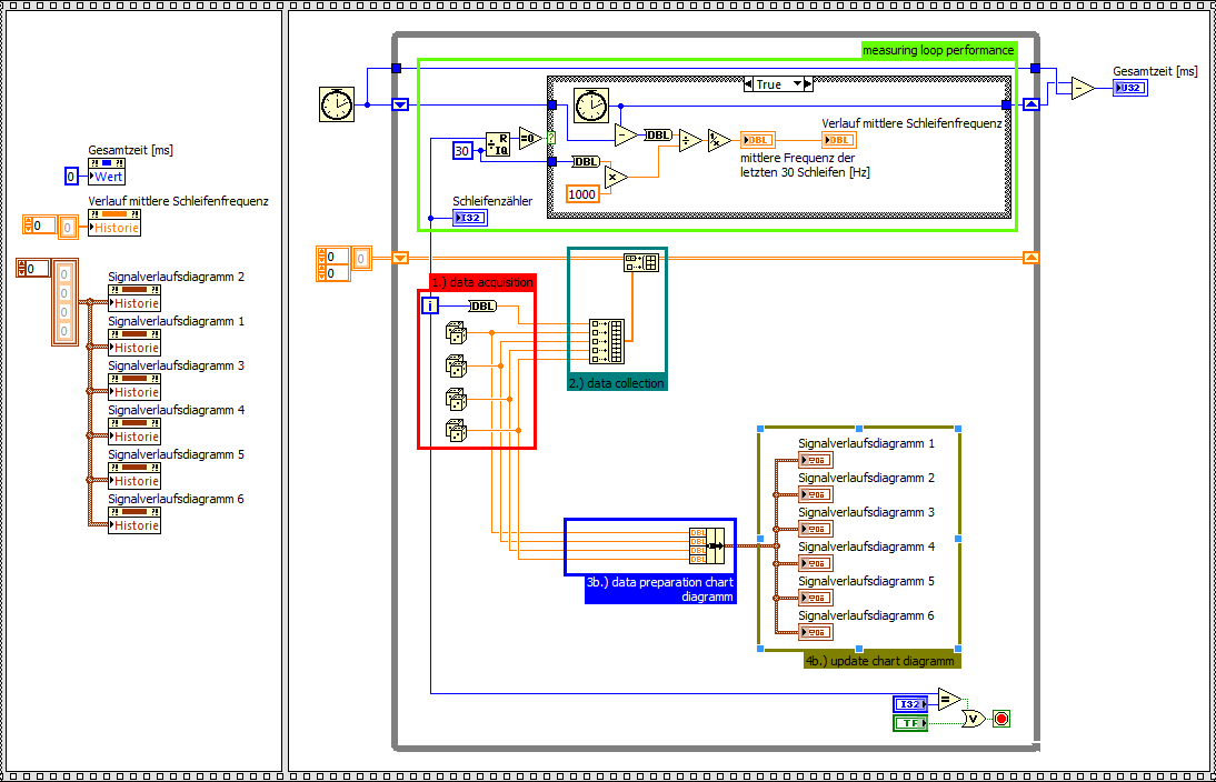
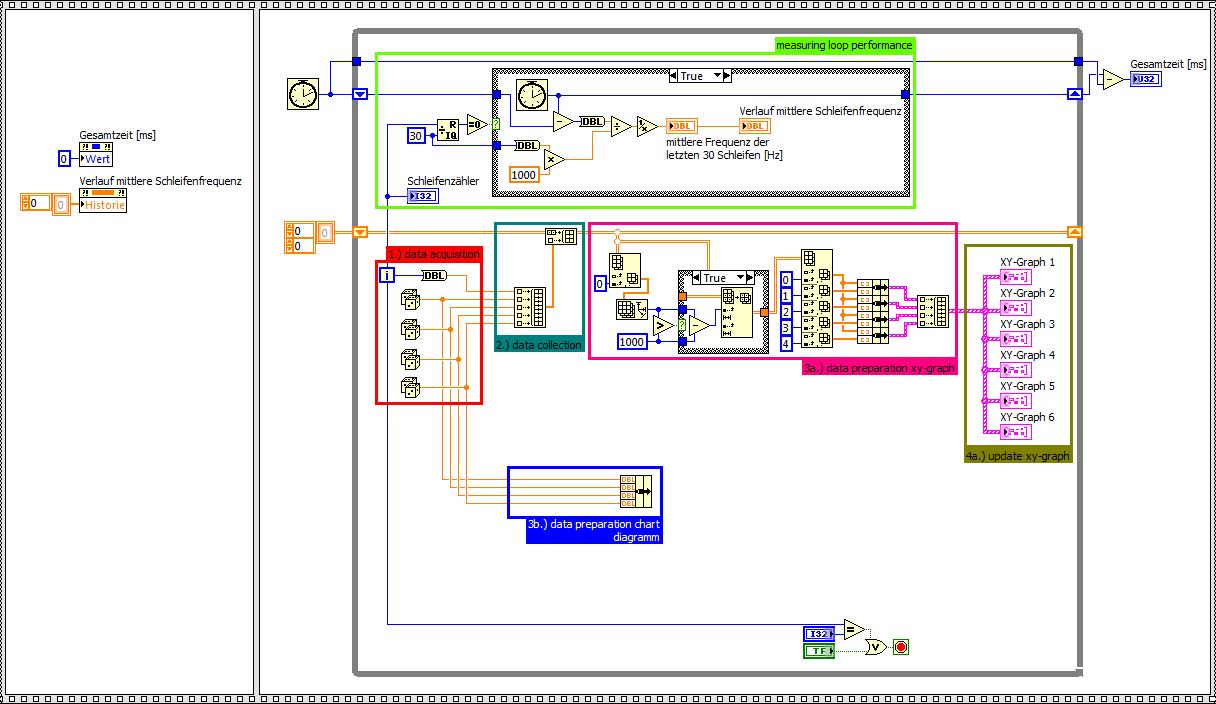
Data preparation and updating xy-graphs seems to be a big performance bottleneck. To clearify this I have written a simple benchmark, comparing xy-graph performance and chart diagramm performance. For the same amount of data, the chart diagramm is around 3 times faster, depending on the ability to draw only the last new value. The xy-graph has to update the whole plot each iteration.
If I also delete the complex data preparation of the xy-graph, the chart diagramm ist up to 6 times faster.
Benchmark xy-graph
Benchmark chart diagramm (including data preparation for xy-graph)
Benchmark chart diagramm (without data preparation for xy-graph)
Questions
- Is there a way to optimize the data preparation part of the xy-graph?
- Is it possible to draw only the last new value of an xy-graph like a chart diagramm?
Why can't I not use a chart diagramm?
- Because the time base ist not constant.
My ideas:
1.) During a measurement I am using a chart diagramm. I know there will be some failure depending on the varying timebase. After acquisition the acquired data will be shown in xy-graphs (only one update necessary) with the right timebase.
2.) I am not showing the whole data inside a xy-graph. Maybe just the last 1000 values would be enough.
Benchmark xy-graph with just showing the last 1000 values
Are there any other ideas how to speed up xy-graphs?
Thanks a lot and best regards,
Michael
Solved! Go to Solution.
03-31-2016 07:05 AM
- Mark as New
- Bookmark
- Subscribe
- Mute
- Subscribe to RSS Feed
- Permalink
- Report to a Moderator
Here are the VIs of the above screenhsots.
03-31-2016 07:15 AM
- Mark as New
- Bookmark
- Subscribe
- Mute
- Subscribe to RSS Feed
- Permalink
- Report to a Moderator
@MichaGue_01 wrote:Why can't I not use a chart diagramm?
- Because the time base ist not constant.
That does not mean you can't use a chart. You should read my nugget on Sporatic Waveform Charts. As long as you acquire waveforms from your DAQmx device, you can just wire your waveforms directly into the chart and it will take care of the time base.
There are only two ways to tell somebody thanks: Kudos and Marked Solutions
Unofficial Forum Rules and Guidelines
"Not that we are sufficient in ourselves to claim anything as coming from us, but our sufficiency is from God" - 2 Corinthians 3:5
03-31-2016 08:14 AM
- Mark as New
- Bookmark
- Subscribe
- Mute
- Subscribe to RSS Feed
- Permalink
- Report to a Moderator
Hello,
thank you for your reply. That is new to me. I will give it a try.
Thanks a lot.
Best regards,
Michael
03-31-2016 08:36 AM
- Mark as New
- Bookmark
- Subscribe
- Mute
- Subscribe to RSS Feed
- Permalink
- Report to a Moderator
@crossrulz,
your nugget is realy interesting and works for your example.
In my example I have a loop frequency of about 1,25kHz. dt has to be around 0,8ms. Is there a way to generate timestamps with less than 1ms on a windows pc? Another requirement (I have not mentioned yet) is to use non deterministic frequencies (i.e. 1kHz; 1,2kHz; 1,5kHz; 3kHz, 5kHz; 5,2 kHz; ...) instead of timestamps as x-axis component. Is this also possible with a chart diagramm?
Thanks a lot.
Michael
03-31-2016 09:17 AM
- Mark as New
- Bookmark
- Subscribe
- Mute
- Subscribe to RSS Feed
- Permalink
- Report to a Moderator
Use the High resolution timer ?
You can do your own math to determine what the dt from the start of the graphing and just add the offest to the timestamp of teh start time.
And while I am at it...
Once the history of the chart fills up and the display starts to scroll the Waveform Data Typ chart will perform even better.
Ben
03-31-2016 09:21 AM
- Mark as New
- Bookmark
- Subscribe
- Mute
- Subscribe to RSS Feed
- Permalink
- Report to a Moderator
Interesting. I'm working with a colleague who has entirely different requirements -- sampling (for hours) at 50 Hz, wants to see "backwards in time" for, say, an hour or two, willing to have multiple time bases. I stumbled upon a Blog post, http://culverson.com/tips-and-tricks/, and thought "Hmm, what an interesting idea" (note who wrote the comment at the end of the Blog).
I've since implemented a variant of this using multiple time bases, each a factor of 5 longer than the previous, and have simulated taking 4 channels of data at speeds up to 500 Hz. [Note -- I just tested it with points coming in at 1KHz. My simulated A/D is set to send me 50 points at a time, so I'm getting plot updates at 20Hz.]
For this particular implementation, I'm plotting only a single channel (selectable by a Front Panel control). Changing the Time Base is done by pushing a "Next" (longer Time Base) or "Previous" button. Switching Channels or Time Bases is essentially instantaneous (probably less than 0.1 sec), and the graph updates fast enough that it looks like a scrolling Chart.
Read Culverson's description, then see if you can implement some of his ideas to fit your needs. I was shocked at how well it worked for us.
Bob Schor
04-01-2016 06:17 AM
- Mark as New
- Bookmark
- Subscribe
- Mute
- Subscribe to RSS Feed
- Permalink
- Report to a Moderator
@Ben wrote:Use the High resolution timer ?
I think you mean this: http://zone.ni.com/reference/en-XX/help/371361L-01/glang/high_res_rel_sec/
That is also new for me and works fine. Thanks for the hint.
@Ben wrote:
You can do your own math to determine what the dt from the start of the graphing and just add the offest to the timestamp of teh start time.
That also works. Thanks a lot for your help.
Best regards,
Michael


