- Subscribe to RSS Feed
- Mark Topic as New
- Mark Topic as Read
- Float this Topic for Current User
- Bookmark
- Subscribe
- Mute
- Printer Friendly Page
How to display spectral lines in color band
09-04-2010 09:25 PM
- Mark as New
- Bookmark
- Subscribe
- Mute
- Subscribe to RSS Feed
- Permalink
- Report to a Moderator
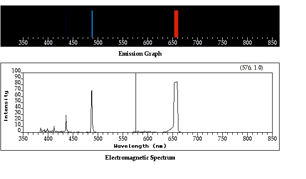
I want to display a line spectrum in color band format. What I have are two arrays: wavelength and intensity. I can plot the graph like the bottom one and I want to convert it to the top color band. The considerations are:
1. the color must agree with the wavelength. For instant, the 650 nm corresponds to the red color and the 490 matches the blue
2. the line intensity is indicated by the line width of the color line. For instant, the 650 nm line is a strong one and its red line in the color band is the widest. The 435 nm line is a weak one so it is barely see (but still visible) in the color band.
I would like to know if labview has any built-in function to assist me with this job. If not, any idea of implementing this?
Thanks in advance for any suggesting.
09-05-2010 05:49 AM
- Mark as New
- Bookmark
- Subscribe
- Mute
- Subscribe to RSS Feed
- Permalink
- Report to a Moderator
i dont think there's labview support on this...the easiest way would be to code it yourself, by drawing an image and using rectangles...to color-code your rectangles, you will have to specify some sampling points (400nm-->blue, 540nm-->green...) and to interpolate between them...the more sampling points you have, as better the color matching...
THINK G!! 😉
------------------------------------------------------------------------------------------------
Using LabView 2010 and 2011 on Mac and Win
Programming in Microsoft Visual C++ (Win), XCode (Mac)
09-05-2010 08:52 AM
- Mark as New
- Bookmark
- Subscribe
- Mute
- Subscribe to RSS Feed
- Permalink
- Report to a Moderator
I am thinking of an alternative way to implement this, but not sure if LabView can handle:
1. First, set a standard color spectrum as background:
2. Then, make the spectral line image as 2D, and put it in front of the color spectrum with the wavelength aligned. The picture below has the y-axis offset a bit to show my concept:
For the 2D spectral line image, I have the max intensity set as white and the min set at black. WHAT IF I can set the min as "opaque" and max as "100% transparent"? Is it possible?
I started my labview programming last year so sometime I may think labview can "fly". If this concept is too crazy (a.k.a. impossible) , just let me know. Thanks!
09-05-2010 10:38 AM
- Mark as New
- Bookmark
- Subscribe
- Mute
- Subscribe to RSS Feed
- Permalink
- Report to a Moderator
You can use the Picture functions. I would start with the shiped example .....\examples\picture\demos.llb\Histogram Plot.vi and modify it to fit your needs.

Besides which, my opinion is that Express VIs
(Sorry no Labview "brag list" so far)
09-05-2010 03:08 PM
- Mark as New
- Bookmark
- Subscribe
- Mute
- Subscribe to RSS Feed
- Permalink
- Report to a Moderator
Hello Coq, would you mind elaborate a bit more? My understanding is to set the standard full spectrum as the background "picture" in the plot, but how to I convert the spectral line plot into a transparent one based on their intensity? Or, are you suggesting another method to implement? Thanks!
09-05-2010 03:24 PM
- Mark as New
- Bookmark
- Subscribe
- Mute
- Subscribe to RSS Feed
- Permalink
- Report to a Moderator
another possibility are user defined controls...for example, you can use an xy graph and use your spectrum as a background (right-click an xy-graph and chose advanced-->customize)
or: use the function "get image subset" in the picture palette to extract a part of your spectrum (or one spectral line...), then you can create an output picture depending on your picture...
THINK G!! 😉
------------------------------------------------------------------------------------------------
Using LabView 2010 and 2011 on Mac and Win
Programming in Microsoft Visual C++ (Win), XCode (Mac)
09-05-2010 03:47 PM
- Mark as New
- Bookmark
- Subscribe
- Mute
- Subscribe to RSS Feed
- Permalink
- Report to a Moderator
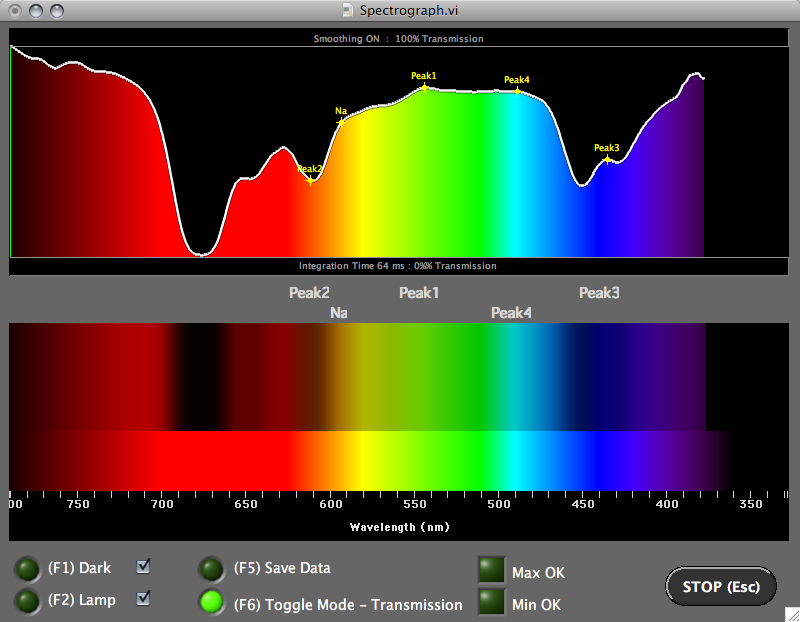
You mean like this?
Shane
09-05-2010 03:55 PM
- Mark as New
- Bookmark
- Subscribe
- Mute
- Subscribe to RSS Feed
- Permalink
- Report to a Moderator
yeah, thats what i meant :-)...didn't know that theres already an example...
THINK G!! 😉
------------------------------------------------------------------------------------------------
Using LabView 2010 and 2011 on Mac and Win
Programming in Microsoft Visual C++ (Win), XCode (Mac)
09-05-2010 04:43 PM
- Mark as New
- Bookmark
- Subscribe
- Mute
- Subscribe to RSS Feed
- Permalink
- Report to a Moderator
YES Intaris, your bottom plot is very close to what I need.
My original data is a 2D array which I usually plot like this:
My goal is to make it look like this:
Following the replies from this post, I am currently in a step of having this (this is another spectrum so the lines look different):
Can you give me hints on how to make your bottom plot?
Thanks everyone for their reply
09-06-2010 03:50 AM
- Mark as New
- Bookmark
- Subscribe
- Mute
- Subscribe to RSS Feed
- Permalink
- Report to a Moderator
I used a picture control to generate the images.
An important note is to ALWAYS create the picture from scratch (start with an empty picture) because if you keep drawing over the old one, performance gets really bad really quickly.
I'll post an example when I get back home, that's where my code is.
Regards
Shane.


