- Subscribe to RSS Feed
- Mark Topic as New
- Mark Topic as Read
- Float this Topic for Current User
- Bookmark
- Subscribe
- Mute
- Printer Friendly Page
Graphing arrays
Solved!04-04-2018 01:31 PM - edited 04-04-2018 01:36 PM
- Mark as New
- Bookmark
- Subscribe
- Mute
- Subscribe to RSS Feed
- Permalink
- Report to a Moderator
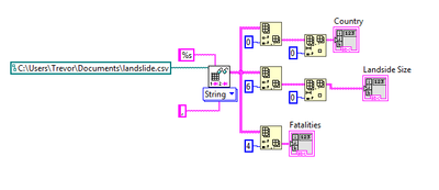
Hey there Labview masters, a beginner here looking some guidance. I have extracted data (strings) from a csv in the form of an array and now I want to graph them in a bar graph by quantity. I have roughly 6000 countries in the column I want to graph, so if Peru is the most common country in the column, the bar graph will indicate that with the largest bar, the least common country will have the lowest, etc. I've scoured youtube and havent come up with a solution yet.
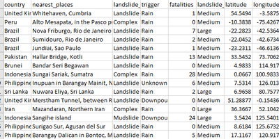
Bonus Round: As you can see from the fatalities column I want to extract, even though the correct column is chosen, all the data is messed up, grabbing elements from other columns. Why is this?
Thanks!
some pics if you dont want to download
Solved! Go to Solution.
04-04-2018 01:44 PM - edited 04-04-2018 01:47 PM
- Mark as New
- Bookmark
- Subscribe
- Mute
- Subscribe to RSS Feed
- Permalink
- Report to a Moderator
Your fatalities column is not right because the "trigger" column has more than one value in some rows "nearest_places" column has a comma in the city name. So basically in those cases, all values get shifted to the right.
04-04-2018 01:48 PM - edited 04-04-2018 01:49 PM
- Mark as New
- Bookmark
- Subscribe
- Mute
- Subscribe to RSS Feed
- Permalink
- Report to a Moderator
Hmm I understand what you are saying, but looking through the data for "trigger" I don't see any elements that have more than one value, no commas. Am I blind?
EDIT: Just saw your edit. Thank you!
04-04-2018 01:59 PM
- Mark as New
- Bookmark
- Subscribe
- Mute
- Subscribe to RSS Feed
- Permalink
- Report to a Moderator
Right csv format view like this:
1.23, 4.56, "some,string"
1.23, some string, 4.56
P.S. Excel make and import incorrect csv file.
04-04-2018 02:51 PM
- Mark as New
- Bookmark
- Subscribe
- Mute
- Subscribe to RSS Feed
- Permalink
- Report to a Moderator
Think you can expand on that a little? Do I have to change the format of the document?
04-04-2018 02:58 PM
- Mark as New
- Bookmark
- Subscribe
- Mute
- Subscribe to RSS Feed
- Permalink
- Report to a Moderator
I assume you are getting this data from a USGS website. If you are able to download a tab delimited file rather than a comma delimited one, the commas in the city name won't affect the import. If CSV is the only available format, you may need to create your own import function that ignores commas inside of double quotes. Maybe there is a way to do this with the Read Delimited Spreadsheet function but I am not aware of it.
04-04-2018 03:06 PM
- Mark as New
- Bookmark
- Subscribe
- Mute
- Subscribe to RSS Feed
- Permalink
- Report to a Moderator
The column "near places" wasnt even needed for what I am doing, so I was able to just delete it and continue on. Now that I have my data, I'm still having trouble graphing it by quantity. Any functions you can point me to to help me out?
04-04-2018 03:56 PM - edited 04-04-2018 04:08 PM
- Mark as New
- Bookmark
- Subscribe
- Mute
- Subscribe to RSS Feed
- Permalink
- Report to a Moderator
Trevor,
In your sample csv file, if the near_places column contains more than one location it is separated by quotes.
To parse the data correctly, first you need to check if the line contains a double quote.
04-05-2018 12:51 PM
- Mark as New
- Bookmark
- Subscribe
- Mute
- Subscribe to RSS Feed
- Permalink
- Report to a Moderator
@trevor322 wrote:
I have extracted data (strings) from a csv in the form of an array and now I want to graph them in a bar graph by quantity. I have roughly 6000 countries in the column I want to graph, so if Peru is the most common country in the column, the bar graph will indicate that with the largest bar, the least common country will have the lowest, etc.
Firstly, your data file seems corrupted, because there is a poorly formatted line (~644) without country (search for "milepost"). You might want to correct that or edit it out. There might be others.
The above solution seems overly complicated, so here's a simpler version. It basically replaces all commas with tabs unless they occur between quotes, then converts each line to a string array based on tab delimiters.
In the attached VI, I also show how you can use variant attributes to sum the total fatalities per country and display it in a sorted table. Modify as needed. (note that the corrupt line has a blank country and empty strings are not allowed as attribute name). A table seems better than a bar graph.
04-05-2018 01:24 PM
- Mark as New
- Bookmark
- Subscribe
- Mute
- Subscribe to RSS Feed
- Permalink
- Report to a Moderator
You're a champion. Very clean work, I'm learning a lot about Labview just by having the examples laid out for me. Thank you!


