- Subscribe to RSS Feed
- Mark Topic as New
- Mark Topic as Read
- Float this Topic for Current User
- Bookmark
- Subscribe
- Mute
- Printer Friendly Page
Edit Plot Markers
11-19-2021 12:11 PM
- Mark as New
- Bookmark
- Subscribe
- Mute
- Subscribe to RSS Feed
- Permalink
- Report to a Moderator
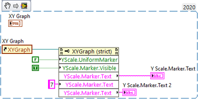
I am trying to make my own custom plot axis mapping to match some weibull plots which are neither linear nor logarithmic. I can manually add in markers at the points I need but I cant seem to be able to create them programmatically or change the text on them. I attached a vi snipit of what I am doing to try to change the text. As far as I can tell there is no way to programmatically add the custom markers. Please let me know if there is a way to add them and get a reference to them.
Thanks
-J
Have a pleasant day and be sure to learn Python for success and prosperity.
11-19-2021 02:15 PM - edited 11-19-2021 02:19 PM
- Mark as New
- Bookmark
- Subscribe
- Mute
- Subscribe to RSS Feed
- Permalink
- Report to a Moderator
Yes, your possibilities are limited. In the mean time feel free to vote for the following ideas:
Allow-text-labels-for-graph-scales
Thanks!
It would be a bit more work, but I would probably roll my own using a 2D picture indicator. 😄 (as an example, search your example finder for "XY Multi Plot.vi", see image below)
11-19-2021 03:11 PM
- Mark as New
- Bookmark
- Subscribe
- Mute
- Subscribe to RSS Feed
- Permalink
- Report to a Moderator
Thanks,
Those two ideas got another upvote each.
I like the 2D picture idea. I already have stock LabVIEW plots all through the application so I would have to roll a 2D picture indicator plot that approximates the look and functionality of the built in LV plots, which sounds like a time black hole. Lets see how that goes.
-J
Have a pleasant day and be sure to learn Python for success and prosperity.
11-19-2021 06:26 PM
- Mark as New
- Bookmark
- Subscribe
- Mute
- Subscribe to RSS Feed
- Permalink
- Report to a Moderator
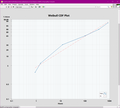
Well for now I made a solution involving, custom markers, text indicators and mapping functions that works as long as you dont resize it. Next step is to make the text fields track with a window resize.
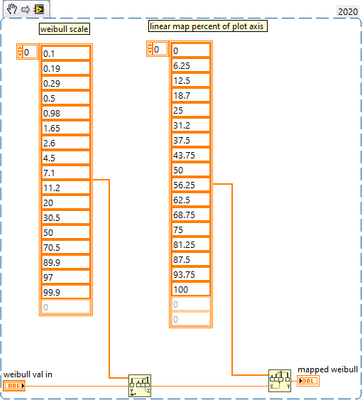
the mapping VI that maps the %failure ( the nonlinear scale) to the linear scale looks like this, in case any one else is trying to do this:
Have a pleasant day and be sure to learn Python for success and prosperity.
02-15-2022 06:53 AM
- Mark as New
- Bookmark
- Subscribe
- Mute
- Subscribe to RSS Feed
- Permalink
- Report to a Moderator
Hello,
could you please attach the VI with front panel above.
03-09-2022 05:39 PM
- Mark as New
- Bookmark
- Subscribe
- Mute
- Subscribe to RSS Feed
- Permalink
- Report to a Moderator
Sorry I have a client paying for this development so I can't post the source code for that here. On a side note you can re-create the VI with the snipit provided, then you can plot the result on a standard XY plot and then make your own scales and it will look suspiciously similar : )
Have a pleasant day and be sure to learn Python for success and prosperity.


