- Subscribe to RSS Feed
- Mark Topic as New
- Mark Topic as Read
- Float this Topic for Current User
- Bookmark
- Subscribe
- Mute
- Printer Friendly Page
Adding cycle count to a labview chart programatically
Solved!10-04-2019 05:37 AM
- Mark as New
- Bookmark
- Subscribe
- Mute
- Subscribe to RSS Feed
- Permalink
- Report to a Moderator
Hi Folks,
I’m in the process of designing a small test stand to evaluate wheelchair components under accelerated test conditions.
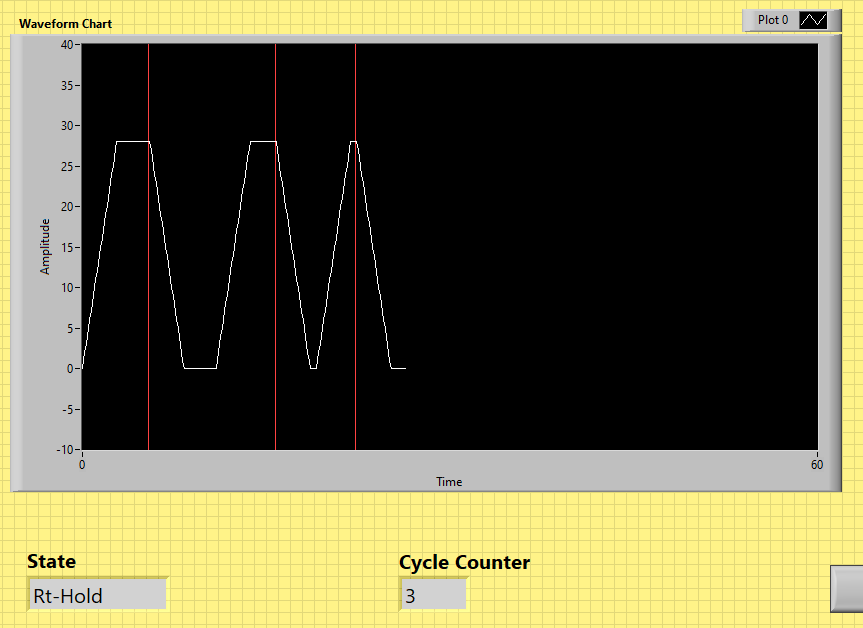
Often these tests run into the hundreds of thousands of cycles so to save post test processing time I take a front panel snapshot every n cycles (or if the unit fails).
The final report consists of a series of jpegs containing all the relevant information without the need to touch excel.
I would like to add the cycle numbers directly into the chart so I’m looking for a method to combine the cycle count with its corresponding peak on the graph and ideally have a procession of cycle numbers.
(Dummy example attached LV17)
Thanks in advance
Si
Solved! Go to Solution.
- Tags:
- Chart
- custom markers
10-04-2019 09:21 AM
- Mark as New
- Bookmark
- Subscribe
- Mute
- Subscribe to RSS Feed
- Permalink
- Report to a Moderator
Why not use the cycle count as your X axis in your chart instead of time?
=== Engineer Ambiguously ===
========================
10-04-2019 09:35 AM
- Mark as New
- Bookmark
- Subscribe
- Mute
- Subscribe to RSS Feed
- Permalink
- Report to a Moderator
Instead of trying to display the Cycle Count as part of your Waveform Chart, just take the Indicator and drag it on the Front Panel so that it "sits on top" of the Waveform Chart, for example, in the lower right part of the chart under the X Axis.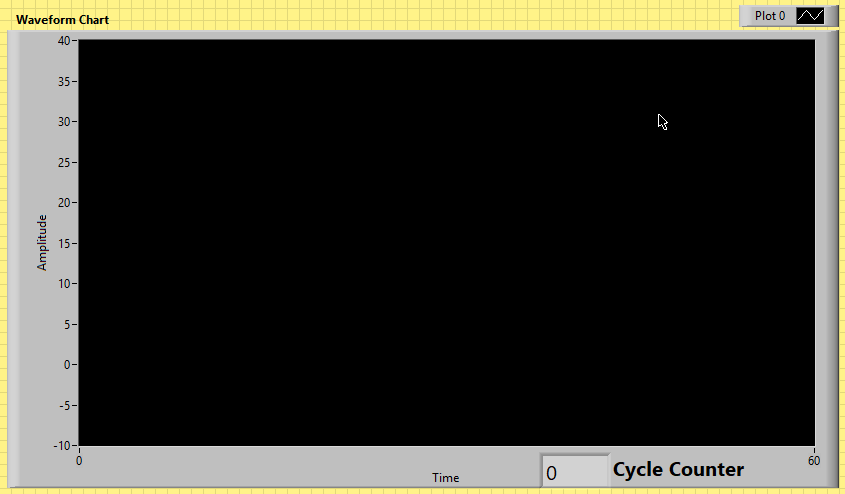
Bob Schor
10-04-2019 10:59 AM
- Mark as New
- Bookmark
- Subscribe
- Mute
- Subscribe to RSS Feed
- Permalink
- Report to a Moderator
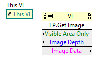
I have needed to do this before, and it'll probably save you some time in the long run to just make a "display" VI that has the plot, a cycle count indicator, test notes, test start time, whatever else you think you might need, then use a Front Panel.Get Image invoke node to get a screenshot of all of the front panel controls and indicators:
I would recommend making a subVI that does this instead of calling that on your main front panel, as you can make it look nicer if you're only using that VI to generate a picture to save. Do like Bob said and add some more indicators and such and you should be good to go.
Another way to do this would be to use a property node and change the label of the X axis (or the plot) to "Time (cycle 53)" or "Plot 0 (cycle 53)" or something.
10-04-2019 11:15 AM
- Mark as New
- Bookmark
- Subscribe
- Mute
- Subscribe to RSS Feed
- Permalink
- Report to a Moderator
It seems like a gigantic waste of disk space to save pictures, because they cannot really be read back by code for further analysis. Since your chart scale is not set to autoscale, you only see the last 60 points (of the 4000 stored in the history buffer). Why not just append three values (timestamp or iteration, chart value, count) to a plain text file whenever the chart value or count changes? You could even write a program to playback the file at any desired speed or create a detailed report.
10-07-2019 02:58 AM
- Mark as New
- Bookmark
- Subscribe
- Mute
- Subscribe to RSS Feed
- Permalink
- Report to a Moderator
Hi Bob,
I didn’t include it in my example because I thought it would confuse matters but I’ve been using the front panel grab idea where all the relevant data is captured which is similar to your suggestion. (which reassures me it’s an acceptable method)
Ideally, I would take the markers (which are basically time values) and get the graph to display the cycle instead of the time value. Just how to do that is my problem.
Regards
Si
10-07-2019 02:59 AM
- Mark as New
- Bookmark
- Subscribe
- Mute
- Subscribe to RSS Feed
- Permalink
- Report to a Moderator
Hi Bert,
I believe you posted this suggestion some time back and it has saved me some much work since. So a massive thankyou if it did come from you. I’ve not looked at the property node Idea but it’s worth pursuing. Especially if I can programmatically identify something like cycle 67 – 72 as the base. The fly in the ointment is variable cycle time will have an impact upon the calculation.
Regards
Si
10-07-2019 03:00 AM
- Mark as New
- Bookmark
- Subscribe
- Mute
- Subscribe to RSS Feed
- Permalink
- Report to a Moderator
Hi Altenbach
While if this was a research project I would agree with you this application is for production acceptance testing. This example was bases upon a linear actuator sub-assembly bought in from China.
As with all this type of work we have to check functionally and longevity of components, so I use a state machine where exceeding predetermined limits (i.e. excessive current, over temp, operating to slowly/fast) leads to an error state. I use a circular buffer to hold an hours’ worth of data which is written to disk on either an error or specified interval. I have been using BertMcMahan front screen grab for some time (I stole the idea from this forum ages ago so I guess it’s not the first time he proposed it).
99% of the time the units fly through, we have evidence of due diligence and nobody ever looks at the data. If it does fail then I have snapshots of data to analyse including the period leading up to failure.
It works quite well I just want to spruce up how I present the data.
Regards
Si
10-08-2019 12:09 PM
- Mark as New
- Bookmark
- Subscribe
- Mute
- Subscribe to RSS Feed
- Permalink
- Report to a Moderator
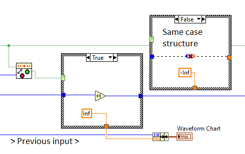
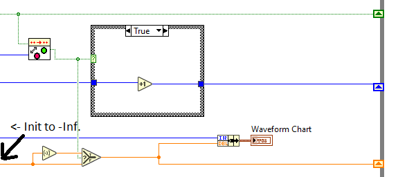
By adding the following (and updating the initial History write):
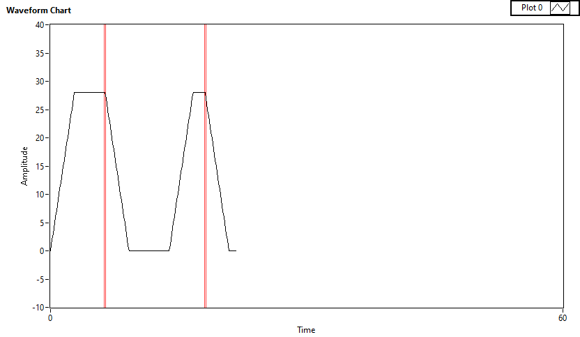
I was able to add vertical lines, like so:
which helps highlight the location of the changes to the "Cycle Count" counter. I haven't found a way to label them as they move though...
Perhaps this helps at least by showing the position of the current value as the rightmost line? (here, cycle count = 2).
10-08-2019 12:16 PM
- Mark as New
- Bookmark
- Subscribe
- Mute
- Subscribe to RSS Feed
- Permalink
- Report to a Moderator
Actually, following some reconsideration, probably the following is better:
Here I added a shift register for the 2nd plot value and just flip the sign when the increment is true. This produces only a single line each time (instead of the double-line that was in the previous post):
