characteristic diagram
I am using DiAdem 12.0 while try to plot some 3D contour data in report. (water fall data, time, frequency and spectrums)
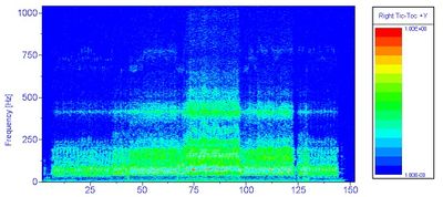
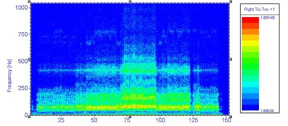
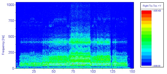
With the same setup, some of my data will plot correct characteristic diagram (faster), with the z-axis data shown in colors from blue to red. For several sets of data, the plot started correctly with the right color, but will hesitate a little at the end of plot, then over the red (high values) with blue/cyon color. The data sets are all similar to one another. I tried change some plot settings but nothing worked. If I switch to surface plot, the colors will show correctly,
Could someone help me to explain/solve this issue?
I have noticed that if I delete the last channel from the 3D data group, the overall plot will be basically fine. All my six set of data all have the same number of channels, but there would be only one or two groups whould have the problem. Copy the data group will copy the problem.
re-upload with "larger" image of the wrong colored characteristic diagram. I first put all full zide imaes together, but it would not show.
Hi ULIHZ,
It looks like the difference between the correct and incorrect plots is that the correct plot has a high intensity line at about 60 Hz-- is that the change you want to see, or is it more complicated than that?
Are you plotting triplet data or matrix data? If matrix data, how did the data get into that format? Did you load it that way or run an ANALYSIS calculation to get it into that format?
Any chance you could post or email a data set?
Brad Turpin
DIAdem Product Support Engineer
National Instruments
brad.turpin@ni.com
The difference is all the yellow colors change to cyon at the end of plot.
The data I got was from a script using:
Call SUDDlgShow("Main", ResourceDrv & "AnaChnOrdAFCalc")
The result was a channel group with frequency, time, and many FFT files at different "RPM". I got the "RPM" using a copy of time channel,
In the report, I was just drag the channel group to make the 3D plot (the programe would not let me type in or chose the "z" axis channels.
I will make a test case and email to you.
Thanks!
Hi All,
For anyone else with a similar symptom, try turning off isoline display-- the isolines get drawn last after the surface and can obscure it if your mesh density is very high.
Brad Turpin
DIAdem Product Support Engineer
National Instruments
 the wrong color plot as characteristic diagram


