- Subscribe to RSS Feed
- Mark Topic as New
- Mark Topic as Read
- Float this Topic for Current User
- Bookmark
- Subscribe
- Mute
- Printer Friendly Page
Overlay plots as intensity graph
04-28-2005 09:54 PM - last edited on 09-05-2018 05:18 PM by Kristi_Martinez
- Mark as New
- Bookmark
- Subscribe
- Mute
- Subscribe to RSS Feed
- Permalink
- Report to a Moderator
Community Admin Note: The article link has been removed due to invalid information.
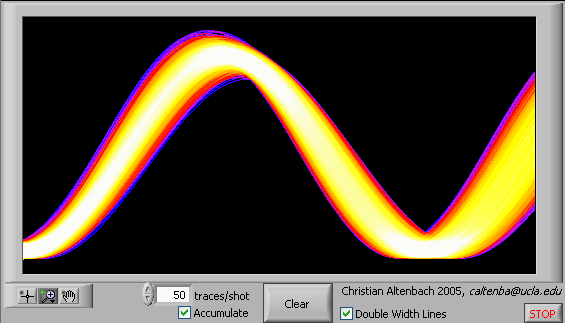
The article above has a picture at the very end of an intensity plot where the data is mostly similiar but somewhat different, where differences are represented as lower intensity traces based on the frequency of their occurence.
I am looking for the easiest way to duplicate this effect in LabVIEW... overlay multiple data plots on an intensity graph/plot/whatever.
I have experimented with intensity graphs and had very little success making them work in this regard. The largest success I had was mapping each plot to a size-limited array and then incrementing each pixel in that array by 1 if the incoming waveform indexed it. It didn't look much like a plot though because it was highly pixelized (# of pixels is based on the size of the array for the intensity plot) and there were no lines connecting the pixels. It did reduplicate the basic shape of the waveform though, was very slow, and showed higher intensities where there was little variation (low noise areas) from run to run.
I have also experimented with other plots to overlay a bunch of data so that even if it wasn't an intensity plot you could still see out of character behavior. What I would really like to do however is something similiar to the picture in the article above.
Does anyone know of any suggestions or examples out there on overlaying multiple sets of data in a way where the resulting plot is not just visible or not-visible if one of the multiple plots has crossed it, but has an actual intensity based on how many plots cross it?
04-29-2005 03:48 AM
- Mark as New
- Bookmark
- Subscribe
- Mute
- Subscribe to RSS Feed
- Permalink
- Report to a Moderator
The attached quick example (LabVIEW 7.1) should get you started. (There are still a few edge effects to take care of, but nothing major.) Letme know if anything is not clear.
Alternatively, you could also display it using a picture indicator.
04-29-2005 06:38 AM
- Mark as New
- Bookmark
- Subscribe
- Mute
- Subscribe to RSS Feed
- Permalink
- Report to a Moderator
04-30-2005 06:52 PM
- Mark as New
- Bookmark
- Subscribe
- Mute
- Subscribe to RSS Feed
- Permalink
- Report to a Moderator
The attached demo (LabVIEW 7.0) allows changing of some parameters, including the linewidth (1 or 2). Enjoy! 🙂
01-06-2007 12:00 PM - edited 01-06-2007 12:00 PM
- Mark as New
- Bookmark
- Subscribe
- Mute
- Subscribe to RSS Feed
- Permalink
- Report to a Moderator
Message Edited by altenbach on 01-06-2007 10:00 AM
06-01-2012 09:45 AM
- Mark as New
- Bookmark
- Subscribe
- Mute
- Subscribe to RSS Feed
- Permalink
- Report to a Moderator
This was reported to R&D (CAR # 49058) for further investigation.
