- Subscribe to RSS Feed
- Mark Topic as New
- Mark Topic as Read
- Float this Topic for Current User
- Bookmark
- Subscribe
- Mute
- Printer Friendly Page
x, y data versus curve fit of data
01-22-2015 10:39 PM
- Mark as New
- Bookmark
- Subscribe
- Mute
- Subscribe to RSS Feed
- Permalink
- Report to a Moderator
I was wondering if I have an X versus Y chart and that data looked like a blob of data points in a linear or possibly polynomial type line if there is a way to generate the curve fit line and then compare the data points to that curve fit line.
So, really what it boils down to is I'm trying to get rid out outlying data points and doing it by a standard deviation of the x axis or the y axis individually doesn't work. That is why it really has to be compared to the curve fit instead and lets say if it is greater than a certain distance away from the curve fit it would be thrown away, or at least not plotted.
Hopefully that makes sense.
Thanks,
Eric.
01-23-2015 01:41 AM - edited 01-23-2015 01:43 AM
- Mark as New
- Bookmark
- Subscribe
- Mute
- Subscribe to RSS Feed
- Permalink
- Report to a Moderator
Hi Eric,
LabVIEW has several fitting functions in the math palette. Please select the one that fits most. (pun…)
X versus Y chart
What is this? I only know of XY graphs - and graphs are different to charts…
if it is greater than a certain distance away from the curve fit
You know how to calculate a "distance"? Atleast Pythagoras did know about that more than 2000 years ago… 😉
01-23-2015 02:40 AM
- Mark as New
- Bookmark
- Subscribe
- Mute
- Subscribe to RSS Feed
- Permalink
- Report to a Moderator
May be the SavitzkyGolay filter will do what you want:
vi.lib\Analysis\3filter.llb\Savitzky-Golay Filter (DBL).vi
01-23-2015 06:33 AM - edited 01-23-2015 06:33 AM
- Mark as New
- Bookmark
- Subscribe
- Mute
- Subscribe to RSS Feed
- Permalink
- Report to a Moderator
hi erfigge,
I'm not sure what you're looking for, but it sounds like somekind of boundary problem.
Do you have those boundaries already or are you looking for a way to calculate such boundaries?
In terms of the second:
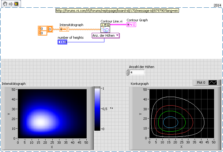
Since LabView 2012 or 2011 there's the built-in contourline.vi
The output of this vi is a topographic map
Regards,
Alex
01-24-2015 10:47 PM - edited 01-24-2015 10:48 PM
- Mark as New
- Bookmark
- Subscribe
- Mute
- Subscribe to RSS Feed
- Permalink
- Report to a Moderator
Ok, so graph is probably more proper.......
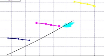
At any rate my graph looks like the one attached. The points I have would be the light blue ones except normally there are a lot more of those along the black line. The example I thought of was if I could calculate the curve fit which would be the black line and then throw out the points that are outside of a certain distance away from that line. A method to get rid of outlying points.
Alex, your idea of the contour plots is interesting but I'm not for sure exactly how I could wrap that around my data points. And then could I easily throw out things outside of a certain contour?
01-25-2015 11:10 AM
- Mark as New
- Bookmark
- Subscribe
- Mute
- Subscribe to RSS Feed
- Permalink
- Report to a Moderator
erfigge wrote: The points I have would be the light blue ones except normally there are a lot more of those along the black line. The example I thought of was if I could calculate the curve fit which would be the black line and then throw out the points that are outside of a certain distance away from that line. A method to get rid of outlying points.
looks like you want to perform a linear curve fit based on selected ■ ■ ■ points, and then calculate a distance for ■ points with respect to this linear border?
↑ Y
X →
this sounds straight forward, show us what you've got so far!
01-25-2015 03:00 PM
- Mark as New
- Bookmark
- Subscribe
- Mute
- Subscribe to RSS Feed
- Permalink
- Report to a Moderator
At any rate my graph looks like the one attached. The points I have would be the light blue ones except normally there are a lot more of those along the black line. The example I thought of was if I could calculate the curve fit which would be the black line and then throw out the points that are outside of a certain distance away from that line. A method to get rid of outlying points.
Alex, your idea of the contour plots is interesting but I'm not for sure exactly how I could wrap that around my data points. And then could I easily throw out things outside of a certain contour?
I'm a little confused by your plot. I see three sets of points, and a small light-blue "blob" which might be hundreds of tiny points. I also see a black line that goes through the "blue blob", but doesn't seem to be related to the three sets of points.
Are the three sets of points irrelevant? Are you trying to fit a straight line through the blue blob? How are the points acquired?
When fitting functions to data, the data are often obtained from several (say, 4) measurements made at some "known" setting (X), resulting in measured values (Y). Your three sets of points look like they might be this sort of measurements -- the X values might be set by the experimenter (stimulus frequency, for example) and the Y values averages of several measurements. Note that this is the "usual case" assumption for most curve-fitting routines. What they minimize is not the distance of the measured values from the best-fit line (this would be the length of the perpendicular from each data point to the line), but the distance in the Y direction from the line. Indeed, "Least Squares" means you minimize (Y(i) - Y(X(i))**2, where Y(i) is the measured Y value, X(i) is the X value at which Y(i) was obtained, and Y(X) is the predicted value of Y given X (if you are fitting a straight line having slope m and y intercept b, Y(X(i) = mX(i) + b).
I apologize if this seems overly pedantic or downright insulting -- that wasn't my intent. I just don't want you to go off chasing Wild Geese ...
Bob Schor
01-25-2015 03:01 PM
- Mark as New
- Bookmark
- Subscribe
- Mute
- Subscribe to RSS Feed
- Permalink
- Report to a Moderator
Oops -- I meant to only include your original graph -- disregard the text above the Quote line ...
BS
01-25-2015 09:11 PM
- Mark as New
- Bookmark
- Subscribe
- Mute
- Subscribe to RSS Feed
- Permalink
- Report to a Moderator
Bob, thanks for asking detailed questions, it is hard to know how much detail to put in without drowning something in the mud.
So, to explain the process we are taking readings from about 30 different instruments over the course of 5 minutes. We average those numbers and get one averaged value for each of those instruments for the 5 minute point. We repeat that 24/7 for months, even years depending on the installation.
Our sbRio does the acquisition and a DB application ftp's the data off the Rio. Then we have a vb.net program that uses measurement studio display the data. The light blue blob of points is all that we are worried about, the rest of the lines and points are just extra data that happened to be in the picture I grabbed. This graph is not an instrument over time, it is a true x vs y. So for example the x axis is instrument 1 and the y axis would be instrument 2 and the light blue points are those values from beginning to end of the data set. This was a lot harder than I thought it would be to explain so hopefully that makes sense.
Doing a standard deviation of a single instrument is easy, lets say in this case instrument 1. But what happens when you do that is you end up with a vertical stripe of data since you are not taking the value of instrument 2 into account. However, even if you did, really what we are after is more along the lines of trying to remove outliers from the blob. The blob (group of light blue points) could have a polynomial or linear shape, it depends on what we are looking at. Either way in my head I keep coming back to the fact we are probably trying to do something like draw a curve fit line like the black one (this part is easy) and then doing some kind of measurement of the point to the line and kick the points the farthest away off.
The reason I was posting here was because I was hoping there was some kind of magical vi in a toolkit somewhere that would do pretty much was I was talking about. However, this sort of thing probably isn't as common as I thought it might be.
Did I clear anything up with this explanation? I'm not looking for anyone to build anything for me or anything like that, I'm just trying to get pointed in the right direction.
As was pointed out there are loads of curve fitting vi's which is the easy part, but I'm not for sure where to head from there and what VI's would be the best, and even if my thoughts are really the right way to accomplish what we are trying to do.
Thanks for your help.
Eric.
01-26-2015 12:12 AM - edited 01-26-2015 12:13 AM
- Mark as New
- Bookmark
- Subscribe
- Mute
- Subscribe to RSS Feed
- Permalink
- Report to a Moderator
As I understand it, curve fitting requires some kind of value dependence, meaning that you have a set of data points y which depend on a set of values of another variable x - so you get pairs of (x,y), where x is the independent and y is the dependent value. In your case things seem different because there is no dependency of the values of one instrument to the values of the other instrument. There could be a whole bunch of functions you could fit through the value pairs, depending on the order in which you go through them. Sounds a bit like drawing according to numbers - depending on where you start and where you put the next numbers the figure you'll get in the end will look quite different from any other way of distributing the numbers.
Therefore I think "fitting" is out of the running here, as your dependency is missing. How about interpreting the x,y-pairs as a point mass each, all with the same mass. Then calculate the combined center of mass taking all points into account. Then you have something like the mean value pair of (x,y). After that it should be easy to compute the distance of any point towards this center of mass.
Hoping not to have taken things off the board completely...


