- Subscribe to RSS Feed
- Mark Topic as New
- Mark Topic as Read
- Float this Topic for Current User
- Bookmark
- Subscribe
- Mute
- Printer Friendly Page
Visualizing sine wave on cRIO RT and FPGA
01-15-2021 01:43 PM
- Mark as New
- Bookmark
- Subscribe
- Mute
- Subscribe to RSS Feed
- Permalink
- Report to a Moderator
Hi everyone,
I have written a LabView FPGA code simply to read input from NI 9223 (I am using cRIO 9082):
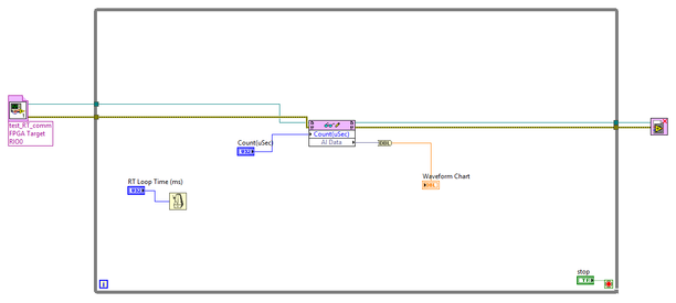
To visualize the analog waveform, I have written a LabView RT code to get the data from FPGA code and display in Waveform Chart:
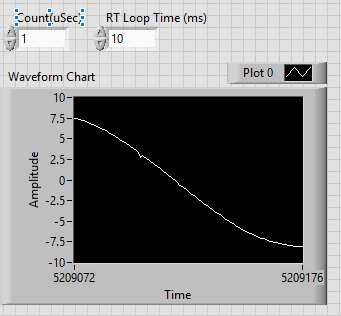
I connected NI 9223 to a function generator which generated a sine wave of 100 Hz (= 10 ms). When I set the FPGA loop time to 1 us, and RT loop time to 10 ms, the display waveform is as follows:
The amplitude is correct, but the period does not make too much sense to me, as why half waveform is displayed for 104 sample steps?
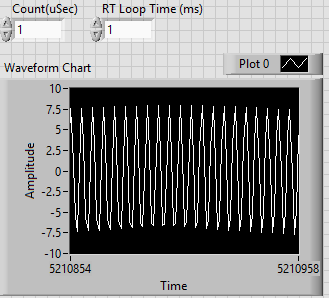
With the same function generator input, when I change the RT loop time to 1 ms, the waveform amplitude is not even correct:
It looks like to have an outer envelope, which is weird.
Can anyone help me to see what is going on?
Also, since the loop time of RT is ms, does this mean that Waveform Chart can never properly display any waveforms above 1 kHz?
Thank you.
01-15-2021 10:38 PM
- Mark as New
- Bookmark
- Subscribe
- Mute
- Subscribe to RSS Feed
- Permalink
- Report to a Moderator
Sigh. Did you learn about acquiring signals? Does the term "aliasing" mean anything to you? How about "Nyquist Frequency"?
If you are updating a display with a single point on a time scale on the order of milliseconds, you absolutely cannot display any frequency information in your signal in the kHz range. There's nothing to stop you from sampling (and returning) 1000 points at a time, sampled at 1 MHz, every millisecond, however ...
In the future, please don't post "pictures" of your LabVIEW code. We can't see the values held in the Controls and Indicators. We cannot "inspect" your code, we cannot try to run your code, and if it is at all complex, it is so much easier to read/see/understand when we can directly manipulate it with LabVIEW.
Bob Schor
01-16-2021 03:51 PM
- Mark as New
- Bookmark
- Subscribe
- Mute
- Subscribe to RSS Feed
- Permalink
- Report to a Moderator
Dear Mr. Shor,
Thank you for your prompt reply.
Yes, my bet was that this was caused by sampling speed near or below the signal frequency. However, since I am new to cRIO and LabView, I just want to see whether there are other additional causes due to my misunderstanding of Waveform Chart.
I am wondering is there any way in LabView to display signals with frequency in or greater kHz range? As you said, I can still sample at 1 MHz even though the RT loops in ms. Would Waveform Graph or any other technique work?
For sure, I will keep your suggestion in mind. I posted pictures since the majority of posts in this forum I read posted pictures for discussions. I apologize for any inconvenience.
Thank you and I look forward to your reply.
01-16-2021 04:18 PM
- Mark as New
- Bookmark
- Subscribe
- Mute
- Subscribe to RSS Feed
- Permalink
- Report to a Moderator
Justin,
Some suggestions and comments:
- Who is "Mr. Shor"? Did I mis-type my signature?
- When you say "display signals in kHz range", what is it that you want to see? Do you want a "dynamic" display that changes much faster than your eye (and brain) can possibly process, or a "static snapshot" of, say, a few milliseconds of the Waveform?
- The main difference between a Chart and a Graph is that the Chart is designed for "sampled" data, where "time" is an implicit variable and the "X axis" represents samples equally spaced in time. A Graph, on the other hand, allows you to independently vary X and Y. You can (and sometime I do) plot time-varying data on a Graph, but then you need to handle the "time" variable yourself, whereas LabVIEW's Chart objects take care of that detail for you. Of course, the data will (try to) plot as fast as you deliver it to a Chart ...
- Which, of course, is another way to "slow down" a plot so you can visualize it. Take 1 second of data at 1 MHz, save it in a million-element array, and then "play it back" to a Waveform Chart at the rate of 50 points/second. It will take you 20,000 seconds (almost 14 hours) to see all the data, but you can at least see more than just a blur of lines on the screen.
Bob Schor
01-16-2021 04:33 PM
- Mark as New
- Bookmark
- Subscribe
- Mute
- Subscribe to RSS Feed
- Permalink
- Report to a Moderator
Hi Mr. Schor,
I apologize for mis-typing your name, and thank you again for your prompt reply.
By "display signals in kHz range", I mean a "static snapshot" of a few cycles of the waveform, as you said.
Thank you for your suggestions - they are very informative.
01-17-2021 09:21 AM
- Mark as New
- Bookmark
- Subscribe
- Mute
- Subscribe to RSS Feed
- Permalink
- Report to a Moderator
@Bob_Schor wrote:
- The main difference between a Chart and a Graph is that the Chart is designed for "sampled" data, where "time" is an implicit variable and the "X axis" represents samples equally spaced in time. A Graph, on the other hand, allows you to independently vary X and Y. You can (and sometime I do) plot time-varying data on a Graph, but then you need to handle the "time" variable yourself, whereas LabVIEW's Chart objects take care of that detail for you. Of course, the data will (try to) plot as fast as you deliver it to a Chart ...
Let me correct Bob's definition here. of these LabVIEW terms.
- A chart is visual object that maintains a history of the past data in a the background and you only need to add the new data when it comes in.
- A graph is a visual object that does not maintain a history. If you want the new data and old data, you store that history yourself in a shift register and rewrite it to the graph every iteration.
- A waveform graph or waveform chart are the entities that use evenly sampled data, usually time, but could be other things on the X axis.
- An XY graph is the entity that handles varied X and Y values, and you can even repeat or loop back to other X values. Nothing has to be evenly spaced. All data needs to be written whenever you want to display new data.
- An XY chart doesn't really exist in LabVIEW. That would be varied X and Y values and also a history. But you can work around that by maintaining your own XY history in a shift register. Also, if you go to the front panel and drop down an "Ex XY Graph", LabVIEW will drop down an XY graph along with an Express VI that will do the work for you of keeping that X, Y history.
01-17-2021 09:28 AM
- Mark as New
- Bookmark
- Subscribe
- Mute
- Subscribe to RSS Feed
- Permalink
- Report to a Moderator
Thanks, RavensFan -- you deserve the Kudo (Go, Stillers!). I was a little sloppy with the details ...
Bob Schor
01-18-2021 10:59 PM
- Mark as New
- Bookmark
- Subscribe
- Mute
- Subscribe to RSS Feed
- Permalink
- Report to a Moderator
Dear RavensFan,
Thank you so much for further clarification. Upon reading your reply in detail, I have got two additional questions.
You stated that a graph does not maintain history. So to display a snapshot of a waveform that is faster than the RT looptime, what I need to do is to store every sampled reading from FPGA in an array, and then return and write the array to a graph at every RT loop iteration, is this the right way? Is there a better way?
I am a little confused about what you call "varied X values". Let's say that X axis is time. Then isn't X value already varying since we are displaying a waveform that spans between two time stamps?
01-19-2021 08:20 AM
- Mark as New
- Bookmark
- Subscribe
- Mute
- Subscribe to RSS Feed
- Permalink
- Report to a Moderator
You seem to be dealing with sampled data, that is, the "X" values are all evenly spaced, so you only need to know the first X value (call it "t0"), the spacing between the X values (call it "dt"), and the array of Y values (call this "Y"). Put these all into a Cluster and you have what LabVIEW calls a "Waveform" (as in "Waveform Chart" or "Waveform Graph").
So now we come to your question about displaying a snapshot of a waveform. The key word here is "snapshot" -- if the data are changing rapidly, your brain and eye cannot process the data except as a blur.
So back to Charts and Graphs -- given "Waveform" data, either a true Waveform (cluster) or simply a 1D Array of values sampled at a fixed frequency, it is often simpler to display it as a Chart (since you only need to present the Y data to see the curve, whereas to make a Graph, you'd need to create an X array with equally-spaced values for every Y element). Charts are the usual way many of us choose to display sampled data, and is (probably) the simplest way to get started.
Bob Schor
01-19-2021 08:22 AM - edited 01-19-2021 08:23 AM
- Mark as New
- Bookmark
- Subscribe
- Mute
- Subscribe to RSS Feed
- Permalink
- Report to a Moderator
@JustinZZJ wrote:
Dear RavensFan,
Thank you so much for further clarification. Upon reading your reply in detail, I have got two additional questions.
You stated that a graph does not maintain history. So to display a snapshot of a waveform that is faster than the RT looptime, what I need to do is to store every sampled reading from FPGA in an array, and then return and write the array to a graph at every RT loop iteration, is this the right way? Is there a better way?
Correct. That is the only way. Note that you will want to have a method that removes older data from the array in the shift register so you don't have the array growing indefinitely.
I am a little confused about what you call "varied X values". Let's say that X axis is time. Then isn't X value already varying since we are displaying a waveform that spans between two time stamps?
Really varied intervals between X values. If the X values are evenly spaced whether it is every second, 10 seconds, 12 inches, 10 liters, ... whatever the units, then you can use a waveform chart or graph. If the interval varies, where the values could be seconds apart one time, minutes apart another, or some distances like 0, 1, 8, 24, 156 inches, they are not evenly spaced so you can't use a waveform chart or graph. You'd have to use an XY graph.


