- Subscribe to RSS Feed
- Mark Topic as New
- Mark Topic as Read
- Float this Topic for Current User
- Bookmark
- Subscribe
- Mute
- Printer Friendly Page
Probability plot - question
11-16-2017 11:32 AM - edited 11-16-2017 11:33 AM
- Mark as New
- Bookmark
- Subscribe
- Mute
- Subscribe to RSS Feed
- Permalink
- Report to a Moderator
Hi,
I'm trying to generate probability plot for 2 sets of data, but I don't like output that I got.
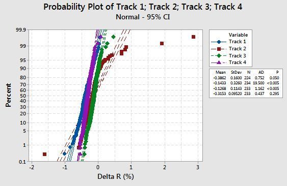
This is graph that is generated in Minitab, and that's how I would like to look like
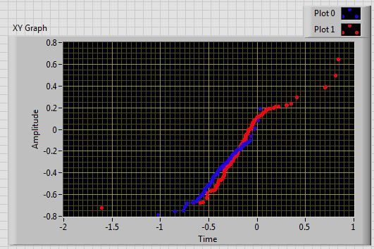
And this is what I get in LV
As it can be seen, problem is in Y axis, Minitab has this nice not sure what is a name but like double logarithmic scale, expanded scale on bottom and top of X-axis.
On VI XY scatterplot I can only get typical Logarithmic scale but this does not look
even close to visualisation that I would like to get.
11-16-2017 12:49 PM
- Mark as New
- Bookmark
- Subscribe
- Mute
- Subscribe to RSS Feed
- Permalink
- Report to a Moderator
LabVIEW does not allow custom axis mappings (this would help, for example).
Of course you could do it all in a picture control and some custom code. 😄
11-16-2017 01:01 PM
- Mark as New
- Bookmark
- Subscribe
- Mute
- Subscribe to RSS Feed
- Permalink
- Report to a Moderator
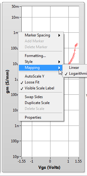
At the very least you can set you Y-axis as Log. Right click on a value in teh y-axis and select "Mapping/Logarthmic", see image below.
To get that exact scale you might need to look outside the standard LabVIEW plots. Try looking at the Advance Plotting Toolkit - http://advancedplotting.github.io/
11-16-2017 01:20 PM
- Mark as New
- Bookmark
- Subscribe
- Mute
- Subscribe to RSS Feed
- Permalink
- Report to a Moderator
The scale has very little to do with logarithmic, Note that in the upper half things are reversed and the spacings get wider again.
11-16-2017 02:52 PM
- Mark as New
- Bookmark
- Subscribe
- Mute
- Subscribe to RSS Feed
- Permalink
- Report to a Moderator
Minitab is a statistics software, so maybe the Y axis is a bell curve on its side, with a custom scale to straighten out the curve?
(Mid-Level minion.)
My support system ensures that I don't look totally incompetent.
Proud to say that I've progressed beyond knowing just enough to be dangerous. I now know enough to know that I have no clue about anything at all.
Humble author of the CLAD Nugget.
11-16-2017 04:42 PM
- Mark as New
- Bookmark
- Subscribe
- Mute
- Subscribe to RSS Feed
- Permalink
- Report to a Moderator
Yep, that's why I called it double logarithmic, because I don't know correct name. But Y scale upper half is inverted of bottom half.
11-17-2017 09:22 AM
- Mark as New
- Bookmark
- Subscribe
- Mute
- Subscribe to RSS Feed
- Permalink
- Report to a Moderator
@altenbach wrote:
The scale has very little to do with logarithmic, Note that in the upper half things are reversed and the spacings get wider again.
altenbach - True and obvious now that I look at this on a PC (I shouldn't squint at pictures on my phone!) And I hope your suggestion for scales gets implemented!
I don't see this feature in the APT either. But you can do it with matplotlib (upon which APT is built). This explains how the scales are generated - http://matplotlib.org/mpl-probscale/tutorial/closer_look_at_viz.html
11-17-2017 09:35 AM
- Mark as New
- Bookmark
- Subscribe
- Mute
- Subscribe to RSS Feed
- Permalink
- Report to a Moderator
That's pretty interesting stuff, actually - and I'm not even a statistician! I can't think of a way to do this - but it might be a good idea for the Idea Exchange.
(Mid-Level minion.)
My support system ensures that I don't look totally incompetent.
Proud to say that I've progressed beyond knowing just enough to be dangerous. I now know enough to know that I have no clue about anything at all.
Humble author of the CLAD Nugget.
11-17-2017 02:14 PM
- Mark as New
- Bookmark
- Subscribe
- Mute
- Subscribe to RSS Feed
- Permalink
- Report to a Moderator
@billko wrote:
Minitab is a statistics software, so maybe the Y axis is a bell curve on its side, with a custom scale to straighten out the curve?
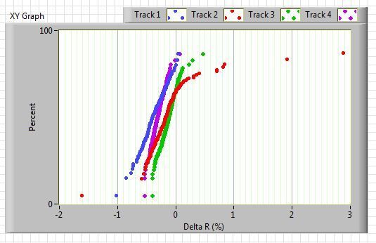
Thanks for advise, at the end I do it in that way, and now result is very similar to Minitab graph, example with 4 data sets at the end.
In previous tests I used Gauss White noisy to generate distribution for Y graph (as i seen on several examples in internet), and there were 2 problems.
First one is that this is normal distribution which does not fit for me since I want this double logarithmic thing on Y scale or whatever name is.
Second is that this generator creates distribution pretty far away from ideal normal distribution, it generates some pseudo random pattern which is maybe good to simulate some realistic situation but when I check histogram of of that generated samples, distribution is pretty deformed from typical ideal Gauss shape, with some spikes, which at the end resulted with additional weird deformation on my X-Y plot.
So at the end for Y graph I used template which I generated with help of Minitab/Excel after some time of playing I produce template of 1000 samples which I stored in LV in a form of one array (Y graph template).
Since that I have for X scale input up to 4 data sets (Track 1 / 2 / 3 / 4), and each of this data sets have not specified sample size, it can be for instance in range 100 - 1000 per track, for each X data set I generate Y scale pair of same sample size.
While I generate Y pair data set, I use mentioned Y graph template.
For instance, template has fixed 1000 samples, and my specific X data set (Track) has 300 samples, I generate 300 samples using "interpolate 1D array" and excavate data from template to generate my desired 300 samples.
Only I had to turn off Y-scale scale ticks since it is displayed as linear and only confuse.
Pictures of final result below
11-17-2017 04:53 PM
- Mark as New
- Bookmark
- Subscribe
- Mute
- Subscribe to RSS Feed
- Permalink
- Report to a Moderator
Don't forget to mark your OWN post as the solution, since it was you who figured out how to satisfactorily display the data! 🙂
(Mid-Level minion.)
My support system ensures that I don't look totally incompetent.
Proud to say that I've progressed beyond knowing just enough to be dangerous. I now know enough to know that I have no clue about anything at all.
Humble author of the CLAD Nugget.


