- Subscribe to RSS Feed
- Mark Topic as New
- Mark Topic as Read
- Float this Topic for Current User
- Bookmark
- Subscribe
- Mute
- Printer Friendly Page
Overlay chart with different Y scales
06-13-2008 10:09 AM
- Mark as New
- Bookmark
- Subscribe
- Mute
- Subscribe to RSS Feed
- Permalink
- Report to a Moderator
06-13-2008 02:03 PM - edited 06-13-2008 02:03 PM
- Mark as New
- Bookmark
- Subscribe
- Mute
- Subscribe to RSS Feed
- Permalink
- Report to a Moderator

Message Edited by JeffOverton on 06-13-2008 03:03 PM
06-13-2008 02:39 PM
- Mark as New
- Bookmark
- Subscribe
- Mute
- Subscribe to RSS Feed
- Permalink
- Report to a Moderator
i can´t open your vi at the moment, but it sounds like you use the array to cluster function. If so, change the cluster size.
Hope it helps.
Mike
06-13-2008 02:47 PM
- Mark as New
- Bookmark
- Subscribe
- Mute
- Subscribe to RSS Feed
- Permalink
- Report to a Moderator
06-16-2008 07:37 PM - edited 06-16-2008 07:39 PM
- Mark as New
- Bookmark
- Subscribe
- Mute
- Subscribe to RSS Feed
- Permalink
- Report to a Moderator
I took a look at your VI, and got some surprising results.
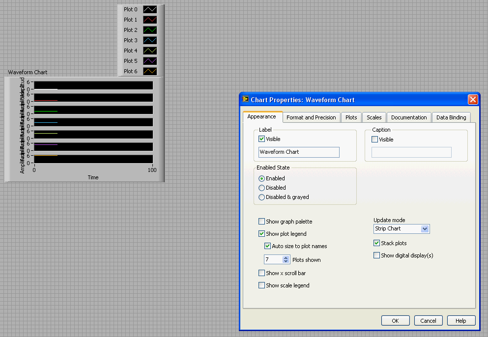
When I first opened it in either LabVIEW 8.2 or 8.5.1, I was able to observe the blank charts when run. However, when I modified the properties page, the problem disappeared. I could either deselect stack plots, and then reselect them, or I could reduce plots shown to 5, and then increase them back to 7.
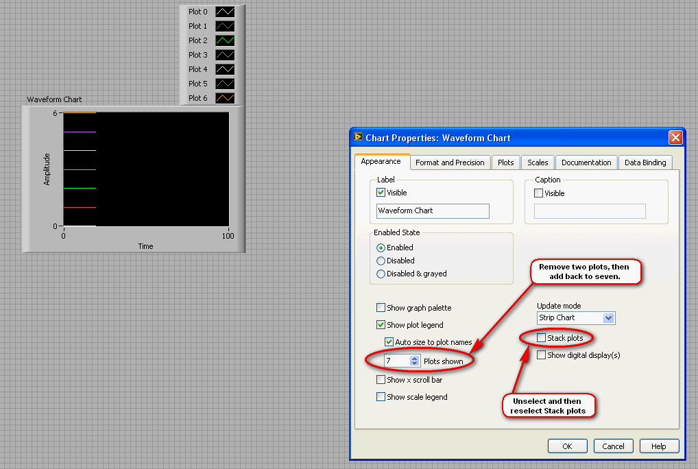
In either case, when the properties were restored to the state you had them in originally, the problem was gone.
This led me to believe this was a bug, and so I tried to independently reproduce it. However, I have be absolutely unable to reproduce this behavior in either 8.2 or 8.5.1. No mater when or how I set the properties, the plots correctly display in their respective space. The empty plots are never seen.
I may not be correctly replicating some sort of setting on your machine, but at the moment, I cant confirm a bug nor offer anything except the above procedure as a solution. If there is any other information you can provide, it might help.
Message Edited by Captain Kirby on 06-16-2008 07:39 PM
CompactRIO Product Marketing Manager
________________
Sail Fast!
06-17-2008 07:33 AM
- Mark as New
- Bookmark
- Subscribe
- Mute
- Subscribe to RSS Feed
- Permalink
- Report to a Moderator
06-18-2008 07:41 PM - edited 06-18-2008 07:44 PM
- Mark as New
- Bookmark
- Subscribe
- Mute
- Subscribe to RSS Feed
- Permalink
- Report to a Moderator
I'm sorry I misunderstood your question, and I may still be confused, so please don't hesitate to correct me (you certainly wouldn't be the first.)
Are you looking for something like this?

In this chart, I have only five y scales, but have arbitrarily assigned the remaining plots to other y scales. This eliminates the two empty charts, and still has the remaining plots assigned to other scales. I did this by reducing the number of plots shown to five, and then changing the Y scale for plots five and six as depicted below.

Now, I may have this wrong again, so please clarify if I'm still out in left field.
Message Edited by Captain Kirby on 06-18-2008 07:44 PM
CompactRIO Product Marketing Manager
________________
Sail Fast!
06-19-2008 07:07 AM
- Mark as New
- Bookmark
- Subscribe
- Mute
- Subscribe to RSS Feed
- Permalink
- Report to a Moderator
06-20-2008 01:37 PM - edited 06-20-2008 01:41 PM
- Mark as New
- Bookmark
- Subscribe
- Mute
- Subscribe to RSS Feed
- Permalink
- Report to a Moderator
In your new example VI, you use a cluster to store the six numeric arrays. Because of this, the cluster defines the number of plots shown on the chart regardless of the value chosen in the properties. If you switch to just using a 2D array, you can reduce the number of plots shown, and then reassign the y axis of the remaining plots to one of the showing plots. That's how I achieved the result in my last post. The only way to change the number of plots shown when using a cluster as an input to the chart is to change the elements in the cluster, which would of course reduce the number of numeric arrays given to the chart.
So in order to achieve the result you want, I think your limited to just using a 2D array into the chart. And when I used this input method, I still had to be careful of the order I changed properties in. First you have to stack the plots, then reduce the number of plots shown, and finally, you can reassign the remaining plots to showing y-axes.
Message Edited by Captain Kirby on 06-20-2008 01:41 PM
CompactRIO Product Marketing Manager
________________
Sail Fast!
06-20-2008 01:44 PM
- Mark as New
- Bookmark
- Subscribe
- Mute
- Subscribe to RSS Feed
- Permalink
- Report to a Moderator
