- Subscribe to RSS Feed
- Mark Topic as New
- Mark Topic as Read
- Float this Topic for Current User
- Bookmark
- Subscribe
- Mute
- Printer Friendly Page
A little more space on the block diagram would be appreciated
09-09-2019 08:52 PM
- Mark as New
- Bookmark
- Subscribe
- Mute
- Subscribe to RSS Feed
- Permalink
- Report to a Moderator
I've read the one book/gospel on LabVIEW style and read plenty on various blogs and this forum about how nearly everything needs to be in its own little subvi and such. But I'm here to say it's a little bit too much. I understand it's nice to have code that fits on the screen, and I agree, BUT... we're not talking about 1024x768 CRT monitors anymore and if I have to bundle + un-bundle a cluster with descriptive labels (as has been drilled into me) there is just no room whatsoever to do that or anything more. It feels constraining, it feels like a holdover from the days of yore, and it just doesn't make sense to me that there isn't just a bit more room to work (like my dad wants me to use an ox to plow a field b/c that's how he learned it). I know I can ctrl-drag myself into some elbow room/freedom but it just makes every other frame/case messy. So how about it Delacor? Be the new trend setter, give the people what they want, set them free! Or at least provide a few more inches of leg room. Make it the default in the DQMH tools that are already awesome. I have the same critique for the JKI state machine (though it is more roomy than the DQMH MHL), which I also love. There's just hardly any room to do anything, I'm not talking about a bunch of space for me to make spaghetti, I'm just talking about enough room to have descriptive labels, code documentation, a few subvis maybe, whatever... All of which will happily fit on my not-at-all-modern, not big, employer supplied monitor with plenty of real estate to spare.
I can't tell you the number of times I've agonized over whether I wanted a helper loop (or just went ahead and made one), when it was really just a tiny bit more MHL room I needed and a helper loop was really unnecessary. I think there are lots of other "coding conventions" that need a fresh, two-decades-into-the-21st-century, re-examination.
I mean this in the nicest way possible, I highly admire DQMH and the especially the support offered along with it.
01-22-2020 05:13 PM
- Mark as New
- Bookmark
- Subscribe
- Mute
- Subscribe to RSS Feed
- Permalink
- Report to a Moderator
Hi DoctorAutomatic,
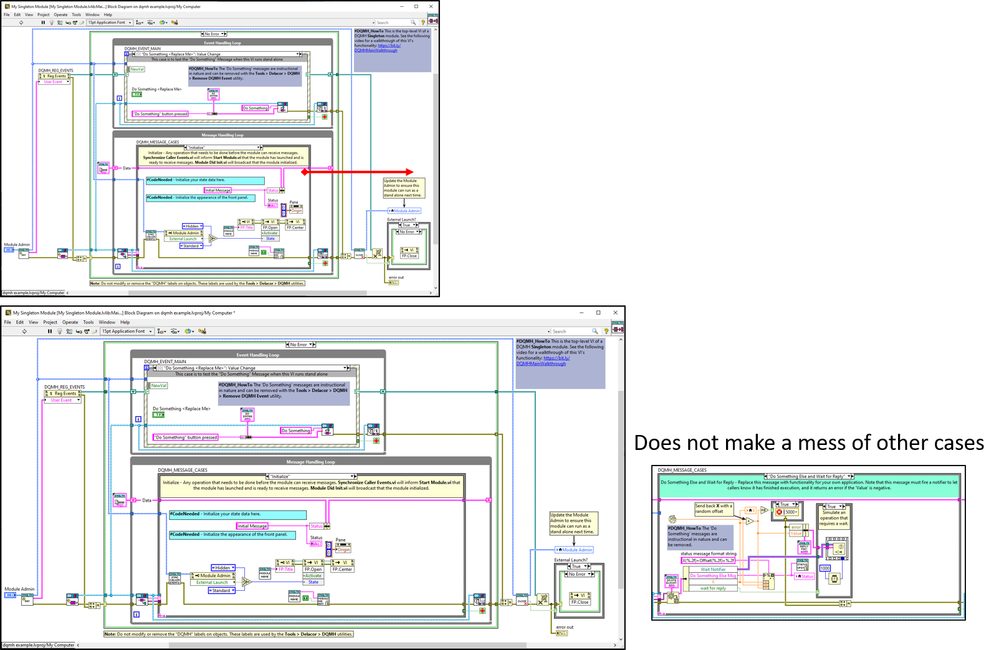
You just have to be deliberate about where you click and drag. Try clicking where red arrow starts and drag to the right.
01-22-2020 06:33 PM
- Mark as New
- Bookmark
- Subscribe
- Mute
- Subscribe to RSS Feed
- Permalink
- Report to a Moderator
Hi DoctorAutomatic,
Thanks for your trust in DQMH and thanks for your feedback.
Style is a very personal thing and each team has their own.
My suggestion is for you to create your own DQMH Module template with the space you want, removing the comments that you don't need, and you could even add a helper loop. You can also make changes to the default events, for example, you could add a timestamp to the status updated broadcast event.
That said if you feel very strongly about this being the default, please add a feature request here:
https://forums.ni.com/t5/Delacor-Toolkits-Documents/DQMH-Feature-Requests/ta-p/3537845
and based on the kudos we may implement it after DMQH 5.0 is out.
Thanks,
Fab
Check out DSH Pragmatic Software Development Workshop!
DQMH Lead Architect * DQMH Trusted Advisor * Certified LabVIEW Architect * Certified LabVIEW Embedded Developer * Certified Professional Instructor * LabVIEW Champion * Code Janitor
Have you been nice to future you?

