NI Tools Network Developer Center » Creating and Managing Reusable Code » Best Practices for Creating Icons in LabVIEW
One important aspect of making your reusable code readable is making sure the VIs have high quality icons. This document discusses a few considerations a developer should take in order to ensure that an API's icons enhance the user experience and do not hinder it.
Brand Your API
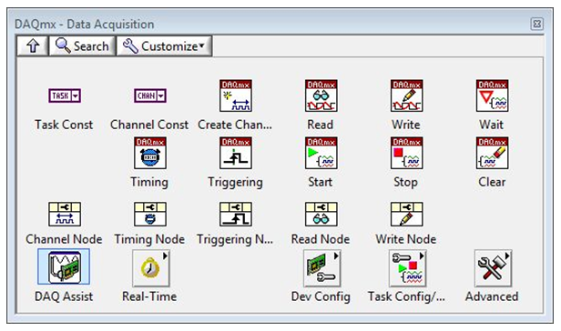
Every LabVIEW API should have something besides the VI name that helps the user identify which API it belongs to. It is important to have some common element between VIs in an API that signifies that the VIs relate to each other. One common way to accomplish this is to create a header for the VIs that have the name of the API or some other text that is significant. Keep in mind that the header should not take up too much room, a 6 point font for text is usually the max. One example of this can be seen in the DAQmx API.
A common glyph also works to brand the icons as coming from the same place. You can use a concept from all of the VIs or your company logo, as long as it does not take up too much space. Also remember that there should be a high contrast or colors between background and glyphs.
Remove Text
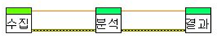
Using text in icons may be very easy for the developer, however it makes it very hard for a user who may not speak the same language. Instead use glyphs and pictures to symbolize what the function does so it is easy for any user in any language to understand. In the below example, the VIs may be completely straightforward for someone who reads Korean, but this API is unclear for anyone else.
Think About Functionality, Not Just Words
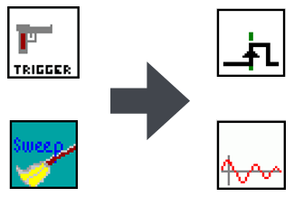
When coming up with an icon for a certain VI, it is easy to use pictures that relate to the words in it's name. However this can be problematic if the words do not mean the same thing in other languages. Instead, you should think about the what the VI actually does and use a symbol that represents this. For example if you have a trigger VI, it may make sense in English to use a gun trigger, but this may not translate well to other languages. Instead use the scientific symbol for what a trigger actually does. Another example is for a sweep function. Instead of using an image of a broom (which sweeps dirt) use an actual drawing of a sweep function.
Don't Reinvent the Wheel
There are many conventions for icons and images that already exist within LabVIEW. For example, the star glyph ( ) generally represents "create" or "new", a pencil (
 )represents "write" and a pair of glasses (
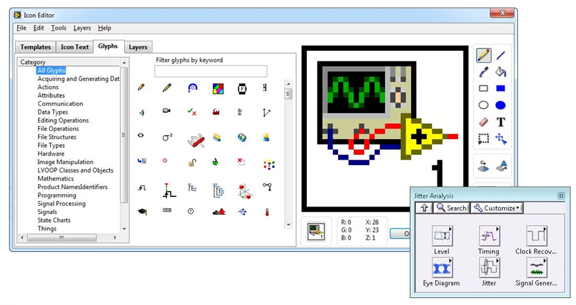
 ) represents "read". Instead of creating new concepts, reuse existing glyphs so your API will match with other LabVIEW VIs. The Icon Editor contains many glyphs. You can sync your collection from within the Icon Editor by choosing Tools > Synchronize with ni.com Icon Library. If the icon library does not have the concept you are looking for, you can also use images from other VIs and functions within LabVIEW.
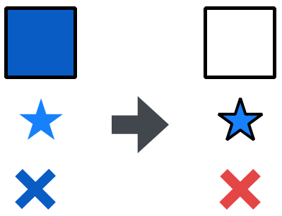
Use Color Wisely
Color can have a huge impact the usability of an API. Use of certain colors may add special meaning to an icon. For example a blue X (which generally has no set meaning) might mean something completely different than a red X (which generally means "Stop" or "No"). You should also be careful about using color contrast. Using color backgrounds with dark glyphs or text will be much easier to read than something with a low contrast. It is also a good idea to outlines lighter glyphs with a darker color. Finally, beware of using color as the only indicator as to difference between two VIs. Users who have color blindness might not be able to know which is which. Vischeck.com is a web site where you can check images and see how they would look to someone who has a variety of types of color blindness. Another good test for color problems is to print icons out in black and white. If the images are hard to distinguish in grayscale, you might consider improving your color choices.
Additional Tools and Resources
There are many tools and resources available for you in creating icons for your API.
- LabVIEW Icon Editor - A great place to start is the built-in LabVIEW icon editor. It has many built in tools for adding glyphs, headers, outlines, etc.
- Axialis Icon Workshop - Tool used by NI Icon developers to create new glyphs and icons
- Corel Paint Shop Pro - A great tool for resizing images
- Google Image search - Can be used for inspiration, but make sure any images you use are properly licensed for distribution
- Vischeck - web site where you can check images and see how they would look to someone who has a variety of types of color blindness
Next: Documentation Best Practices
Return to: Creating and Managing Reusable Code
