- Subscribe to RSS Feed
- Mark Topic as New
- Mark Topic as Read
- Float this Topic for Current User
- Bookmark
- Subscribe
- Mute
- Printer Friendly Page
How do we plot multiple waveforms on the x-axis as in excel using DIADEM?
Solved!11-08-2021 03:02 PM - edited 11-08-2021 03:04 PM
- Mark as New
- Bookmark
- Subscribe
- Mute
- Subscribe to RSS Feed
- Permalink
- Report to a Moderator
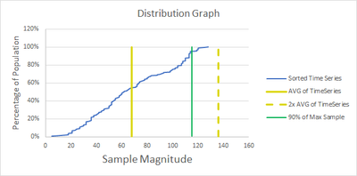
I want to plot a graph in diadem where we have single y-axis and multiple x-axis as below:
The table is as below:
| Sorted Time Series | Percentage of Population | AVG of time series | 2x AVG of time series | 90% of Max Sample | |
| 5 | 0.5% | 68 | 136 | 115.2 | |
| 10 | 1.0% | 68 | 136 | 115.2 | |
| 14 | 1.5% | 68 | 136 | 115.2 | |
| 18 | 2.0% | 68 | 136 | 115.2 | |
| 18 | 2.5% | 68 | 136 | 115.2 | |
| 18 | 3.0% | 68 | 136 | 115.2 | |
| 18 | 3.5% | 68 | 136 | 115.2 | |
| 21 | 4.0% | 68 | 136 | 115.2 | |
| 21 | 4.5% | 68 | 136 | 115.2 | |
| 21 | 5.0% | 68 | 136 | 115.2 | |
| 21 | 5.5% | 68 | 136 | 115.2 | |
| 21 | 6.0% | 68 | 136 | 115.2 | |
| 21 | 6.5% | 68 | 136 | 115.2 |
Attached a sample using excel, could you please help achieve the same on DIADEM
Solved! Go to Solution.
11-11-2021 05:45 PM
- Mark as New
- Bookmark
- Subscribe
- Mute
- Subscribe to RSS Feed
- Permalink
- Report to a Moderator
Hi joshilpa,
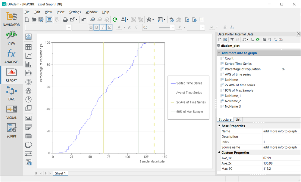
You can display vertical lines like that with a "Constant" curve type, for which you only need one X value. I created a DataPlugin with the Excel DataPlugin Wizard that reads the data columns from your *.xlsx file, then I created a script to populate the Group properties needed to show those vertical lines (and assign the "%" unit string).
You need to double-click the *.uri file first to register the DataPlugin, but then you can run the *.vbs in DIAdem SCRIPT to see the result.
Brad Turpin
Principal Technical Support Engineer
NI
11-15-2021 08:57 AM
- Mark as New
- Bookmark
- Subscribe
- Mute
- Subscribe to RSS Feed
- Permalink
- Report to a Moderator
Hi Brad,
Thank you, this script worked!
Could you please help with 2 doubts below:
1. How can we add title to the graph from the script based on the file name loaded?
2. Could you please share the steps you have used to generate Excel Graph.TDR?
11-15-2021 02:18 PM
- Mark as New
- Bookmark
- Subscribe
- Mute
- Subscribe to RSS Feed
- Permalink
- Report to a Moderator
Hi joshilpa,
I configured the layout manually with the mouse, dragging channels onto the graph, double-clicking the graph and configuring settings in its dialog and such, then saving the resulting layout as a TDR file.
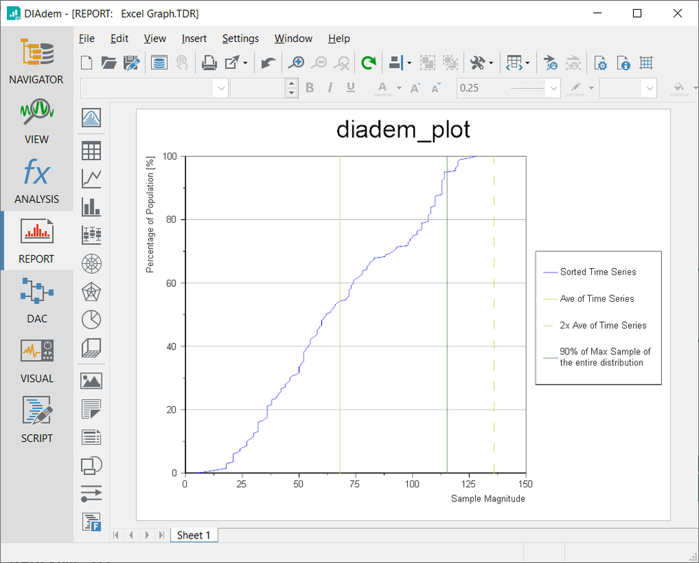
You just need to drag the filename property onto the layout to show the currently loaded data file. Here's an updated and saved TDR file that has that change, with no "name:' prefix and centered with enlarged text.
Brad
11-17-2021 05:33 AM - edited 11-17-2021 05:35 AM
- Mark as New
- Bookmark
- Subscribe
- Mute
- Subscribe to RSS Feed
- Permalink
- Report to a Moderator
Hi Brad,
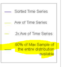
Thanks for the solution it works fine. Could you please let me know if I increase the description in legend is it possible to left align the text when exporting it as an image (attached) ?
Script used to save the graph as an image:
def save_image(report_type):
    file_name = dd.Data.Root.Properties("name").Value
    dd.Report.Settings.ImageExport.JPG.BitsPerPixel = 3
    dd.Report.Settings.ImageExport.JPG.Quality = 75
    dd.Report.Settings.ImageExport.JPG.Progressive = 0
    dd.Report.Settings.ImageExport.JPG.UseRatio = True
    dd.Report.Settings.ImageExport.JPG.Height = 768
    dd.Report.ActiveSheet.ExportToImage(image_save_path + "" + file_name + "_" + report_type + ".JPG",
                                        dd.eImageExportTypeJPG)
    print(dd.Data.Root.Properties("name").Value)
12-06-2021 06:48 PM
- Mark as New
- Bookmark
- Subscribe
- Mute
- Subscribe to RSS Feed
- Permalink
- Report to a Moderator
Hi joshilpa,
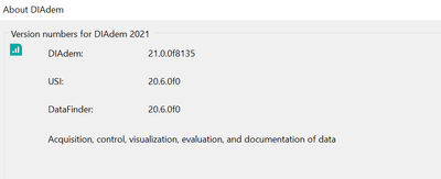
What version of DIAdem are you using? When I add the extra text to the legend of the graph, it automatically appears left justified...
Brad Turpin
Principal Technical Support Engineer
NI
12-07-2021 09:42 AM
- Mark as New
- Bookmark
- Subscribe
- Mute
- Subscribe to RSS Feed
- Permalink
- Report to a Moderator
HI Brad,
When you export the graph as an image you will observe the formatting will no longer last.
I am using the below version:
