- Document History
- Subscribe to RSS Feed
- Mark as New
- Mark as Read
- Bookmark
- Subscribe
- Printer Friendly Page
- Report to a Moderator
- Subscribe to RSS Feed
- Mark as New
- Mark as Read
- Bookmark
- Subscribe
- Printer Friendly Page
- Report to a Moderator
UI Craft: Tips and Tricks for Creating Quality User Interfaces and Installers
NZ LUG Presentation: UI Tips and Tricks
This document is intended to bring together a set of tips and tools for making it easier to produce professional looking VIs and to apply fit and finish to projects.
The purpose of all these tips is to make it easier for engineers to deliver projects with outward indicators of quality that are visible to managers and customers and to allow for subtle branding of final products.
Mockup/Build function:
Functionality is the first step to quality design and fit and finish. The code needs to work reliably and to be usable if human interaction is required.
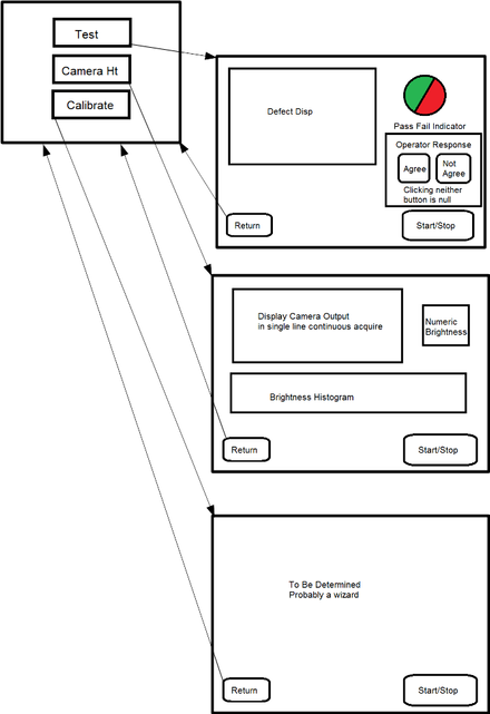
For usability, I favor a wireframe approach where I sketch out what controls and indicators are on each front panel and how they interact.
The illustration shows a sketch I did using paint and LibreOffice Draw for a set of VIs. Sometimes I just use a sheet of paper, but the idea is to start with a paper mockup or wireframe to think through how a user interacts with the interface.
Pick A Palette:
For branding or just to have a more pleasant visual interface you may want to change the color scheme of your VIs. Start with picking the colors and later you can import them into LabVIEW.
There are a lot of tools to help with this. If you have an image or branded material to base your color scheme on and want a quick start Pictaculous or Palette FX are helpful. Adobe also has a color palette generator that does 5 color palettes. If you don't want to do any subtle adjustments to your colors and you think you will need more than 5 Paletton can be used to generate harmonious palettes and includes some value/saturation variations to use with them. Paletton can also simulate what your color scheme will look like to people with color blindness or on different monitor types.
I'm going to use a simple subdued complimentary color palette.
Palette used for this example.
From Paletton, which I used here, you can export to a text file so that you can copy and paste the RGB values that represent your colors into the LabVIEW color tools and color standard controls. If you are being flash and making custom controls you can open the exported palette image (shown in Figure above) to select colors from in your editor of choice (mine is GIMP) or copy hex codes/RGB values.
If you add these to your LabVIEW color palette it will make things easier.
Details on NI Zone.
In LabVIEW Tools Menu open the Options dialog. From there go to Environment on the left hand pane. Clicking the Custom Colors button in the Colors section will bring up the dialog below, which allows you to edit the custom color set.
User Colors Window
The colors are saved to LabVIEW.ini in your LabVIEW installation directory.
You can delete the “ColorUserItem” lines from the ini to revert to default colors. Just remember to always copy the ini file before you edit it so you can revert if needed!
Backgrounds:
If your palette doesn't include the labview grey you'll want to do a background for your vis. The simplest way is with the paintbrush in the tools dialog, but if you already have a VI design you may want a few graphical elements for branding or interest. Not much, because focus should be on the function first and graphical elements that distract the user aren't helpful. If you use a background image you can set up the LV window to use tile effects or set the window to a standard size in LV settings.
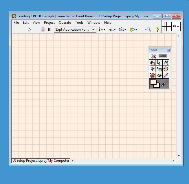
Using the Tools Palette click on the VI background and it will be recolored.
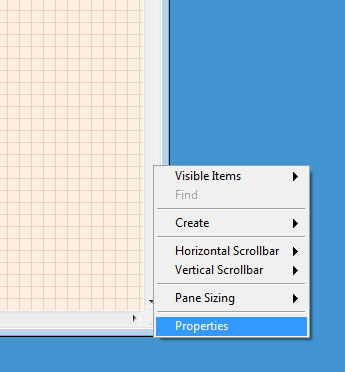
Right clicking on the left-hand scrollbar of a VI allows access to the Properties menu for the pane.
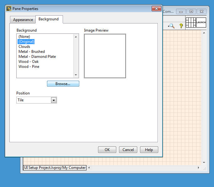
From the Pane Properties screen you can browse to a background VI.
Easy Buttons:
Making flat controls, similar to google or Windows 10 in any color can be done from the Classic Boolean controls with only the paintbrush. This is a great option if you are doing a project that needs to look reasonably clean but you want to invest your time in programming and not UI. The paintbrush tool can get all your elements looking harmonious with a logo or your internal branding in a snap. If you need specialized function indicators there are plenty of places to get stock clipart that you can drop on your button in the tools editor.
Example of what you can do with the classic buttons and the paintbrush.
Setting up a splash screen:
There are lots of examples for splash screens available.
This one is particularly helpful.
I varied this a bit so the splash screen only lasts until the main code finishes setup. If your code has a fast setup, then a splash screen is probably going to be more annoying than helpful. If you have a bit of loading and setup though it may be helpful to let the user know what is going on.
This project doesn't need a splash screen, but does need a launcher, so I will make the launcher look nice. I'll also include in the sample code a full splash screen config.
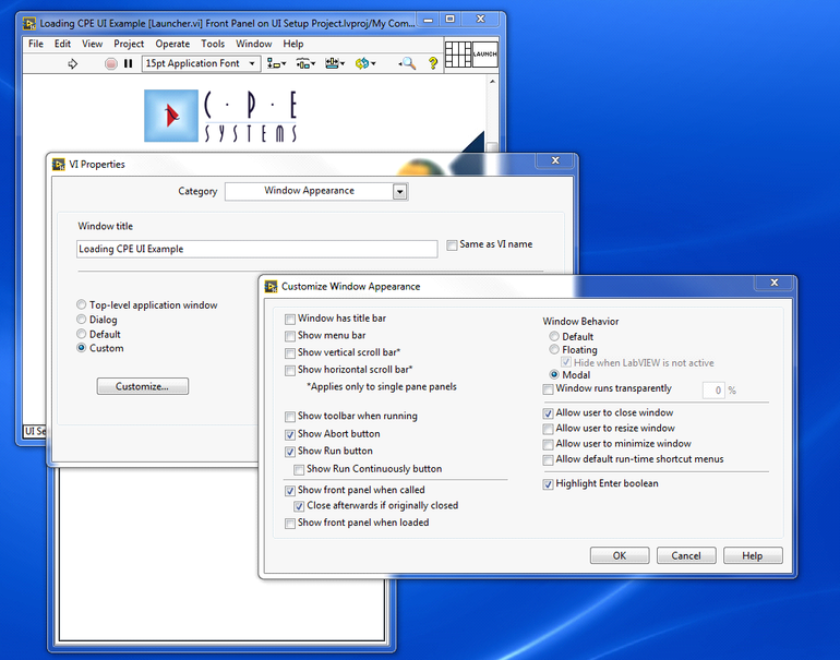
Splash Settings Window Appearance.
Notice the Title is set to something specific and the screen is modal
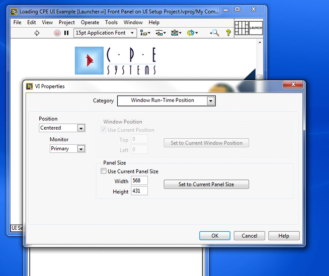
Splash Settings Run Time Position
Your splash screen should usually be centered and set the pane size appropriately for your image.
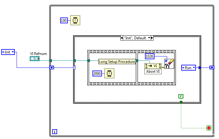
Launcher Code
My preferred approach to splash screen launchers is to close the splash screen only after setup is complete. So, I pass the launcher VI reference into the main vi to be closed after setup.
Main VI Code closes the launcher.
Again, this is specifically for long setup VIs so the user knows what is going on. You can put an animated gif on your launcher front panel or you can cycle a picture ring control as in the linked example.
Icon Templates:
If you want to create an Icon Template to use with your project you can create a template.
Get the Data Directory
Your icon template wil need to go in the data dirctory. You can find the existing ones there too. "_blank" is a good starting point if you want simple. I didn't add any glyphs, but they can be done the same way.
Example Icon Template
This is a quick Template I made. If you update a template later all instances of the template update.
Template Directory
My templates were not reliably showing up in LV 2016, though they were great in 2015. In the icon editor you can look at properties via the Tools menu and check your directory. My 2016 directory didn't have the same path structure as previous versions. The referenced directory doesn't exist so I changed my path. It still didn't show up immediately but after restart and clicking on all the sub categories they did.
EXE Icons:
For your icon you essentially need a 32 x 32 pixel file with a simple logo or design. From Gimp or Photoshop you can export straight to an ICO format. From Paint you need to save as a standard format and use an online converter.
Here is a converter I tried out.
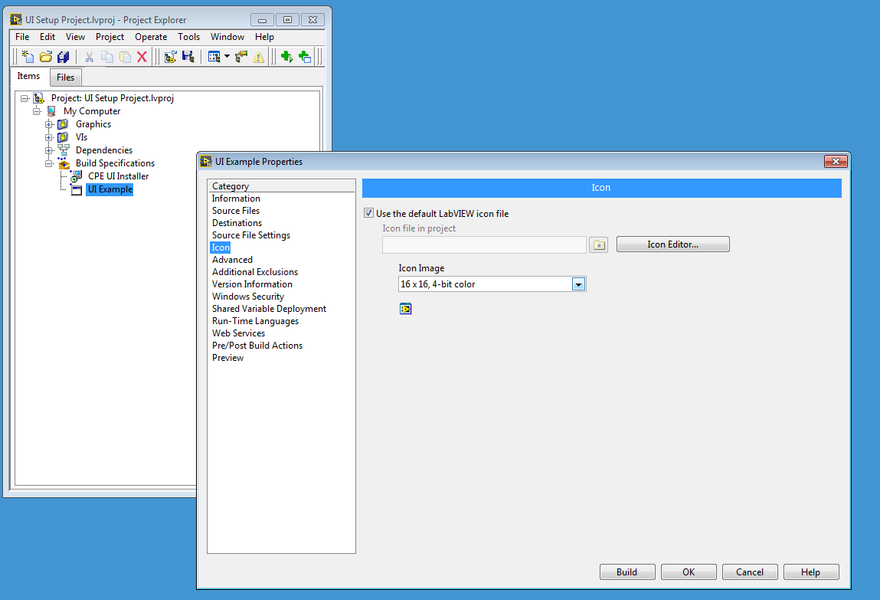
You can set the icon in the build specification under Icon. You need to have added the icon to your project.
Set Icon
After Unchecking “Use the default LabVIEW icon file” you can select your icon.
Installer Screens:
The example I used for this no longer links with the community upgrade, so I will post what I did and if anyone can find the link to the first person who originally solved this I will add the link.
After creating and compiling an exe for your project you can create an installer and customize the screens. The screens need to be correct DPI, size, and format to work. It’s easiest to open the attached installer art and edit or paste over it.
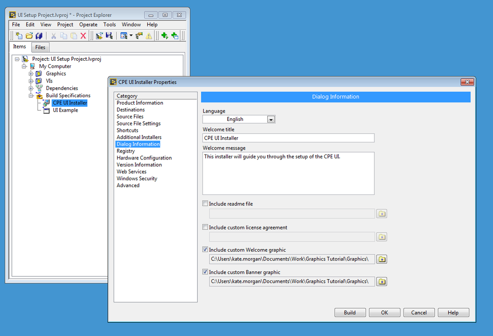
Installer Dialog Information
In the Dialog Information section of the installer you can check to include custom welcome graphic and banner graphic. These graphics files need to be part of the project.
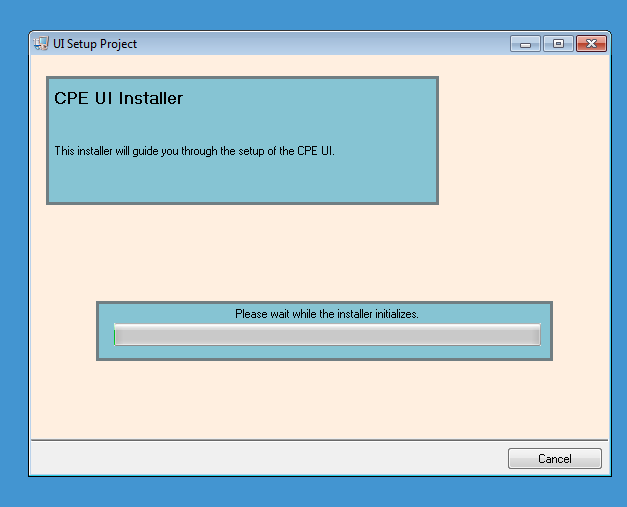
Example install. The example Welcome Screen has blue boxes to show you were the text and progress bar go.
Install continues. There will be text in the top area but there is room for a logo on the right.
Final Comments:
Example VIs, including the splash launcher are attached for LabVIEW 2014 and 2016. A PDF version of the included information is also attached. Hopefully, the provided instructions will prove helpful to make your UI work easier or more polished.
Katherine Morgan
Test Engineer at Morgan Integration
- Mark as Read
- Mark as New
- Bookmark
- Permalink
- Report to a Moderator
Did you try to use this tool? http://forums.ni.com/t5/UI-Interest-Group-Documents/User-Interface-Manager/ta-p/3539490
Certified TestStand Architect
Certified LabVIEW Architect
- Mark as Read
- Mark as New
- Bookmark
- Permalink
- Report to a Moderator
PrimaryKey, I hadn't seen that tool. It looks useful and I will try it out if I have an application in the future; it doesn't look like it does most of the tasks I was illustrating though.
