From Friday, April 19th (11:00 PM CDT) through Saturday, April 20th (2:00 PM CDT), 2024, ni.com will undergo system upgrades that may result in temporary service interruption.
We appreciate your patience as we improve our online experience.
From Friday, April 19th (11:00 PM CDT) through Saturday, April 20th (2:00 PM CDT), 2024, ni.com will undergo system upgrades that may result in temporary service interruption.
We appreciate your patience as we improve our online experience.
Further to my previous post, I wanted to share another little bit of UI work I've been doing recently to create better looking and more functional charts. Over the years I've really enjoyed seeing other people's UIs to see what cool stuff others have done (like some of the UI presentations at NI events) so wanted to share something myself in the hope that it'll inspire others!
As with my post about dynamic/resizeable UIs - I'm not going to post code as there's too much proprietary stuff in there for me to share so take this as a source of inspiration for your own implementation!
I wanted to create some really nice dynamic charts where you can spawn an instance of a chart and select which signals to display. One of the key requirements was that it could be moved/resized by the user.
One of the problems with having resizeable/dynamic charts in LabVIEW is that the plot legend really does not scale very well - it's difficult to show the correct number of plots, it doesn't grow to fit the plot name correctly or you get the 'empty element' as you scroll down the plot list with the scrollbar turned on.
So here it is:
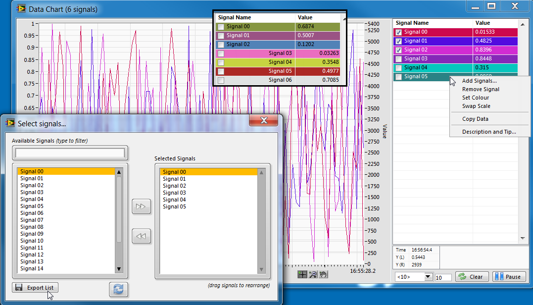
Here are some of the features of the chart:
A few notes about the implementation:
- Splitters are awesome for any sort of resizeable UI panel. The graph is in the left-most pane and then the right pane is split into 2 for the table/buttons.
- I really think that using multi-column listboxes are a far superior method to display a plot legend than the one built into the native charts. I think it looks so much nicer and is much more easily customisable to display extra data. It also resizes nicely with the scrollbar to display all of your signals. I've used this chart+table/MCL in lots of applications now and I'll never go back to using the built-in plot legend! Perhaps there's an XControl to be made here...
- If your table/MCL flickers when you write to it, you can either 1) put a tiny decoration over the table somewhere or 2) use the value property node to write the data. Both methods work and stop the table from flickering when you update it
- If you load a chart into a subpanel, sometimes it doesn't redraw the old chart data. The best solution I've found for this is to detect if it is in a sub panel and defer panel updates, make a miniscule adjustment to the X-scale, restore it and then enable panel updates again. The 'force redraw' method doesn't seem to do anything.
- For pausing the chart, I enqueue the data into a limited-size queue while paused and then flush the queue when the user unpauses the chart to display the data that came in while it was paused
- I'm using the System Controls 2.0 VI Package for the graph control itself and the buttons. They look super neat and add a bit of extra colour to your applications!
Now go forth and graph!
Really cool! Thanks for posting!
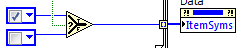
Hey, how do you dynamically add On/Off switch on the listboxes?
The checked and unchecked boxes are symbols for the listbox items. You can programatically get/set them to simulate checkboxes.
Thanks Ravi!
As Ravi has said, you can set the ItemSyms property to set the symbols in the array like this:
To detect clicks on the checkbox and the checkbox alone, in the Mouse Up event for the MCL I have: