- Subscribe to RSS Feed
- Mark Topic as New
- Mark Topic as Read
- Float this Topic for Current User
- Bookmark
- Subscribe
- Mute
- Printer Friendly Page
combined bar and line graph: need some advice
11-17-2010 09:56 AM
- Mark as New
- Bookmark
- Subscribe
- Mute
- Subscribe to RSS Feed
- Permalink
- Report to a Moderator
Hi,
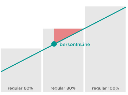
I'm builing a small app for a customer. The basic functionality is showing the bar chart and the line (see the figure attached), and now I want to show
the area above the line in another color. This is the cost saving for the customer. Can I do this? And how would you suggest me to achieve this!
Can I also show the big dot as seen in the figure?
Thanks!
12-29-2010 08:18 AM
- Mark as New
- Bookmark
- Subscribe
- Mute
- Subscribe to RSS Feed
- Permalink
- Report to a Moderator
Hi,
Do you want to build this on the Frontpanel?
I don't think this can be done.
Regards,
Bas van Dijke
12-29-2010 08:24 AM
- Mark as New
- Bookmark
- Subscribe
- Mute
- Subscribe to RSS Feed
- Permalink
- Report to a Moderator
@_Faust wrote:
Hi,
I'm builing a small app for a customer. The basic functionality is showing the bar chart and the line (see the figure attached), and now I want to show
the area above the line in another color. This is the cost saving for the customer. Can I do this? And how would you suggest me to achieve this!
Can I also show the big dot as seen in the figure?
Thanks!
Although I believe that graph would be possible by banging on the graphs hard enough, but it would pretty easy to render that image using a picture control since rectangles, lines, text, and circles are supported.
The link I included above will take you to a thread devoted to Picture related threads.
Ben

