- Subscribe to RSS Feed
- Mark Topic as New
- Mark Topic as Read
- Float this Topic for Current User
- Bookmark
- Subscribe
- Mute
- Printer Friendly Page
adding multiple Y-axis to XY graph in the program panel
10-30-2020 01:22 PM
- Mark as New
- Bookmark
- Subscribe
- Mute
- Subscribe to RSS Feed
- Permalink
- Report to a Moderator
Hi!
I want to plot resistance and voltage on the same XY graph in my project. Both data traces R and V are plotted against the same X axis (current).
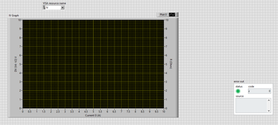
I figured out how to do that in the front panel and this is how my front panel XY graph looks like:
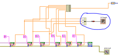
But what I do not understand is how do I bundle 3 traces to my XY graph in the back (programming panel)?
I am creating a new post of my question in case I do not receive a response on the question I posted in this thread (it has been marked solved): https://forums.ni.com/t5/LabVIEW/How-to-get-a-second-y-axis-in-xy-graph/m-p/4095472?lightbox-message...
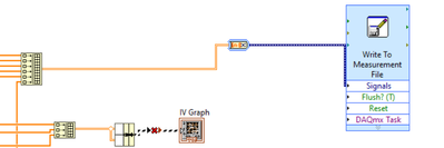
My second question was, how do I name my columns (associate string identifiers to them) when I am writing the multiple array data to a measurement (excel xls) worksheet?
As of now, my the data is saved as "untitled" columns in my excel worksheet. I would like the column heads to show "V", "R", etc respectively...
Thank you!
10-30-2020 01:04 PM
- Mark as New
- Bookmark
- Subscribe
- Mute
- Subscribe to RSS Feed
- Permalink
- Report to a Moderator
Hi!
I read this thread as I am trying to add a new y-axis to my XY graph...
Both my first and second Y axis need to be plotted against the same X scale and data....
Reading this thread I figured out how to make a 2 Y-axis, single X-axis XY graph in Labview front panel. But what I am still figuring out is how to write 3 traces of data to my XY graph in the programming/schematic of my project.
This is how my front panel looks vs. how I program the blocks in the back (programming) panel.
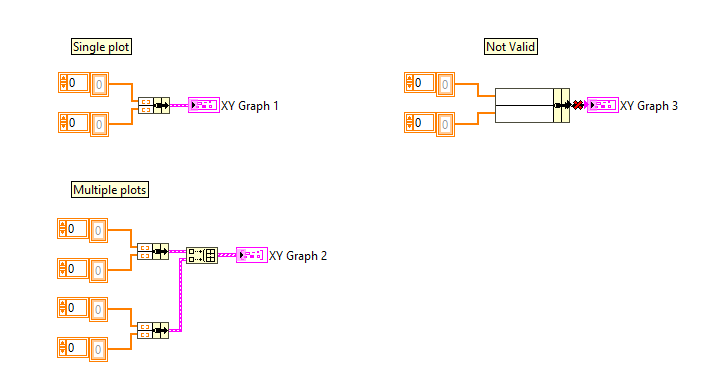
So basically, I cannot bundle three traces and send them to the IV graph... I need another way to send three traces I am trying to plot to the graph. How do I do that?
Thank you. Any guidance at all is appreciated.
10-30-2020 03:17 PM
- Mark as New
- Bookmark
- Subscribe
- Mute
- Subscribe to RSS Feed
- Permalink
- Report to a Moderator
You used Bundle by Name, but didn't wire in any cluster to the top to define the names or what the cluster looks like.
Try using the regular Bundle function.
10-30-2020 03:30 PM
- Mark as New
- Bookmark
- Subscribe
- Mute
- Subscribe to RSS Feed
- Permalink
- Report to a Moderator
I tried the simple bundle function, not the "bundle by name" one. And I still get an error that says I have a mismatch in data types...
The problem is that I have 3 traces, and thus my bundle output is a cluster of 3 elements, and the input of a XY graph seems to restricted to cluster of 2 elements only.
My question is that how do people plot 2 y-axis data on an XY graph then, if the XY graph only accepts cluster of 2 elements?
10-30-2020 04:18 PM
- Mark as New
- Bookmark
- Subscribe
- Mute
- Subscribe to RSS Feed
- Permalink
- Report to a Moderator
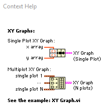
Hover the mouse over the graph and select context help (CTRL+H) and you'll see that you need to bundle teh X-Y arrays as pairs, then build an array of N of those bundles..
Craig
10-30-2020 06:10 PM
- Mark as New
- Bookmark
- Subscribe
- Mute
- Subscribe to RSS Feed
- Permalink
- Report to a Moderator
You do have responses on your previous thread. Cstorey told you that the data you wired up is not valid for an XY Graph.
If you want to write column headers to your spreadsheet file, use the "write delimited spreadsheet" function and write an array of strings first. You can convert all your data to strings and slap the headers on top of your data, or call the "write delimited spreadsheet" function twice, making sure to set append=true the second time you call it when you write the data.
