- Subscribe to RSS Feed
- Mark Topic as New
- Mark Topic as Read
- Float this Topic for Current User
- Bookmark
- Subscribe
- Mute
- Printer Friendly Page
Waveform Graph showing entire data history
04-29-2021 01:08 PM
- Mark as New
- Bookmark
- Subscribe
- Mute
- Subscribe to RSS Feed
- Permalink
- Report to a Moderator
Hello,
I am working with ADC sampled data sent from a serial port and trying to display the time series as well as the FFT of the sampled data. I seem to be doing this, however, my time series waveform graph seems to show all of the data from sample 0 to whatever the current sample is. What I would really like is to display the most current 100 points in a streaming fashion. My FFT plot seems to be doing the same thing. What am I missing here?
Thanks for any help. My VI is attached.
04-29-2021 01:18 PM
- Mark as New
- Bookmark
- Subscribe
- Mute
- Subscribe to RSS Feed
- Permalink
- Report to a Moderator
Your data in the shift register grows forever (and you insert the new element at the beginning, which is also very questionable!) and you are taking an FFT from larger and larger data. You should initialize the shift register with an array of the desired size and do a rotate&replace to keep the last N points for processing. There are plenty of examples in this forum.
04-29-2021 01:21 PM
- Mark as New
- Bookmark
- Subscribe
- Mute
- Subscribe to RSS Feed
- Permalink
- Report to a Moderator
Thanks for the feedback, as I am new to LabView.. Would you be able to point me to a decent example?
Thanks again.
04-29-2021 02:21 PM
- Mark as New
- Bookmark
- Subscribe
- Mute
- Subscribe to RSS Feed
- Permalink
- Report to a Moderator
Sorry, posting by phone. Hopefully somebody else can help.
04-29-2021 03:38 PM
- Mark as New
- Bookmark
- Subscribe
- Mute
- Subscribe to RSS Feed
- Permalink
- Report to a Moderator
Hi,
You need to change a little your thinking mode, something like... "reverse engineering". You need to simulate your acquisition before put your visa on your project, after that all work ok... you can change / integrate your visa logic. Why ?! Simple... You put here your vi and it clame connection with your hardware. I don't have your hardware ! To help you with this vi... is needed to be very good in LV because only theoretically you can be helped. I show you a simple example...
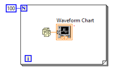
This simple vi count and display last 100 values. It is a chart is not a graph, well... now you can change the aleatory number with your visa logic and will display last 100 value of your acquisition. Look here... https://forums.ni.com/t5/LabVIEW/LabView-bug/td-p/4145743
I don't put my entire vi on the forum, I make a small vi with what I don't understand and put it in the forum, altenbach give me 3 possible solution, (I thank to altenbach) I analize them, I choose one of them and I port it to my big vi.
Best regards, Marcelo
04-30-2021 01:54 AM
- Mark as New
- Bookmark
- Subscribe
- Mute
- Subscribe to RSS Feed
- Permalink
- Report to a Moderator
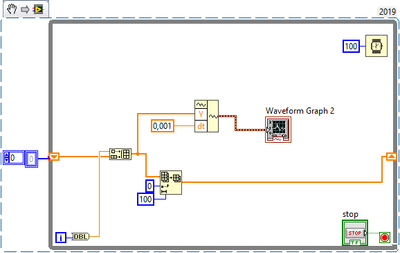
Something like this perhaps?
Subarray of last 100 points. The graph is kinda funky tho.
04-30-2021 02:13 AM - edited 04-30-2021 02:14 AM
- Mark as New
- Bookmark
- Subscribe
- Mute
- Subscribe to RSS Feed
- Permalink
- Report to a Moderator
Here's what I had in mind.
(I am not sure about the suggestions above. The FOR loop makes no sense for continuous data and prepending and trimming also seems convoluted. If prepending, the newest point is on the left which is not typical. You don't need to do all that waveform stuff. You can set dt of the graph once at edit time.)
04-30-2021 07:08 AM - edited 04-30-2021 07:31 AM
- Mark as New
- Bookmark
- Subscribe
- Mute
- Subscribe to RSS Feed
- Permalink
- Report to a Moderator
Hi,
Let analyze a little what you want...
"I am working with ADC sampled data sent from a serial port"... Here you speak about an ADC sample data and a serial port.
1 - an ADC it have a data sampling rate (sample / second)
2 - an serial port it have baud rate that can be translated to values / second
"trying to display the time series as well as the FFT of the sampled data"
3 - "time series" of what ?! of ADC sampling data rate or values that come on serial port ?!
" my time series waveform graph seems to show all of the data from sample 0 to whatever the current sample is " (I suppose that when you speak about "current sample" you speak about ADC data sampling rate)
4 - where you have a " time series waveform graph " ?! on one graph I see... "Time" without measure unit !!! but with am "0-12" on the time scale (I don't see "100" value) !!! and another graph have frequency (3000) that mean that you can plot 3000 point / second (I don't see "100" value)
"What I would really like is to display the most current 100 points in a streaming fashion"
5 - where do you want "display the most current 100 points in a streaming fashion" - both graph are NOT prepared to display 100 points NOR "in streaming fashion" you don't have where to display what you want, I don't see "100" value.
"What am I missing here?"
6 - well... I think that you are missing to clear yourself with know of what you want and mix terms that are not compatible / are not clear one with another.
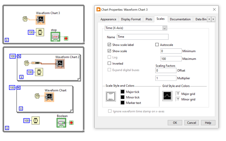
Here you have some example from where you can start to understand about how "Chart", "Graph" work and of course from contextual and extended help. Also you have plenty of examples here in this wonderful forum.
In my opinion first time you need to start to "simulate you data" that want to display in the "streaming fashion", after that you made this and it function ok... well you can add to, or change your simulation with the real acquisition environment (after that you are clear with what you want to display... the real ADC sample values or... the data that came on serial port. Do not forget that if your ADC data speed are greater than the speed of your serial com port speed, you need to process the data before you send it to serial port)
My opinion is that you make a mistake starting to build a house with some parts of the roof, some parts of the walls, but without foundation.
This is my humble opinion, I do NOT try to be offensive with nobody, please forgive me if is wrong.
Best regards, Marcelo
P.S. in the Star Wars... Yoda say at one moment... "Open you mind... open your mind..." you also have at your disposition, propriety nodes, local variables and... so on...
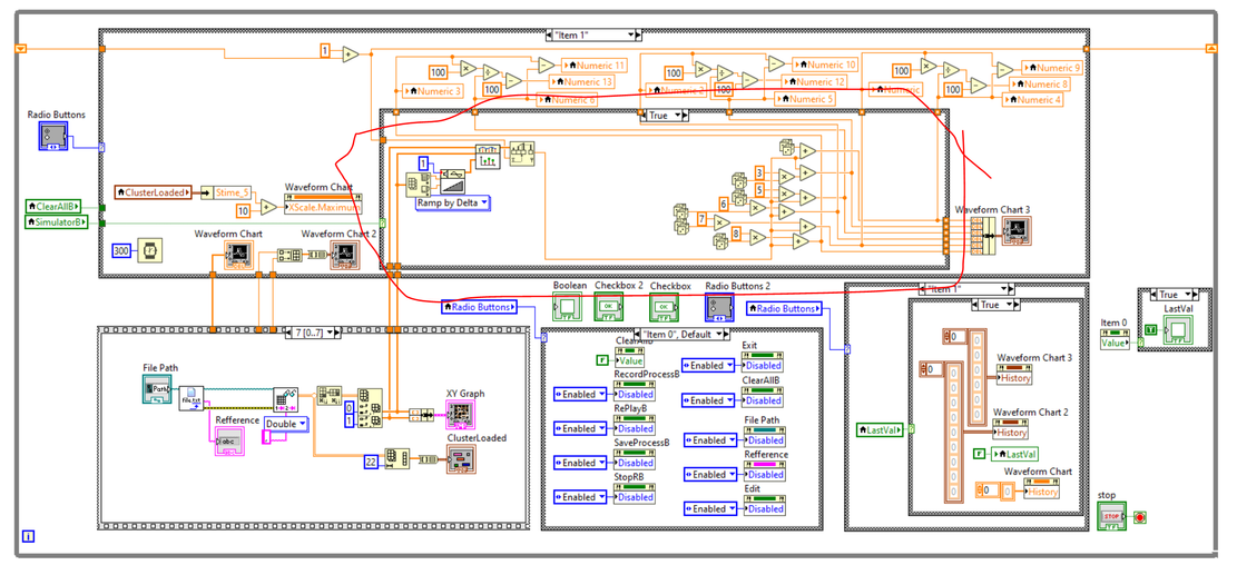
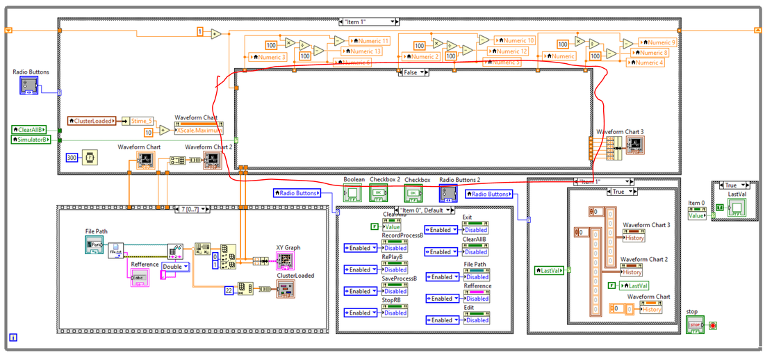
here you have an example how I simulate in "steaming fashion" 6 plots on an transparent Chart overlaid on top of XY Graph. As result (picture) you can see it here
Here will be the real life acquisition from 6 temperature sensors values data that I read from 2 BLE (Bluetooth Low Energy) modules.
I mention that I DON'T KNOW LABVIEW. I made this in only 3 weeks from scratch following context help, extended help and the beautiful examples from this wonderful forum.
04-30-2021 07:16 AM
- Mark as New
- Bookmark
- Subscribe
- Mute
- Subscribe to RSS Feed
- Permalink
- Report to a Moderator
Thank you for the feedback.
My ADC sample rate is 4Khz
My Serial baud rate is 2Mbaud (shouldn't have any issues with timing here...)
I am correctly converting the data from the ADC and displaying it on the graph, but I am not storing the data in arrays correctly. I am basically creating an array that is building continuously forever and plotting everything.
I guess what I am asking is, how would I take the most recent 100 points (doesnt have to be 100 could be more, but needs to be a finite number) and only plot those points in a streaming fashion.
I will take a look at all of the information and examples all of you have provided. Thanks very much for the assistance.
04-30-2021 07:44 AM
- Mark as New
- Bookmark
- Subscribe
- Mute
- Subscribe to RSS Feed
- Permalink
- Report to a Moderator
what I say is... you need to start from the end to start, from simulate values -> after that you build from simulator real like data -> after that you display this simulation in a graph or chart -> after that you change the simulator or better add your visa logic and compare with simulated data that you know that are working correct. Not put all together in a mixer like and hope that will work, you need a step by step approach.
Best regards, Marcelo
