- Subscribe to RSS Feed
- Mark Topic as New
- Mark Topic as Read
- Float this Topic for Current User
- Bookmark
- Subscribe
- Mute
- Printer Friendly Page
Waveform Chart with delayed Time-Stamps
Solved!10-01-2019 01:51 PM
- Mark as New
- Bookmark
- Subscribe
- Mute
- Subscribe to RSS Feed
- Permalink
- Report to a Moderator
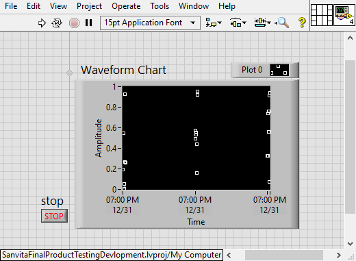
I collect 10 data points within 100ms once every minute, and I repeat this for let's say 5 minutes. I need to plot this using waveform chart. What I have already implemented doesn't really show the time-difference or time lag between, rather it plots all points equidistant or uniformly spaced out.
How can I actually plot the data points with respect to the exact actual time they were recorded?
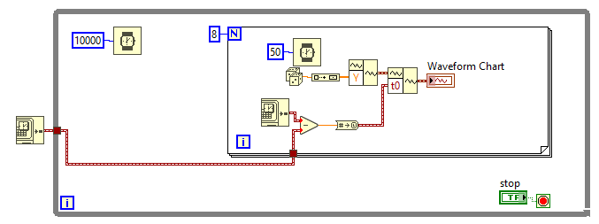
Attached is my VI. Please advise.
- NI PXIe-1071, 4-Slot 3U PXI Express Chassis , 1 GB/Slot throughput, Part Number: 781368-01
- NI PXIe-PCIe8381,x8 Gen2 MXI-Express for PXI Express Interface,3m, Part Number: 782522-01
- PXIe-5160 PXI Oscilloscope, 500 MHz, 10 bits, 2.5 GS/s, 2 Channels, 64 MB, Part Number: 782621-01
- Astronics PXIe-1209 2-Channel, 100 MHz PXI Pulse Generator, Part Number: 785033-01
Solved! Go to Solution.
10-01-2019 02:05 PM
- Mark as New
- Bookmark
- Subscribe
- Mute
- Subscribe to RSS Feed
- Permalink
- Report to a Moderator
One "feature" of a Chart (as opposed to a Graph) is that all the points have the same spacing between the points in the X (or "time") axis. You are plotting 10 points with a spacing of 10 ms (or 9 10-ms intervals), then waiting 9.9 seconds before plotting the next point. This means you cannot use a Chart (unless you supply "dummy unplotted points" for the 9.9 seconds, but that makes little sense).
You can, however, plot the data as a Graph, explicitly specifying the various-spaced X coordinates. It will look pretty silly -- a bunch of points, a big space, another bunch of points, another big space, ...
Maybe it is time to think about what it is you are trying to show, and to come up with a better way to show it.
Bob Schor
10-01-2019 02:19 PM
- Mark as New
- Bookmark
- Subscribe
- Mute
- Subscribe to RSS Feed
- Permalink
- Report to a Moderator
Hello Bob,
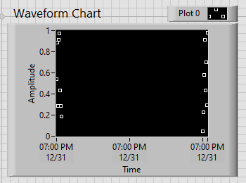
The idea is to show a bunch of scatter points at each minute, each of the scatter point represents the data taken between 10ms. See the figure below to understand what I have in mind. I just have to show the correct time-stamps on X-axis such that we know each tick represents 1 minute apart.
- NI PXIe-1071, 4-Slot 3U PXI Express Chassis , 1 GB/Slot throughput, Part Number: 781368-01
- NI PXIe-PCIe8381,x8 Gen2 MXI-Express for PXI Express Interface,3m, Part Number: 782522-01
- PXIe-5160 PXI Oscilloscope, 500 MHz, 10 bits, 2.5 GS/s, 2 Channels, 64 MB, Part Number: 782621-01
- Astronics PXIe-1209 2-Channel, 100 MHz PXI Pulse Generator, Part Number: 785033-01
10-01-2019 02:23 PM - edited 10-01-2019 02:31 PM
- Mark as New
- Bookmark
- Subscribe
- Mute
- Subscribe to RSS Feed
- Permalink
- Report to a Moderator
If you use a Waveform Data type, you can achieve what I think you desire.
For each set of 10 samples you acquire use a "Build Waveform" node to put the array of 10 samples into the "Y" array of the waveform and set the "dt" according to the timing of the acquired readings and use the "T0" input to specify the current time.
Present that waveform (verify the "ignore attributes of the chart is NOT checked) to the chart and the chart will use the "T0" you specified to determine where in time the readings will be plotted with the "dt" control the spacing between the readings.
If you have more than one channel the waveform can be built into an array of waveforms before presenting the data to the chart.
Give it a try. I have been using that since LV 6i and it works great.
Edit:
See this Nugget by crossrulz to see an example.
Ben
10-01-2019 02:35 PM
- Mark as New
- Bookmark
- Subscribe
- Mute
- Subscribe to RSS Feed
- Permalink
- Report to a Moderator
Okay, followed your advise and used dt. At this point, I only need to show each X-axis tick as 10seconds apart as used in the block diagram. How do I make the graph show that?
- NI PXIe-1071, 4-Slot 3U PXI Express Chassis , 1 GB/Slot throughput, Part Number: 781368-01
- NI PXIe-PCIe8381,x8 Gen2 MXI-Express for PXI Express Interface,3m, Part Number: 782522-01
- PXIe-5160 PXI Oscilloscope, 500 MHz, 10 bits, 2.5 GS/s, 2 Channels, 64 MB, Part Number: 782621-01
- Astronics PXIe-1209 2-Channel, 100 MHz PXI Pulse Generator, Part Number: 785033-01
10-01-2019 02:43 PM - edited 10-01-2019 02:45 PM
- Mark as New
- Bookmark
- Subscribe
- Mute
- Subscribe to RSS Feed
- Permalink
- Report to a Moderator
An X/Y chart can use absolute or relative time as the X Axis
So as long your acquisitions were taken with proper timestamps to begin with, if you place them all on the same chart you will see your "dead time" between acquisitions
=== Engineer Ambiguously ===
========================
10-01-2019 02:45 PM
- Mark as New
- Bookmark
- Subscribe
- Mute
- Subscribe to RSS Feed
- Permalink
- Report to a Moderator
What you seem to be doing (now that I see the picture of the code that you attached -- I have a bit of a reputation on the Forums for always wanting to see code), I'd suggest that you treat your data (for plotting purposes) as though you are sampling an 8-channel dataset with a sampling rate of 1/60 Hz (once/minute). Here's how you do that:
- Once a minute, you acquire 8 samples of data from a single channel at, say, 1 kHz. I'm assuming you save this as a Waveform, with dt = 0.001. Save the data however you want to save it -- I'm going to only discuss plotting.
- Pretend that these 8 samples from a single channel are really 1 sample from 8 channels. Send these 8 data points to a Chart, and adjust the X spacing so that the dt is effectively 60 seconds. Problem solved.
- A "feature" of this trick is you can "color the points" if you want to distinguish between the first and the last sample of the 1 kHz "burst" (you probably don't, but who knows?). You probably do not want to plot lines, only points.
Bob Schor
10-01-2019 02:48 PM
- Mark as New
- Bookmark
- Subscribe
- Mute
- Subscribe to RSS Feed
- Permalink
- Report to a Moderator
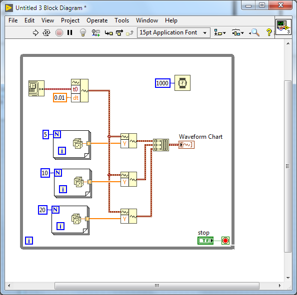
This will do three channels all sampled at 100Hz with sample set of 5 , 10 ,20 samples that are acquired once a second.
Ben
10-02-2019 07:24 AM
- Mark as New
- Bookmark
- Subscribe
- Mute
- Subscribe to RSS Feed
- Permalink
- Report to a Moderator
I like Ben's idea better than my own! But I have a suggested "improvement" -- unless the actual time you took the readings is important to you, don't wire the Current Time in Seconds into the t0 terminal -- wire "Elapsed seconds" (so that your Time Axis starts at 0 and increments in "Time Increments"). When you make your Chart, set the X Scale Display Format to "Relative Time" and "HH:MM:SS" (though if you are doing 1/min, you can use the default "HH:MM" scale). Go to Scales and set X Minimum to 0, and X Maximum to the number of seconds you want to see "full width" (so if 10 minutes, X Maximum = 60 * 10 = 600).
Now place a Shift Register above the top Build Waveform. Initialize it to 0. Bring a branch down and wire it to t0, putting on the Wire the "to Time Stamp" function. Now add sufficient seconds to the value in the Shift Register each loop (i.e. add 60 if your loop runs once/minute, add 1 (or do a simple Increment) if you are running at 1 Hz (as in Ben's example).
Bob Schor
10-02-2019 07:42 AM
- Mark as New
- Bookmark
- Subscribe
- Mute
- Subscribe to RSS Feed
- Permalink
- Report to a Moderator
@Bob_Schor wrote:
.... Now add sufficient seconds to the value in the Shift Register each loop (i.e. add 60 if your loop runs once/minute, add 1 (or do a simple Increment) if you are running at 1 Hz (as in Ben's example).
Bob Schor
Watch out for jitter or you could discover another attribute of the WF Chart.
In the example I shared, there is a lot of room for error. But if we are sampling at say 1KHz, and grabbing what is in the buffer and updating the chart 1/sec the T0 can mess with you if the number of samples is one sample more than 1,000 as we would expect but the T0 is exactly 1 second more than the previous we would confuse the Chart plotting logic since the last data point plotted from the previous update gets plotted 1 mSec after the T0 of the current WF... the chart will freak out (it does not make sense to plot new data at an earlier time than what is already plotted) and toss the history and start over again.
I ran into that problem (back in 6i when I was first exploring WF charts) when I was calculating the T0 and the error in my math piled up and caught up with me. Boy was that a riddle to figure out!
Now in the case of continuous acquisition from a DAQmx device, configured to return Waveform data, I have never seen the T0 from DAQmx to ever be wrong. Dead-nuts on!
Where the above method of just grabbing the current time is elegant is when we are using a serial gizmo to sample data. Serial (for the most part) is Asynchronous. So the samples are seldom periodic. Using the system time is a nice way of documenting when in time the sample was actually acquired.
Take care,
Ben


