From Friday, April 19th (11:00 PM CDT) through Saturday, April 20th (2:00 PM CDT), 2024, ni.com will undergo system upgrades that may result in temporary service interruption.
We appreciate your patience as we improve our online experience.
From Friday, April 19th (11:00 PM CDT) through Saturday, April 20th (2:00 PM CDT), 2024, ni.com will undergo system upgrades that may result in temporary service interruption.
We appreciate your patience as we improve our online experience.
01-26-2010 08:42 PM
Hi
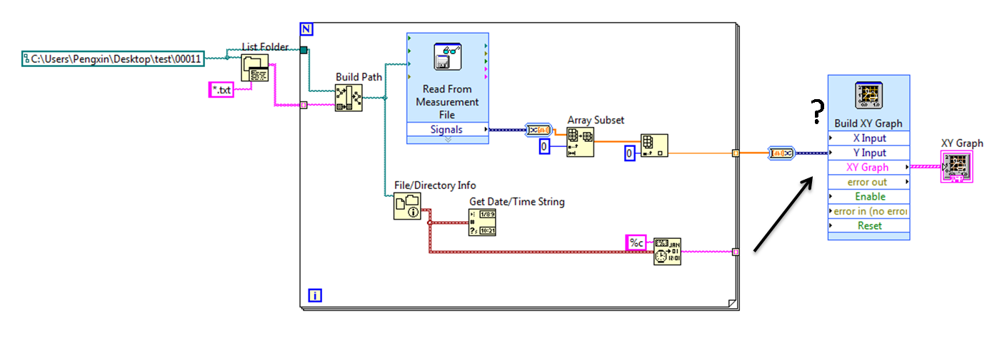
I wanted to plot out my data by looping all the text file in a particular folder. I am able to read all the data for the Y axis. Now i wanted to plot the X axis for each data point. The X axis data point will be retrieved from the time it is being generated.
I do not know how to input this information into the x axis of the XY Graph. Please help me on this
Please see the Picture Below
Thank you
Cheers
PX

01-26-2010 08:55 PM
That makes no sense. If you wire a graph directly to the signals output, you will display the data, including the x axis, that you saved. By converting to DBL, you are removing all of the timing information. An lvm file is just plain text. Open one with Notepad and see what's there. If you did not save the timing information when it was written, you won't have anything to read.
Post an example of one of your lvm files - a small example.
01-26-2010 09:58 PM
Hi
This is the LVM file i got from my measurement. I wanted to read this LVM.
01-26-2010 11:04 PM - edited 01-26-2010 11:07 PM
This is the code and the result. The x axis is wrong because of the localized time format difference.
There is a single result from 10 channels in there. Are you creating a new file each time you do a measurement?
01-26-2010 11:38 PM
Yes i am creating a new file after each measurement.
The scenario is that perhaps today i will do 5 measurement on a system. So 5 different LVM files will be generated after each measurement. Every week i will be doing 5 measurement. Therefore after 2 months, i would like to compile all the results over this 2 months period, to see its trend.
Ideally i wanted the y axis for each data point to be at the same interval, and at the bottom of the graph will show the date it is generated. The attached picture is the example that i drew out.
01-26-2010 11:55 PM
02-12-2010 01:54 AM
HI Dennis
I think there is no waveform component to be acquired , since i am not getting from a continuous data.
This is the scenrio
I have 5 LVM files in a folder. The date of each file is created in the following date : 28 Jan 2010, 30 Jan 2010,03 Feb 2010, 09 Feb 2010 ,12 Feb 2010.
Each LVM file has a value to be extracted out. Eg : 3 , 5 ,9 ,1 ,4
I am planning to plot out something like this : Each data point will be[ ( 3 , 28 Jan 2010 ), (5,30 Jan 2010) ..... ].
So i can see the trend of result as each day pass. It is similar to watching stock prices.
I am not able to convert the dynamic data to waveform data and i am still confuse about using timestamp and to be converted to DBL and used as the X axis.
02-12-2010 10:40 AM - edited 02-12-2010 10:41 AM
This is kind of what I had in mind. The waveform data type does not have to contain multiple points. In this case, it's just a different way to represent the evil dynamic data you are using.
Experiment a bit with the arrays that you get. You might need to transpose and/or extract a column. I don't have multiple files so that is up to you. I also did not convert the timestamp to dbl. That will also be up to you.

02-17-2010 03:56 AM
Hi Dennis
I manage to create it finally. Thank you very much. The first picture will be the VI i made.
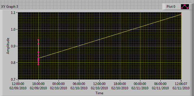
However, there is some improvement i would like to make. Looking at the 2nd picture, this is the result of the VI then i run. It can clearly display the result over time. If i had added one more data point which was taken another day ( Look at Picture 3, from 09 Feb to 11 Feb), then the the trend line will be compress to such and it will not longer be meaningful to user to see how the trend changes.
I want to ask whether it is possible to remove the interval between those data points, or saying that the interval between data point to be plotted out will be the same ; at the same time it still can show the time at the x-axis when this data point is generated.
Cheers
PX


