- Subscribe to RSS Feed
- Mark Topic as New
- Mark Topic as Read
- Float this Topic for Current User
- Bookmark
- Subscribe
- Mute
- Printer Friendly Page
Space between Y axis labels on XY Graph
Solved!07-13-2020 08:21 AM
- Mark as New
- Bookmark
- Subscribe
- Mute
- Subscribe to RSS Feed
- Permalink
- Report to a Moderator
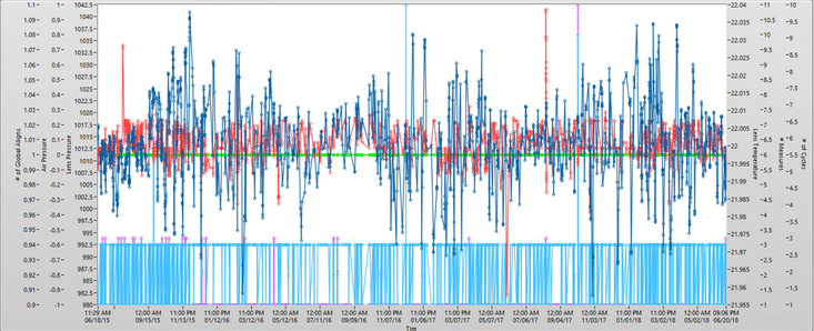
So I was wondering if anyone might be able to tell me why (and possibly how to fix it) there is a space between two of my Y axis labels on the XY graph? I believe I've checked all the formatting parameters in the drop down menus and all axis' are configured the same. Programatically, I'm only using the visible property node on each axis. Any ideas would be greatly appreciated.
Thanks.
Solved! Go to Solution.
07-13-2020 09:46 AM
- Mark as New
- Bookmark
- Subscribe
- Mute
- Subscribe to RSS Feed
- Permalink
- Report to a Moderator
I can create space between two Y axis, if the inner Y axis label has multiple lines.
Can you check if your label has any carrige return or line feed characters in it?
07-13-2020 11:49 AM
- Mark as New
- Bookmark
- Subscribe
- Mute
- Subscribe to RSS Feed
- Permalink
- Report to a Moderator
No returns in the lines. Actually the label used is from a pulldown menu so I used the same name in the menu to plot all 6 axis to rule grammar issues out.
07-13-2020 01:01 PM - edited 07-13-2020 01:01 PM
- Mark as New
- Bookmark
- Subscribe
- Mute
- Subscribe to RSS Feed
- Permalink
- Report to a Moderator
Save that graph in a separate VI (2017) and share with the class.
Test Engineer at Moog Inc.
Saying "Thanks that fixed it" or "Thanks that answers my question" and not giving a Kudo or Marked Solution, is like telling your waiter they did a great job and not leaving a tip. Please, tip your waiters.
07-13-2020 01:16 PM
- Mark as New
- Bookmark
- Subscribe
- Mute
- Subscribe to RSS Feed
- Permalink
- Report to a Moderator
Here ya go...
07-13-2020 01:18 PM
- Mark as New
- Bookmark
- Subscribe
- Mute
- Subscribe to RSS Feed
- Permalink
- Report to a Moderator
That appears to have been saved in 2018.
Test Engineer at Moog Inc.
Saying "Thanks that fixed it" or "Thanks that answers my question" and not giving a Kudo or Marked Solution, is like telling your waiter they did a great job and not leaving a tip. Please, tip your waiters.
07-13-2020 01:24 PM
- Mark as New
- Bookmark
- Subscribe
- Mute
- Subscribe to RSS Feed
- Permalink
- Report to a Moderator
Sorry about that.
07-13-2020 01:39 PM
- Mark as New
- Bookmark
- Subscribe
- Mute
- Subscribe to RSS Feed
- Permalink
- Report to a Moderator
As for how the space got there, I'm honestly drawing a blank. Tried a bunch of stuff to reproduce it on a new graph and couldn't. Silver controls and indicators have acted weird for me before, so who knows (probably at least one Knight of NI).
As for how to make it go away, hover over each of the y axes to the right of the space and right click -> Delete Scale. Then hover over the y axis that remains and right click -> Duplicate Scale twice. Then you can go about making things look nice and pairing axes with plots and such.
Test Engineer at Moog Inc.
Saying "Thanks that fixed it" or "Thanks that answers my question" and not giving a Kudo or Marked Solution, is like telling your waiter they did a great job and not leaving a tip. Please, tip your waiters.
07-13-2020 03:14 PM
- Mark as New
- Bookmark
- Subscribe
- Mute
- Subscribe to RSS Feed
- Permalink
- Report to a Moderator
So I started swapping axis around and it would just move the space to a different spot (very strange). I ended up right clicking on the graph and choosing Advanced --> Reset Scale Layout. It moved all 6 plots to the left side (just like swapping) but this time it removed the space? I swapped the 3 axis back and now the space is gone. Woohoo. Thanks for the help.
07-14-2020 12:38 AM
- Mark as New
- Bookmark
- Subscribe
- Mute
- Subscribe to RSS Feed
- Permalink
- Report to a Moderator
Hi Wayne,
@Wayne_CSE wrote:
I ended up right clicking on the graph and choosing Advanced --> Reset Scale Layout. It moved all 6 plots to the left side (just like swapping) but this time it removed the space? I swapped the 3 axis back and now the space is gone.
That's a problem of the graph indicators (IMHO): after customizing/editing them a lot (like creating and editing 6 Y axes) they tend to go insane. Sometimes it only helps to recreate the graph completely. This time it already helped to reset the scale layout…

