- Subscribe to RSS Feed
- Mark Topic as New
- Mark Topic as Read
- Float this Topic for Current User
- Bookmark
- Subscribe
- Mute
- Printer Friendly Page
Raltime XY Chart
02-03-2020 10:58 PM
- Mark as New
- Bookmark
- Subscribe
- Mute
- Subscribe to RSS Feed
- Permalink
- Report to a Moderator
I have 2 stream data set I want to plot these data into chart data1 on Xaxis and data2 on Yaxis, please advise to how to implement, thank you
02-04-2020 12:14 AM - edited 02-04-2020 12:15 AM
- Mark as New
- Bookmark
- Subscribe
- Mute
- Subscribe to RSS Feed
- Permalink
- Report to a Moderator
I suspect the problem you're having relates to your "2 stream data set"? If you have arrays, this is simple - bundle the arrays and connect to an XY Graph.
Perhaps you mean you're getting a subset of points each iteration of a loop, and you want to append these to a graph?
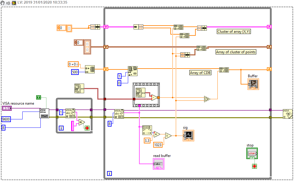
In that case, you can use one of 3(?) formats - an array of points (cluster of X and Y), a cluster of arrays (X array, Y array) or an array of Complex numbers (Re, Im).
The 3rd option is quite straightforward if you use the Build Array and Re/Im to Complex nodes.
A comparison of the methods can be seen here:

This was taken from another thread I answered, but hopefully it's clear that I have two individual DBL numbers (one for X, taken from the difference in time, and the other for Y from the string conversion over serial port) and I'm creating 3 different arrays on the Shift Registers (you only need to pick one of these options) and connecting it to an XY Graph (named Buffer).
You can get a link to the other thread if you're interested to read more by clicking on the image, and under the kudos/download buttons, there should be "publishing history" or similar. This thread and one other will be linked.
02-05-2020 10:22 AM
- Mark as New
- Bookmark
- Subscribe
- Mute
- Subscribe to RSS Feed
- Permalink
- Report to a Moderator
Are you confusing Charts and Graphs? In a Chart, the X axis is an implicit time axis, so you plot one (inor more) values on the Y axis, then move a fixed (dt) step to the right, and wait for the next set of data to plot. If you want to plot X-Y pairs, where both X and Y are independently specified, you need to use a Graph.
Bob Schor
