- Subscribe to RSS Feed
- Mark Topic as New
- Mark Topic as Read
- Float this Topic for Current User
- Bookmark
- Subscribe
- Mute
- Printer Friendly Page
Points in a frequency domain curve
05-27-2019 05:38 PM
- Mark as New
- Bookmark
- Subscribe
- Mute
- Subscribe to RSS Feed
- Permalink
- Report to a Moderator
Dear all,
I am learning labview and would like to make a graph about the frequency response of my sistem (experimental acquisition).
I am now using the subVI SPECTRSAL MEASUREMENTS to get the Frequency Function Response but seems there is a few points in my curve as one can see in figure attached. There is points from 5 to 5 Hz in frequency domain witch make me able to indentify only from 5 to 5 frequencies.
I would like to know how can i make to plot more points in a interval from 20 to 30 Hz in frequency domain (x lable).
one can also find main Vi and Sub Vi attached.
Thanks a lot,
Arthur.
05-28-2019 07:48 AM
- Mark as New
- Bookmark
- Subscribe
- Mute
- Subscribe to RSS Feed
- Permalink
- Report to a Moderator
Thank you for attaching your VI. It shows (among other things) that you are using LabVIEW 2017, and have configured the Dreaded DAQ Assistant to do continuous acquisition at 2.5 kHz, 500 points at a time. All of the data are being conveyed through Dynamic Data Wires, which have their own peculiarities.
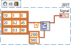
To figure out "how to do it in LabVIEW", it is often useful to start with a small, simple system that "does one thing" and figure out, using that as a test system, how to do what you want. I'm attaching a Snippet of a Signal Generator that creates a Waveform (a native LabVIEW Data Type, with its own Palette on the Block Diagram, much easier to use than the Dynamic Data Wire) consisting of three sinusoids (10 Hz, amplitude 1, phase 0; 20 Hz, amplitude 0.2, phase 45°; 30 Hz, amplitude 0.5, phase 90°) plus RMS 1 noise. I recommend that you use this signal (which you can modify to suit your needs, adding more frequencies, changing the frequencies, changing the sampling properties, S/N ratio, etc) and figure out how to create the frequency-domain curves you are seeking. Starting with something known and simple and then applying the known method to your larger problem should be helpful.

Bob Schor
