- Subscribe to RSS Feed
- Mark Topic as New
- Mark Topic as Read
- Float this Topic for Current User
- Bookmark
- Subscribe
- Mute
- Printer Friendly Page
Plotting actual measurement time with variable intervals
Solved!11-20-2017 02:32 PM
- Mark as New
- Bookmark
- Subscribe
- Mute
- Subscribe to RSS Feed
- Permalink
- Report to a Moderator
I have been playing around for a while trying to figure out how to plot (in real time) data taken at varying time intervals. The attached is what I came up with, using the loop counter as my data for ease of analysis. Essentially, I'm cheating by looping an array and creating a new plot every time. It seems like overkill but trying to do a waveform chart doesn't seem possible with sampling rates !=1, and waveform graphs do not plot in real time. Is there a better way to do this?
Thanks!
Solved! Go to Solution.
11-20-2017 02:45 PM
- Mark as New
- Bookmark
- Subscribe
- Mute
- Subscribe to RSS Feed
- Permalink
- Report to a Moderator
Checkout the sporatic waveform chart nugget by Crossrulz.
11-20-2017 04:12 PM
- Mark as New
- Bookmark
- Subscribe
- Mute
- Subscribe to RSS Feed
- Permalink
- Report to a Moderator
Very clever, Crossrulz -- Kudo from me!
Bob Schor
11-20-2017 05:20 PM - edited 11-20-2017 05:20 PM
- Mark as New
- Bookmark
- Subscribe
- Mute
- Subscribe to RSS Feed
- Permalink
- Report to a Moderator
It takes a little more time and energy but I find using an XY type chart with time as the x-axis is the best way to accomplish this, and any chart that needs time in the x-axis.
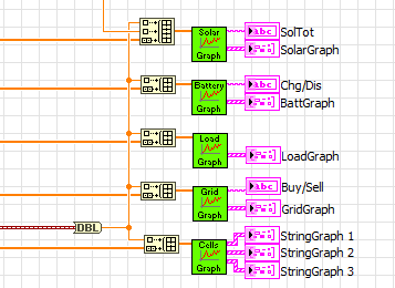
What I do is make all my graphs an "action engine" or "functional global", here's an example of a program that has several live graphs with time as the x-axis.
=== Engineer Ambiguously ===
========================

