- Subscribe to RSS Feed
- Mark Topic as New
- Mark Topic as Read
- Float this Topic for Current User
- Bookmark
- Subscribe
- Mute
- Printer Friendly Page
Plot graph -y values versus timestamp stored in txt files
04-01-2010 12:17 PM
- Mark as New
- Bookmark
- Subscribe
- Mute
- Subscribe to RSS Feed
- Permalink
- Report to a Moderator
Dear all,
i have a set of measurement results that i saved in text file. First and second column are timestamp values while third and fourth values are results from my two sensors. Mayi know can anyhow help to extract these results and plot them onto a graph or xy graph? I have problem plotting the timestamp results (x axis) onto the graph.
I have attach sample of the text files. Thanks for your help!
04-01-2010 03:16 PM
- Mark as New
- Bookmark
- Subscribe
- Mute
- Subscribe to RSS Feed
- Permalink
- Report to a Moderator
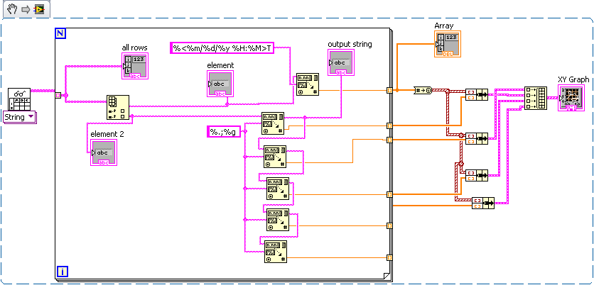
Maybe not an elegant solution but it works.

It is interesting that two different separators are used in your text file: space and TAB.
04-02-2010 02:13 AM
- Mark as New
- Bookmark
- Subscribe
- Mute
- Subscribe to RSS Feed
- Permalink
- Report to a Moderator
Dear sir,
Thanks for illustrating to me for the plotting. I got one question to ask. What does the string %.;%g means? I know %g but what does %.; means?
How should i modify the codes if let say i have more columns instead of only two columns of measurment data? I have 10 columns of data in the spreadsheet now. I tried to modify your existing codes for the 10 extra columns and it works but the code is quite lengthy as i have 8 more scan string icons.
Any elegant way to code it to make it shorter?
Thank you and i am glad if anyone can give some feedbacks.
04-02-2010 04:13 AM
- Mark as New
- Bookmark
- Subscribe
- Mute
- Subscribe to RSS Feed
- Permalink
- Report to a Moderator
Dear all,
Attached is the program i wrote for inclusion of 5 columns of data. I am wondering if i have more than 5 columns, say 50 columns of data. How can i write more efficient codes to cater for more columns of data? It will be quite lengthy program if more columns of data are present.
Anyone can assist on that?

04-02-2010 09:07 PM
- Mark as New
- Bookmark
- Subscribe
- Mute
- Subscribe to RSS Feed
- Permalink
- Report to a Moderator
04-09-2010 04:39 AM
- Mark as New
- Bookmark
- Subscribe
- Mute
- Subscribe to RSS Feed
- Permalink
- Report to a Moderator
Dear all,
I have the same set of data but it is saved in excel format instead of text file now. However i think the column data are separated by tab, i have tried to use the same code as above but it dont seem to plot out the graph properly. Can anyone help out?
04-09-2010 09:37 AM
- Mark as New
- Bookmark
- Subscribe
- Mute
- Subscribe to RSS Feed
- Permalink
- Report to a Moderator
04-09-2010 11:23 AM
- Mark as New
- Bookmark
- Subscribe
- Mute
- Subscribe to RSS Feed
- Permalink
- Report to a Moderator
