- Subscribe to RSS Feed
- Mark Topic as New
- Mark Topic as Read
- Float this Topic for Current User
- Bookmark
- Subscribe
- Mute
- Printer Friendly Page
Phase shift due to multiplexing/interchannel delay
02-24-2018 03:25 PM
- Mark as New
- Bookmark
- Subscribe
- Mute
- Subscribe to RSS Feed
- Permalink
- Report to a Moderator
I have spent many hours trying to fix this, and none of the solution that I have tried have worked. I have done the math to determine the constant phase shift that occurs due to the single A/D multiplexing 8 different channels using this guide:
http://www.ti.com/lit/ug/tidu427b/tidu427b.pdf
I am not using an NI DAQ. I am using the USB-231 from Measurement Computing. Here are the specs for the card:
Resolution: 16-bit
Sample Speed: 50kS/s
AI channels: 8 RSE, 4 DIFF
Analog Input Range: +/- 10V
Code Width: 305uV/LSB
According to the above guide, The phase shift due to multiplexing is:
phi_mux = (f_in/f_ADC)*360 = (60Hz/50kHz)*360 = 0.432 degrees
and so the maximum phase shift I should see from channel 0 to channel 7 is 7 times this value:
phi_mux_MAX = 7*phi_mux = 7*0.432 = 3.024 degrees.
Since I will be sampling 8 channels “simultaneously”, each channel must be sampled at 6.250kS/s (50k/8) . And if I want to view up to 2.5 periods of a 60Hz waveform, then I will need to sample 260 samples (6250k*41m). I have these parameters entered on the front panel.
I wanted to test and see if I could observe the phase shift values that I calculated above, so I measured the exact same waveform on all 8 channels and calculated the frequency, amplitude and phase of all 8 channels to observe the phase shift due to multiplexing(front panel.png). The measured values were almost spot on the the calculated values. Because of this, I was able to correct the phase shift NUMBER, but I don’t know how to correct it GRAPHICALLY.
I have seen so many solutions that state to fix this by determining what the fixed phase shift is and correcting for it. But I do not know how create a new graph with the corrected phase shift (mux phase.png).
Ultimately, I want to have a waveform graph that will display all 8 waveforms with the inter channel phase shift compensated. I need this to be very accurate so I can measure the phase shift of voltage and current waveforms within 1% accuracy.
How do I correct this graphically?
Attached is the VI im using (MultipleChannel.vi) It may not be much help since im not using an NI daq card.
Thanks,
JM
02-25-2018 10:00 AM
- Mark as New
- Bookmark
- Subscribe
- Mute
- Subscribe to RSS Feed
- Permalink
- Report to a Moderator
One suggestion, plot the data using waveforms, where you define t0, dt, and data. You can give each plot a slightly different t0 to account for the time/phase lag between them.
mcduff
02-25-2018 10:27 AM
- Mark as New
- Bookmark
- Subscribe
- Mute
- Subscribe to RSS Feed
- Permalink
- Report to a Moderator
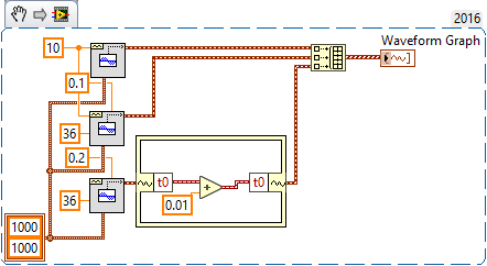
Go, McDuff! I read the question, thought briefly "How would I do this?", then read your suggestion and thought "That's much too simple!", but it works! If you plot a Waveform Graph, you need to turn off "Ignore TimeStamp" (which fooled me, at first), and I recommend plotting X as Relative Time.
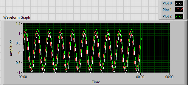
This Demo makes three Waveforms -- the Original, one with a phase of 36° (0.01 sec), and a third with the same phase but a t0 advanced by 0.01 sec. The second and third plots have been shifted up by 10% to avoid overlap.
@Jon -- please mark McDuff's reply as the Solution, as this is his idea (I'm only demonstrating to myself that it works!).
Bob Schor
02-25-2018 11:37 AM
- Mark as New
- Bookmark
- Subscribe
- Mute
- Subscribe to RSS Feed
- Permalink
- Report to a Moderator
Good suggestion by Bob Schor about ignore time stamp. I always roll my own cluster of t0, dt, and data and hardly ever use the “real waveform” cluster type. I would have completely missed that.
Mcduff
02-25-2018 05:44 PM
- Mark as New
- Bookmark
- Subscribe
- Mute
- Subscribe to RSS Feed
- Permalink
- Report to a Moderator
Well, I'm definitely able to adjust the phase by deselecting that remove time step option, but the graph is just "wacky" now. I want to be able to adjust how many periods that I can see at once. And I don't understand why the x-axis shows the same time everywhere? I want to be able to see the waveforms like you would on an oscilloscope..
02-25-2018 06:13 PM
- Mark as New
- Bookmark
- Subscribe
- Mute
- Subscribe to RSS Feed
- Permalink
- Report to a Moderator
I didn't notice the time scale. It's time, in hours:minutes:seconds format. One second = 0 hours:0minutes or 0:00. You can change the time base -- you need to understand how to handle scales on Charts and Graphs in LabVIEW.
Bob Schor
02-25-2018 07:35 PM
- Mark as New
- Bookmark
- Subscribe
- Mute
- Subscribe to RSS Feed
- Permalink
- Report to a Moderator
Here's the same code, but with the X-Scale in HH:MM:SS.
This even makes sense, as we generated 1 second of waveform ...
BS
02-25-2018 08:56 PM
- Mark as New
- Bookmark
- Subscribe
- Mute
- Subscribe to RSS Feed
- Permalink
- Report to a Moderator
Awesome. I'm going to have to do some research on graphs and charts for my application. I will be reading in data constantly, not a fixed number of data points. And I need the graph to refresh accordingly. I don't really want the waveform to be moving either. I want it fixed in one spot like an oscilloscope that is triggering a waveform, but I may have to live with it.
02-26-2018 07:46 AM - edited 02-26-2018 07:54 AM
- Mark as New
- Bookmark
- Subscribe
- Mute
- Subscribe to RSS Feed
- Permalink
- Report to a Moderator
Capture more data, use the basic trigger level detection vi and use that information to scale your graph x-axis ..
(or while you correct the t0 timestamp anyway, add (or better substract;) ) the triggerposition)
Henrik
LV since v3.1
“ground” is a convenient fantasy
'˙˙˙˙uıɐƃɐ lɐıp puɐ °06 ǝuoɥd ɹnoʎ uɹnʇ ǝsɐǝld 'ʎɹɐuıƃɐɯı sı pǝlɐıp ǝʌɐɥ noʎ ɹǝqɯnu ǝɥʇ'


