- Subscribe to RSS Feed
- Mark Topic as New
- Mark Topic as Read
- Float this Topic for Current User
- Bookmark
- Subscribe
- Mute
- Printer Friendly Page
Lining up zero position on graphs with multiple scales & auto scale
Solved!10-26-2011 10:54 AM
- Mark as New
- Bookmark
- Subscribe
- Mute
- Subscribe to RSS Feed
- Permalink
- Report to a Moderator
Hello!
I'm hoping this is a quick one - but google searches and browse of the forums turned up nothing.
I have a graph with two scales - one for position and one for velocity (which can obviously differ significantly from each other). What I want to be able to do is to have the graph/scales auto-scale - but for the 0 position to remain in the centre of the graph. With the 0 point of the scales in different places it makes the graph very difficult to understand at a quick glance.
If you see the attached screenshot - the two 0 positions are in different places.
Is it possible to have auto-scale, but for the zero to stay in the centre of the graph for both scales?
Many thanks in advance,
Sam
Solved! Go to Solution.
10-26-2011 12:12 PM
- Mark as New
- Bookmark
- Subscribe
- Mute
- Subscribe to RSS Feed
- Permalink
- Report to a Moderator
No. I'd be freeking if I ws the devloper that had to code that.
Work-around....
Shut-off auto-scale.
Before each update, defer FP updates.
after each update do a "Autoscale once now" and then get the max and min an whichever is large set it for the max in the other direction.
underfer updates.
lather rinse repeat.
Ben
10-26-2011 01:05 PM
- Mark as New
- Bookmark
- Subscribe
- Mute
- Subscribe to RSS Feed
- Permalink
- Report to a Moderator
(As far as I know) you can't do it with Auto-Scale.
Turn off autoscale, then manually set the range to be symmetrical about zero for each scale.
Find the maximum of the absolute value of each plotted array. Then set the range to + and - this value. (in the example below, I made it a loose fit by multiplying by 1.1). Since you have more than one Y-axis scale, you have to loop through to address each one at a time. First you have to tell it which Y scale you're setting, then, set the values.
Another option would be to have the zeros line up, but not have the scale be symmetrical around them. You can do that too, it just takes a bit more math. Let me know if that's what you'd like.
10-26-2011 01:13 PM
- Mark as New
- Bookmark
- Subscribe
- Mute
- Subscribe to RSS Feed
- Permalink
- Report to a Moderator
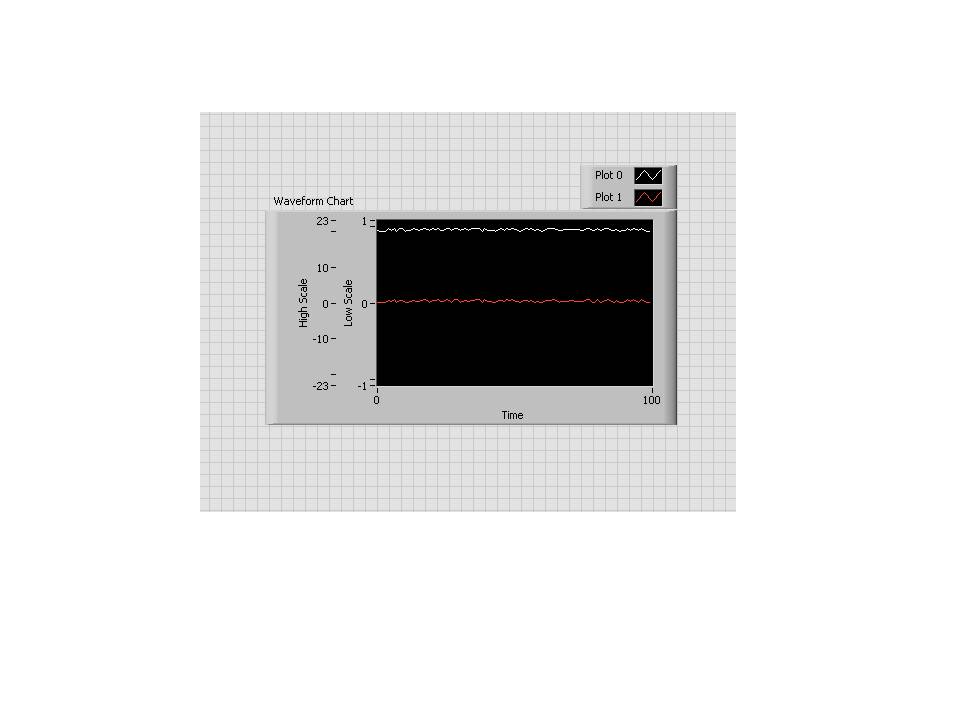
Oops, hold on a second. Now that I look at this, it doesn't quite look right. I got one scale to go from -23 to +23, and the other to go from -1 to 1... and the zeros line up, just like you wanted....
But the graphs themselves don't look right. The white line should look flatter than the red line because it's got the same amount of randomness, but is plotted on a larger scale.
Give me a couple of minutes to get that sorted out.
10-26-2011 01:17 PM
- Mark as New
- Bookmark
- Subscribe
- Mute
- Subscribe to RSS Feed
- Permalink
- Report to a Moderator
10-26-2011 01:22 PM
- Mark as New
- Bookmark
- Subscribe
- Mute
- Subscribe to RSS Feed
- Permalink
- Report to a Moderator
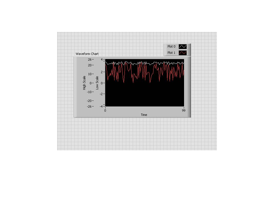
That does make a bit of a difference, doesn't it? :manwink:
Here we have two plots. Each is the same random signal from 0 to 4. One of them has been shifted by +20. The scales line up at zero, and the red one appears wider because it's plotted on a smaller scale.


