- Subscribe to RSS Feed
- Mark Topic as New
- Mark Topic as Read
- Float this Topic for Current User
- Bookmark
- Subscribe
- Mute
- Printer Friendly Page
How to make waveform chart lines less steppy WITHOUT using a lot of interpolation maths
Solved!09-12-2009 11:53 AM
- Mark as New
- Bookmark
- Subscribe
- Mute
- Subscribe to RSS Feed
- Permalink
- Report to a Moderator
So I use a waveform chart, the sensor inputs numbers in sequence like this, 22,23,24,25.... the graph looks steppy. The (picky) customer said hey i want a smooth graph, do you have spline function or something?
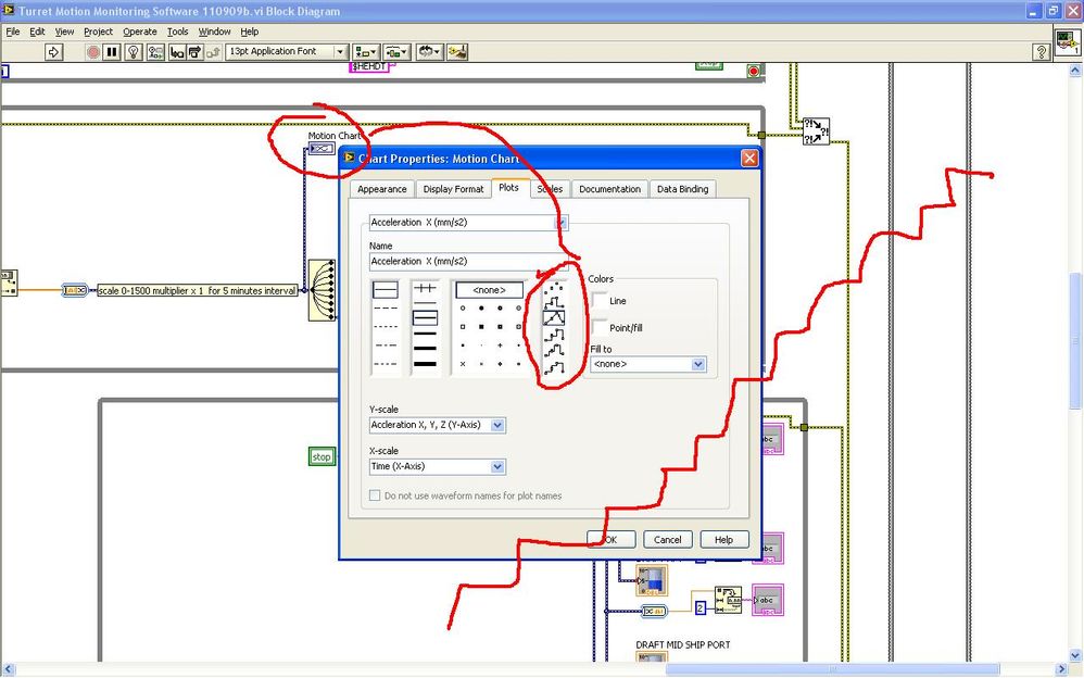
So i was searching searching the chart properties and i only saw the settings below that doesnt help much. I suggested to (picky) customer that hey maybe we can make the Y scale larger so the staircase lines wont look so obvious, the (picky) customer said no. So i was sweating about the tedious mathematics required for interpolation in the hot and noisy oil tanker without internet, luckily the evening bell rang.![]()
Now is there some function blocks that makes the chart lines smooter, some spline function or something? Thanks.
Solved! Go to Solution.
09-12-2009 01:02 PM - edited 09-12-2009 01:04 PM
- Mark as New
- Bookmark
- Subscribe
- Mute
- Subscribe to RSS Feed
- Permalink
- Report to a Moderator
Hi sunflower,
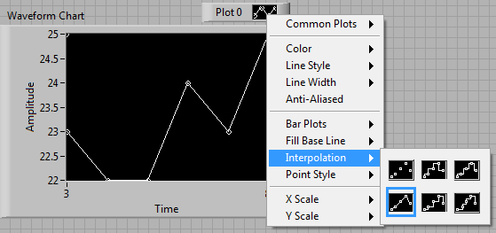
with your example values and the setting shown in the picture you should get a straight rising line ![]()
Using the "straight line" interpolation instead of the "steppy" options should be ok!
Can you show a picture of the graph/chart with some real data, where your customer complains?
Edited:
If the data changes only in steps (maybe because of limited resolution) you can apply a running average to smoothen the line.
09-13-2009 08:38 AM
- Mark as New
- Bookmark
- Subscribe
- Mute
- Subscribe to RSS Feed
- Permalink
- Report to a Moderator
If I understand you correctly, your sensor puts out integers (22, 23, 24...).
So, does the default interpolation not work for you?
Anything else is phony data. A running average makes it smoother, but the peak at 24 above will not reach 24, etc., etc.
A spline will make it smoother in places and uglier in places.
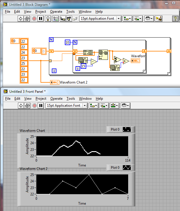
You could try oversampling by 10x and doing a running average of say 15 samples.
Here's an example of that:

Culverson Software - Elegant software that is a pleasure to use.
Culverson.com
Blog for (mostly LabVIEW) programmers: Tips And Tricks
09-13-2009 12:35 PM
- Mark as New
- Bookmark
- Subscribe
- Mute
- Subscribe to RSS Feed
- Permalink
- Report to a Moderator
Please show us an actual picture of the front panel showing the offending display. (Or even better, attach a simplified VI containing some real data. e.g. run the VI to see data on the graph, copy the graph to a new VI, make the graph data the default, save the new VI and attach it here)
What kind of data is this? Are you seeing steps because of limits in the digitizer resolution?
09-13-2009 11:11 PM - edited 09-13-2009 11:17 PM
- Mark as New
- Bookmark
- Subscribe
- Mute
- Subscribe to RSS Feed
- Permalink
- Report to a Moderator
Hi guys
Attached vi chart and image.
09-13-2009 11:17 PM
- Mark as New
- Bookmark
- Subscribe
- Mute
- Subscribe to RSS Feed
- Permalink
- Report to a Moderator
09-13-2009 11:42 PM
- Mark as New
- Bookmark
- Subscribe
- Mute
- Subscribe to RSS Feed
- Permalink
- Report to a Moderator
sunflower2772 wrote:Attached vi chart and image.
Looks like some of your data is quantized dues to limits in resolution of the DAQ. This is not an interpolation issue, because there are consecutive equal values between the jumps.
Can you tell us a bit more about your hardware? Where is the data coming from? Maybe you need a digitizer with more bits, maybe you can adjust the voltage range.
09-16-2009 09:03 PM
- Mark as New
- Bookmark
- Subscribe
- Mute
- Subscribe to RSS Feed
- Permalink
- Report to a Moderator
09-16-2009 11:47 PM
- Mark as New
- Bookmark
- Subscribe
- Mute
- Subscribe to RSS Feed
- Permalink
- Report to a Moderator
So your data is quantized to the integer level.
I'm not clear which of the plots you showed in your big screenshot you are not happy with. Which of the plots is this 23, 24, .... 10Hz data?
And you still haven't post a VI with all the front panel data saved as default as Dennis as asked.
09-17-2009 12:00 PM
- Mark as New
- Bookmark
- Subscribe
- Mute
- Subscribe to RSS Feed
- Permalink
- Report to a Moderator
sunflower2772 wrote:The data coming is from a RS232 10hz with just ascii numbers like 23, 24,...
One place where I see steps is for "surge", but these are not integers, but steps of 1/100. Since this is realtime data, you can only do e.g. filtering to smooth out the things, leading to a distortion. For interpolation, you would need to be able to look into the future, which is difficult with current technology. 😉
Of course there are ways to extrapolate based on existing data and graph interpolated+extrapolated data by rewriting the chart history as new data arrives, but that seems clunky.


