From 04:00 PM CDT – 08:00 PM CDT (09:00 PM UTC – 01:00 AM UTC) Tuesday, April 16, ni.com will undergo system upgrades that may result in temporary service interruption.

We appreciate your patience as we improve our online experience.

LabVIEW Idea Exchange

Community Browser
cancel
Showing results for 
Search instead for 
Did you mean: 
Post an idea

I would be nice if the Clear Error primative was modified so that it's icon was not the full subVI size, but rather smaller which would help to keep the block diagram neat and clean.


Proposed Clear Error Modification.png

I work with large projects.  And I often need to move items around in my projects.  However...  while you're dragging an item in the Project Explorer, if the cursor is at the top or bottom of the visible area, the window does not scroll.  This means that the item you're moving, and its destination, must both be visible at the same time in order to drag and drop it.


I regularly have to un-expand items in order to be able to simply move a file.  This is time consuming and forces me to un-expand tree items that I would prefer to keep expanded.

We've all seen it: The annoying 1-pixel bend when wiring between VIs with mismatched connector panes. Many ideas have been proposed to address this on a small scale... But I think it can easily be improved on a much larger scale.


IDEA:

Modify the way the 5335 connector pane is rendered so that the top and bottom terminals line up with those of the standard 4224 connector pane.

connectorpanes.png


In case the image doesn't say it all, all I'm proposing is that the top-left terminal of the 5335 connector is made 1-pixel larger by stealing 1-pixel from the terminal below. Likewise for the top-right, bottom-left and bottom-right.


The obvious benefit is that it becomes much neater to wire errors and references between mismatched VIs. Goodbye OCD! Smiley Very Happy

Originally suggested by RavensFan.


LabVIEW scripting makes it possible to automate repetitive tasks in LabVIEW, but it is often difficult to find the properties and invoke nodes to accomplish the task. It would be great to have a recording feature that watches what you do in LabVIEW, and then generates the corresponding code for it. I'm sure the engineers at NI could design it much better than any more specific ideas I could throw out, so I will leave the rest up to them. 

For reasons outlined in detail in this idea, the the expression node should be redesigned. These vertical lines are too thick and the end arrows are pointless and too busy.


After all, the expression node is basically a [single line|single variable] formula node and for this reason it should look more similar to a formula node.


Here is my suggestion for the redesigned expression node (on the right). The current design is shown on the left for comparison.


Note that the grey left and right borders are exactly matched to the border design of the formula node, making things consistent and intuitive. (Top and bottom should remain single pixel to save diagram space). 


While I have many, one of my major gripes with LabVIEW is that it's very easy to have dozens of open windows.  This would normally not be a terrible burden, but LabVIEW has a bad habit of raising ALL open LabVIEW Windows when any single one is given focus.


For example, if I have both the front panel and block diagram windows of 3 VIs, a project window, the VI palettes, and a ctrl+h help window open, then clicking any one brings all 10 windows to the front.  This is a problem if, for example, I'm trying to draw an icon based on some source image from Google image search.  I am forced to maneuver all LabVIEW windows and the browser window such that the two things I actually want are both visible at the same time.


To get around this, and other difficulties introduced by the huge numbers of windows that labview is fond of creating, I propose this idea based on the relatively recent addition of a "Single Window Mode" to the open source photo editor Gimp (http://www.gimp.org).


In the original Gimp UI, each open image occupies a unique window.  Additionally, the toolbox and other dialog windows (layers, brushes, etc.) occupy unique windows as well.  This, to me, is remarkably similar to the LabVIEW UI.


gimp multi window.jpg


In Gimp's Single Window Mode, the toolbox and any open dialogs can be locked to one side of the screen and each open image is in a tab.  (Note that this is strongly influenced by Photoshop's UI.)


gimp single window.jpg


I would like to see something very similar to this for labview.  In this concept, each open VI would occupy a tab (perhaps split vertically into front panel and block diagram) and open dialogs (such as VI palette, ctrl+h help window, navigation window, project explorer, etc.) could be docked to the screen edges.  Here is a rendering of such a concept.


labview single window.jpg


I would note that most text IDEs (such as Eclipse, Visual Studio, etc.) use a very similar paradigm (ie lots of source files open in tabs, project viewer, find+replace, etc locked to screen edges).  Clearly more thought would have to be given to how front panels are displayed, e.g. outside of a labview development environment, but I feel that this concept would be a dramatic improvement for the development task.


(Unless it's already changed in newer LV's, i'm on 2011 right now)


When opening the connector pattern, the current isn't marked in any way. If i'm after some extra connectors or a symmetrical one (why do people choose 3-1-1-1?) it'd be nice to quickly see where to start looking. A simple bold outline would suffice, maybe in blue?


ConnectorPane.png


/Y

1. Allow for "Tabbed Browsing" of VI's to better manage windows.

2. Allow for the BD to be open independent of the FP.

3. Allow dockable palettes... dock to either the edge of the screen, or to the top bar (pictured below) of LabVIEW.

4. As a bonus, consider being able to open PDF's, txt's, and html's in tabs also for Help and documentation.

5. Finally, allow the project tree to be docked into the IDE.


Please, add your own IDE upgrade ideas in this discussion - illustrations will be especially helpful here. If it's a major enough idea, create a new idea!


LabVIEW2010.png

Edit >> Create SubVI:  I almost never use this function... but it could be so nice!

Imagine being able to develop code on some diagram, check functionality in line, and quickly generate a subVI.  We're so close with "Create SubVI", but in 7+ years, I've never really used it.


Suggested Tweaks:


1) Use default connector pane (12 terminals)
2) If there are error clusters, wire them to the bottom terminals.
3) If there are error clusters, auto create a case structure and put the code in the No Error case.  Wire the error cluster through the Error case.
4) If there are in and out references (e.g. File In, File Out), wire these to the top terminals.
5) Run Clean Up Diagram.

Searched and didn't find this.  I know you can format the text manually.  Comments should be colorized automatically.


formual node.png

The Timing palatte is looking bad with all thes gaps.  A simple fix would be to fill these holes with useful functions. I'm proposing 3 and attaching 2 from my re-use code. (I may re-create the third later)

timing2.PNG


Time to XL.vi (Attached): and its inverse, XL to Time.vi

12:00:00.0 AM Jan 0, 1900 is a pretty common epoch (Base Date) for external programs and converting from LabVIEW epoch shows up several times a year on the forums. and Time to excel has a few solutions to threads under its belt.   Moreover for analisys against external data from other enviornments you are often using Access, Excel, Lotus... All share the same epoch (and Leap year bug) in their date/time formats.  These vi.s have been pretty useful to me although the names may change to avoid (tm) infringements


Time to Time of Day.vi (Attached) has also been in my arsenal and proves both valuable and get on a few threads per year on the forum.


The gaps in the palatte make it a perfect fit

timing.PNG

Download All

I just finished installing LV15 (and device drivers) on a new PC and I think the installer window could use an upgrade.

When expanding the different features you can install beyond 2-3 levels, they disappear out of the narrow tree-area. 


It would be awesome if I could then just resize the entire installer and it would grow the tree (and description) so I didn't have to use the little horizontal scrollbar


installer with 3 levels expandedinstaller scrolled to the right

I would love it if the Call By Reference node had a "don't wait until done" option, so that we can stop using the inconvenient and inelegant Set Ctl Val method or other inconvenient ways to pass arguments to dynamically called processes.


I believe the main issue with this is what to do with the outputs from the subVI (since you won't be able to use them) and I can think of two options:


1. This option would be settable at edit time and would break the caller if you wire any of the outputs.

2. This option would be settable at run-time and you would get default data from the outputs and an error or warning from the error out terminal of the node if you wire any of the outputs.

I find the Example Finder to be a terrible eyesore.  Really.  It's to the point that I don't even like to open it up--I'd rather type in search terms on the NI Community and hope someone has posted the code there, or some similar code.


Example Finder Scrolling.gif


My major beefs with Example Finder:


1. Line spacing is inconsistent.  Some examples have long titles that extend onto a second line, some don't.  (See green in image.)  I would prefer to use the horizontal space on my monitor by resizing the window horizontally, so that everything fits on one line.


It's nice the word order is consistent among examples.  However, it's not that helpful because we can't make use of this consistency by resizing the window.  For instance--your eyes will dance around trying to find the differences between these next four DAQmx examples:


Cont Acq&Graph Voltage- Int Config

Filter- SCXI114x.vi

Cont Acq&Graph Voltage- Ext Clk- Dig

Start.vi

Cont Acq&Graph Voltage- Ext Clk.vi

Cont Acq&Graph Voltage- Int Clk-

Accessory Status-PXIe-4300.vi


Now, watch how it all becomes much more clear when you allow the window to stretch out, so there's one example per line:


Cont Acq&Graph Voltage- Int Config Filter- SCXI114x.vi

Cont Acq&Graph Voltage- Ext Clk- Dig Start.vi

Cont Acq&Graph Voltage- Ext Clk.vi

Cont Acq&Graph Voltage- Int Clk- Accessory Status-PXIe-4300.vi


2.  Lots of scrolling to compensate.  Before I open an example, I try to glean some information from it by reading the "Information" section--but it's hard to keep track of things with all the scrolling (see red in the above image).


To minimize scrolling, we should have flexible sub-windows within the main Example Finder window.  Maybe I would want to give the majority of the window room to example VI titles, and less room to that huge "LabVIEW Zone" image I never click on.  Or maybe I'd minimize the extensive list of hardware the examples pertain to, and give more horizontal room to the "Information" column in the upper-right.  The point is, however I resize the Example Finder for my use, it should stay that way every time I load it up.


Resizing sub-windows


Here's hoping!  Please let me know what y'all think.

This is a very simple improvement, since the features are almost there. I want the block diagrams look like an electric diagram, that is: Controls aligned to the left, with the labels on the left of the control and the indicators moved to the right with the labels on the right, like this:

Wish.png


The problem is that in current LV versions the alignments occurs on the labels as well, making look the diagrams like this:

Current.png


Normally you should: 1) align labels relative to the object and 2) align the objects (without the labels) relative to the block diagram. This kind of cleaning up saves a lot of space and clutter.


Now I am pushing my luck, but it would even be better if I could have these settings on SubVI's only, because I usually don't want this in my main.


Good luck 


One of the biggest deterrents for learning is lack of organization.  LabVIEW examples in the Example Finder are currently only half-organized.  There's a directory structure--and that's great--if I need to find a data acquisition or generation task example, I can pretty easily think through the directories:


Hardware Input and Output >> DAQmx >> Analog Measurements >> Voltage


But here's where I have to stop and REALLY search.  Not only is it hard to read through the examples (see my other idea about Resizing Example Finder), but the slew of examples make no sense in order of complexity.  The Example Finder currently appears to only organize examples based on alphabetic order.


For instance, take a gander at the following laundry list of DAQmx >> Analog Measurement >> Voltage.  I marked in blue the first five examples I would recommend to a new user, in the order I would recommend them.
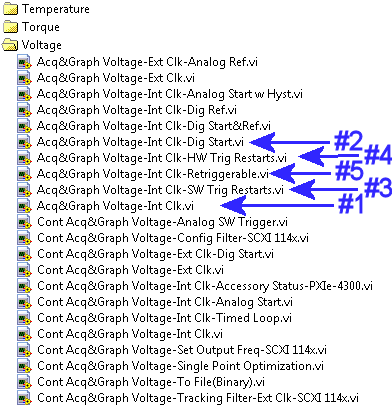
 

Organizing Examples.gif


How would a new programmer ever be able to get started with those so well hidden?  I have a lot of people who ask me exactly that: "I know I just need an example, but I don't know which one!"  From a customer support perspective, I have to say a lot of time spent and confusion revolves around finding a good, pertinent example


So here's what I recommend::


Reorganize all the examples in order of increasing complexity.  How do we define increasing complexity?  Well, the DAQ and Signal Conditioning Course already has it hammered down pretty well for DAQmx:

1. We start with just a Finite Acquisition with an internal clock--the most basic acquisition

2. Then, we add a little complexity with a trigger

3. We add a little more complexity by showing how to simulate a trigger in software

4. We add a little more complexity, doing the same thing in hardware-timing

5. And so on until the very end, when we look at very special-case, fancy examples which are supported by specific hardware, and which require specific property nodes to manipulate the behavior.

6. When we've exhausted the subject of Finite Acquisitions with triggers, we move on to Continuous Acquisitions with triggers in another sub-topic of the lesson.  Again, we build up from simple to complex.


Not only would this simple re-ordering help new learners, but it helps re-learners who have taken a DAQ class and have forgotten which example to start with (which happens all the time).  Let's be honest--it's VERY difficult to remember everything you've taken in any class.  We should do a better job to marry coursework (customer education courses) with homework (Example Finder).


It would also be of benefit if we added some extra directory structure to examples--such as Finite vs. Continuous and Internal vs. External clock in the case of DAQmx examples.  It is of really no benefit to have all these examples run together, as they are now.  New programmer or experienced programmer, a long list format with a lot of reading just gets confusing.  Technically, I believe anything over 7 items is about the limit for grasping new concepts.  Beyond 7 items, an average learner will be overtaxed and/or lose interest.  Besides--adding some extra descriptive folders would help a budding programmer to identify abbreviations like "Int Clk" with "Internal Clock".
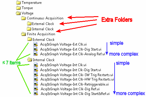
 

Organizing Examples Folders.gif


From my digging, it looks like the examples that are in the most dire need are DAQmx, SVXMPL (Sound & Vibration), and everything in LabVIEW Fundamentals. The CAN, RIO, and FPGA examples are actually organized a little better, but could still use some work organizing from simple to complex instead of alphabetically.


This is a relatively easy project an intern could do, but it would be a huge help getting new programmers through the LabVIEW learning curve.

NXG needs an Idea Exchange.  The feedback button is a lame excuse for a replacement.  Why?


  • I can't tell if my idea has been suggested before.  (And maybe someone else's suggestion is BETTER and I want to sign onto it, instead.)
  • NI has to slog through bunches of similar feedback submissions to determine whether or not they are the same thing.
  • Many ideas start out as unfocused concepts that are honed razor sharp by the community.
  • This is an open loop feedback system.

Let's make an Idea Exchange for NXG!

When creating a control or indicator based on a subVI terminal or strict typedef, formatting (speicifically the radix) is preserved.  However, when creating a constant from the same source, the format is removed.  This can cause incorrect behavior to inadvertantly be implemented when dealing with components that use Octal or Hexadecimal, as incorrect values can be input under the assumption of the correct formatting.


radix.png


Instead, block diagram constants should display the same behavior as controls and indicators, and maintain the correct radix/formatting when created from an existing source.


As outlined in this post, the current identical look of the Expression Node and Convert Unit can cause serious miscommunications, since their functions are completely different.


I suggest that they are made to look different so we can tell immediately what we have.


For example the two results below are very different, even though the code looks absolutely identical if the labels are hidden.


One possibility would be to make "convert unit" a different default background color (example shown below), but there are probably even better suggestions. How about rounded corners (not shown)?


I really like this idea: https://forums.ni.com/t5/LabVIEW-Idea-Exchange/Regular-Expression-search-in-Maps/idi-p/3934993

But as so often there are only a few Kudos - probably because it's a very special feature not needed by many programmers.


I'd like to suggest also to add a function (or option) for a case insensitive search for string keys as first and easy to use implementation. As second I also hope for the regular expression search.