LabVIEW Idea Exchange

cancel
Showing results for 
Search instead for 
Did you mean: 
tst

Show hidden controls as "ghosts" in edit mode

Status: Completed

The ability to show hidden controls at edit time has been implemented in LabVIEW 2021.

I occasionally hide controls on my FP and control their visibility programmatically during the execution of my program. The problem is that if I edit my UI and the control is hidden, it's very easy not to be aware that it's there and to accidentally overlap it, hide it or even move it off the screen.


To solve this, I usually try to save the VIs with all the controls visible, but that's not always feasible.


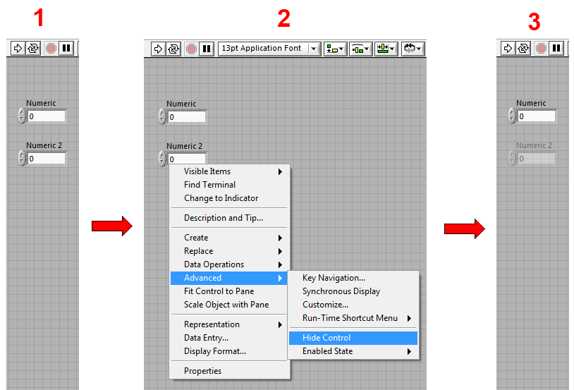
A better solution - LabVIEW should always show hidden controls in edit mode. It should just have some way of differentiating them from visible controls. This mockup shows them as ghosts, but it can also be any other solution:


20779iD19E3A04FFDC0A31


In run mode, of course, the control would not be shown. This is similar to the black border you get when objects overlap a tab control.


___________________
Try to take over the world!
47 Comments
AristosQueue (NI)
NI Employee (retired)

> I really like this idea.  I personally don't see the need for the toggle in edit mode.  The trick will be the appearance/color in edit mode.  I don't think
> that the greyed out look is the best. I was thinking a color that sharply contrasts with the background it appears on.  Not sure how this would

> affect color blind users so it probably needs some texture/dashed lines as well.


The grayed out effect bothers me because it looks like a disabled control, which is a perfectly valid UI state for a control. There's another UI element that we already have that might work as an analogy: the drop shadow for one control overlapping another. That shadow only draws in edit mode, not run mode. Perhaps with hidden controls, they could draw with some sort of glyph or halo or something like that instead of graying out the control itself -- something that you wouldn't mistake for an actual visible control. Thoughts?


Another point about this feature: It would help dramatically with the problem of Move Forward and Move Backward when controls are hidden -- did a user intend to do the zplane reordering taking the hidden controls into account or not? LV has one particular behavior, but it takes some work to figure out what our behavior is. With this feature, that would be clear.

elset191
Active Participant

@Aristos wrote:

The grayed out effect bothers me because it looks like a disabled control, which is a perfectly valid UI state for a control.


I was going to post about this earlier that the control is transparent, and not greyed out (notice you can see the grid), so it would be enough distinction.  Then I realized if the transparent control is on a tab structure or something there is no grid so it would look exactly the same.


So, yes, some other sort of distinction ought to be made.


--
Tim Elsey
Certified LabVIEW Architect
tst
Knight of NI Knight of NI
Knight of NI

I should point out that the original mockup does not have the control greyed out, but rather semi-transparent, although I agree that the difference in the mockup is too subtle for mainstream use. Like I said in the original idea, other options are certainly welcome, but I would leave it to LV R&D to try different options and see what they look like. The drop shadow is an existing convention, but it's quite obtrusive (which this specific feature does not need to be) and might make manipulating stacked controls harder.


Also, ideally I would like to see this concept extended to cover all the cases where the run-time appearance hurts edit-time usability, like the invisible splitters idea I linked to.


___________________
Try to take over the world!
JackDunaway
Trusted Enthusiast

Maybe there doesn't need to be a distinction: use CTRL+M to toggle in and out of Run/Edit mode. The muted transparent controls would properly disappear, and the Greyed and Disabled would look the same.

Ray.R
Knight of NI

Oh yes...  This is a very good suggestion.


I do not typically hide controls, well.. maybe occasionally, in a special case that I won't go into (probably glad I'm sparing you another long story)  😉

I do see many people doing this and it is annoying to debug.  Even when trying to help someone on this forum, and they hide controls.


I like the idea that the controls or indicators would be greyed out while editing the code.


Mr B.
Member

That looks like "disabled & grayed out", just behind the grid. But the grid is optional. If you turn it off, you would not see any difference. A colored version of "disabled & grayed out" would be helpful to see the difference. Anyway, there are some controls I want to hide totaly. No need for some Clustosaurs to be visible while editing. I would prefer a solution which can be toggled on/off globaly via shortcut while editing the frontpanel.

AristosQueue (NI)
NI Employee (retired)

> No need for some Clustosaurs


You're right. Clustosaurs should be extinct. Make it a LV class, or even a class hierarchy. 48x48 pixels... or, in the words of the Genie: "Phenomenal  cosmic power... itty bitty living space."

chembo
Active Participant

I like it. I'm working right now on a GUI with a lot of hidden controls, so it will be really useful. And a toggle option will be also nice.

TimmTheEnchanter
NI Employee (retired)

Ditto, I think you should be able to toggle this option.

National Instruments
Darin.K
Trusted Enthusiast
What if the effect, grayed out or otherwise only appeared with the move tool selected. You can see everything while dragging around, or manually select the tool. I guess you miss out on interacting with a hidden control, but the next time I do that will be the first.