From 04:00 PM CDT – 08:00 PM CDT (09:00 PM UTC – 01:00 AM UTC) Tuesday, April 16, ni.com will undergo system upgrades that may result in temporary service interruption.

We appreciate your patience as we improve our online experience.

LabVIEW Idea Exchange

cancel
Showing results for 
Search instead for 
Did you mean: 
Darren

Key Focus Surrounding Border - Let's Get Rid of It!

Status: New

I really, really don't like this behavior:
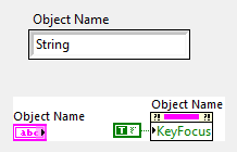
 

key_focus_border.png


Whenever you use the KeyFocus property, or simply the tab key on a running VI, whatever control has key focus gets that ugly black border around it.  Can we just eliminate this feature, or at the very least, have the ability to disable it?  The border doesn't appear on System-style front panel controls, but it does for anything else.  I've written all sorts of hacks over the years (the latest being in Quick Drop) where I have to figure out a way to hide that ugly border when a control gets key focus.

18 Comments
Darin.K
Trusted Enthusiast

Color your FP black, problem solved.

altenbach
Knight of NI

Maybe allow setting the key focus frame color dynamically, with transparent being one possibility.


It should also more closely resemble they key focus look and feel of the OS (e.g. when tabbing through a windows dialog.)

CrystalTech
Member

How about we ask NI for the source code for Labview and fix all the front panel issues they should have been doing for the last ten years (yeah, right!).

I agree with Darren.  NI needs to fix the Front Panel issues.  There have been too many years of users kludging controls, or putting up with the limitations and style.  NI needs a new team of developers dedicated to the front panel.

shb
Active Participant
Active Participant

Setting the color dynamically (or at least in the config file) would be a good solution. Setting the size would be nice too. Some users want to see the frame.

JackDunaway
Trusted Enthusiast
altenbach's idea is where my vote goes.
shb
Active Participant
Active Participant

Maybe SetKeyFocus should be a Method with an argument named border or highlight.

PJM_JKI
Member

I wish I could vote for this more than once as I am working on one of these "Ugly Hack".


vipm.io | jki.net

AristosQueue (NI)
NI Employee (retired)

I'm open to the idea of making this customizable on controls, so that you can put a pretty highlight on it instead of just the black box, but I want it to be difficult to make it go away entirely. "What?!" I hear you say. Yes. Difficult. Keyboard focus highlights are a critical part of making an app that can be navigated by keyboard, and I'm getting sick to death of web sites and shareware apps that eliminate the keyboard focus rectangles. It sacrifices usability in the name of aesthetics. Tell the UI designers to find a way to make these rectangles look elegant within the system. Do not eliminate them.


Oh, and add them to the System style controls. That would actually make them behave *more* like the controls that actually ship with the operating systems (Mac and Windows, anyway).


(PS: The same goes for the underline on hyperlinks. Draw the underline! Don't make me guess what is a link and what is just pretty colored text. And this goes double for any designer who tells me "well, it's obvious from the color" when your text is black and your links are navy blue.)

Kikujiro
Member
Hello the LalviewMen Totally agree with all of these remarks. For 16 years I have developed in Labview, I confirm that NI seems to really hang on interface design. Each new version has nothing to do so. During the seminar, our sales engineers NI references to 'http://decibel.ni.com/content "to find other drawing order!. As a designer, I'll be fine to spend a few months at home, to tell them what to do ..... But they are good, but not in all areas! My respects to this great community. Alain.
AC
smmarlow
Member

I am commenting here in hopes of resurrecting this idea.  This ugly border problem is now much worse with the Silver controls.  If you put a Silver control in an auto-sized cluster and set its Key Focus, the ugly black border is partially chopped off.  Ugh.  Get rid of it already, or add a property that allows us to disable it.  That way, people with no taste can keep it if they wish.