From Friday, April 19th (11:00 PM CDT) through Saturday, April 20th (2:00 PM CDT), 2024, ni.com will undergo system upgrades that may result in temporary service interruption.

We appreciate your patience as we improve our online experience.

LabVIEW Idea Exchange

cancel
Showing results for 
Search instead for 
Did you mean: 
JackDunaway

Control Reference Improvement

Status: New

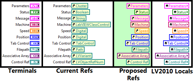
The current implementation of Control References on the Block Diagram could be improved. This Idea was first conceived over a year ago in a discussion on Smaller Static Refs, in the comments here.
 

21816iB89689857FFA076E

Consider the following advantages:


  1. It's generally bad style to have Ctl Refs with hidden labels. New implementation always demonstrates the label to comply with inherent self-documentation of G (just like a Local)
  2. Smaller footprint combined with better visual distinction between Ctl Refs doubly improves information density
  3. In general, the Control Class does not need to be shown at all times on the BD. Rather, it could be shown in Context Help (currently, CH is not useful when hovering over Controls Refs, but this is another topic), or determined by browsing Properties/Methods.
  4. Eliminates the undesirable ability to rename/delete a Control Ref Label such that it no longer matches the Terminal Label.
  5. Creates a better distinction between a Control Ref and a Control Class Constant (NULL Ref). The color of the Static Refs denote a "live link" with a control, while the muted tones of a Class Constant indicate no such link (NULL)
  6. Complements the new LV2010 Local Variable upgrade (see image), yet remains distinct by having a different glyph, different background colors, and no directionality arrow
In summary, a Control Reference revamp could reduce the footprint, increase readability, and prevent obfuscation that decouples the Static Control Ref from the Control.
24 Comments
tst
Knight of NI Knight of NI
Knight of NI

Jack, I think I would agree that this is worse and that keeping the type color is better.


Also, putting the references against a white background makes that yellowish color a lot more distinct.


Lastly, the folded edge works well enough for me. Personally, I think I would have prefered that locals didn't have any glyph, thus creating a distinction between the three types (which would work until someone invented another type or until someone suggested having the terminals look like that [which isn't that far fetched - in the webLV product, the terminal, local and property node are all combined into a single node which looks basically like that and I wouldn't be hugely surprised if NI decided to migrate feature at some point in the future, as it does make some sense]).


___________________
Try to take over the world!
JackDunaway
Trusted Enthusiast


@tst wrote:

...until someone suggested having the terminals look like that...


I drafted an Idea for the terminals when I wrote this one for the references. Presenting this Idea on such a fundamental node is a touchy subject, so I've been hesitant to post it yet before getting the wording and concept art polished. Stay tuned.


Wonger
Member

I did some investigation and the changing of the color of static references to the muted green color is a bug in 2010 which was unintentionally introduced with the addition of another new feature. I will see that this is fixed in 2010 SP1.

JackDunaway
Trusted Enthusiast

Thanks, Wonger! Could you post a CAR here?


(By the way, what do you think of this Idea? Suggestions? I might expect this to get delegated to you if accepted, since you worked on the new Locals)


Also, later I may post an amendment to this Idea that I'll get Laura or Todd to append to the original Idea. This will make it clear that the change I'm asking for is not so drastic as it seems.

Wonger
Member

CAR #245571


I like the look of your idea but it seems like some users do want to be able to see the type easily. We may be able to make it a user option to view as this way or the old way.

tst
Knight of NI Knight of NI
Knight of NI

I'm not sure the class of the reference is still required. I think Shane came around.


I would say that having the folded corner is highly desirable, though. I don't like that the nodes are distinguishable only by a glyph.


___________________
Try to take over the world!
Intaris
Proven Zealot

Just to give my 2c again.


Tst is correct.  I came around to the idea tha label is (>95% of the time) the better display option.

Broken_Arrow
Active Participant

I like the "ears" idea, but I agree there needs to be more delineation. I'm not so sure this discussion needed to steer away from my original idea, but thanks for linking to it in your description.

Richard


JackDunaway
Trusted Enthusiast

@broken Arrow wrote:

I'm not so sure this discussion needed to steer away from my original idea


I'm with you 100%, and with an ideal format for evolving Ideas, there would have been no need to create a new post.


The other day when GregS posted the New 4-3-3-4 ConPane idea, it occurred to me that there were several "subideas" that evolved from Ideas, but they are lost in the comments (read my first comment on that thread). Since these "subideas" don't occupy a top-level slot that can be officially tagged as "In Development" or "Completed", I don't know if these little Ideas will be scavenged and implemented by R&D since there's no official link to their effort and community drive.


That being said, I'm trying to pull out any "subideas" that could qualify as a new top-level post, and I would encourage others to do the same. At worst, it's a complete duplicate, and at best, better ideas will be spawned as old ideas are revisited.

Wonger
Member

Ah I see. I will definitely keep an eye on this idea when we are doing our feature planning. I like the look of the "ear" as well.