LabVIEW Idea Exchange

cancel
Showing results for 
Search instead for 
Did you mean: 
JackDunaway

Block Diagram Terminals Improvement

Status: New

I continually find myself fussing over the "configuration" of terminals. There are many permutations of icon/condensed view and label alignment, yet little consensus thus far for a standard.


My goal is to convince you this: Having different "flavors" of terminals does not make LabVIEW easier to understand or more "customized" to your preferences or learning style. Instead, it creates a source of confusion for new users to identify these Block Diagram components, and creates a hassle when it comes to formatting new or existing VIs to "your style". And no more label gymnastics trying to fit what should be a 22120iFF5D2D358A179035 into a 22124i47B01DC3554D8D28 or a 22122i534509B41D018E18.


Just a few Common Terminal Configurations:

22102iC18AB09CA35049A6


  1. Default Alignment - Not too bad, but not so great for stacking terminals vertically
  2. Block Diagram Cleanup Tool - Interesting choice of label alignment...
  3. CTRL+Space then CTRL+T - This is the "best" style, but it falls short in correctly aligning label in Icon View (arguably of inconsequence, since Icon View is not "best" style)
  4. The "Rogue Drag" alignment - Now where'd that label go?
  5. The "Monk" alignment - Everything has to be perfectly snapped to center
  6. The "There's a 'Size to Text'??" alignment - AKA - "This is what happens when I open your VI on my system" alignment
  7. The "Don't Stop - Believing - Hold on to that Feeeeling" label - I can't let go of LV 4.0 or Power Ballads
  8. The "But it takes up too much BD space - I'm'a remember what it's called" guy - or worse - "Neat, terminals can all have blank labels!!"
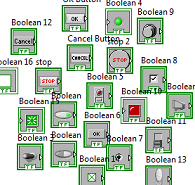
Oh yeah, and to add to the confusion of configuration permutations, we have some more ingredients:
22100i5704DD0516745EAB
 
Many Ideas - some very popular - have hinged around Terminal Configuration. Respectfully, I think they should all be supplanted by this Idea. The goal here is to eliminate even the need for a configuration:
  
  1. Default Option: Do NOT Place FP Terminal as Icon
  2. Separate label locations for Controls and Indicators
  3. Lable Position Options
  4. Add a setting to allow different label positions for controls and indicators
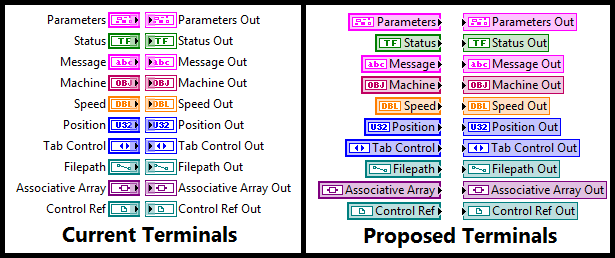
The prelim artwork is an attempt for an information-dense, easily-recognizable, same-footprint, attractive alternative to the current terminal configurations. It offers no display configuration, always showing the label for the sake of self-documentation. It was designed to complement the Improved Control References and the New LV2010 Local Variables. I would envision being able to double-click on the integrated label in order to rename the node.
 
22112i4F5D7F09801CC176
 
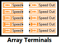
For completeness, here's what an array would look like. Or perhaps, one of the array alternatives on the Redesign Terminals Idea that focuses on the inability to clearly show array dimensions with the currently implemented terminal:
 
22114iE4253941BD5748E5
 
Finally, you're not voting for my artwork, you're voting for this concept: Standardize terminal configuration to make it non-configurable, robust against self-documentation SNAFUs, and universally recognizable. Just like the zero-config behavior of the Local Variable, we want a what-you-drop-is-what-you-get Terminal.
31 Comments
elset191
Active Participant


@seeker169 wrote:


initInfoSpectraSpectragram

initInfoSpectraLofar


initIn...gram

initIn...ofar

--
Tim Elsey
Certified LabVIEW Architect
David S.
NI Employee (retired)

I just found this suggestion. What a fantastic idea!

David Staab, CLA
Staff Systems Engineer
National Instruments
drjdpowell
Trusted Enthusiast

A strong ANTI-kudos if it means that terminals wont be very visually distinct from local variables or references.  I want it to be immediately obvious if local variables, and thus potential race conditions, are in play.    


-- James

PS> I greatly prefer icons, but do see the potential value of standardization one way or the other on that issue.  

JackDunaway
Trusted Enthusiast

@drjdpowell wrote:

A strong ANTI-kudos if it means that terminals wont be very visually distinct from local variables or references... but do see the potential value of standardization one way or the other on that issue 


Yeah, the big take-away here is standardization. Feel free to suggest alternate designs.

GregSands
Active Participant

@drjdpowell wrote:

A strong ANTI-kudos if it means that terminals wont be very visually distinct from local variables or references.  I want it to be immediately obvious if local variables, and thus potential race conditions, are in play.


I can't see that it makes any difference for race conditions whether I'm using a local variable or the terminal.  A race condition presumably requires more than two accesses of a variable, so whether one or none of them is the terminal itself shouldn't matter.  Or am I missing something here?


Perhaps the proposed design (which I like!) would make it more difficult to locate the terminal, but they're not always easy to find anyway without "finding" them from the front panel control/indicator.

drjdpowell
Trusted Enthusiast


GregS wrote:   I can't see that it makes any difference for race conditions whether I'm using a local variable or the terminal.  A race condition presumably requires more than two accesses of a variable, so whether one or none of them is the terminal itself shouldn't matter.  Or am I missing something here?
If I quickly look at a VI and see only terminals, I can exclude the possibility of several types of structures using locals.   If I see a local (or "Value" property node, reference, etc.) then I know that something more complex is going on than just simple input/output, and thus need to look into it in more detail.  Your right, it takes at least three accesses to make a race condition, but it is never obvious exactly how many accesses there are, and even many two-access uses of locals (as "wireless" cross-diagram communication methods) are less than clear.  Most VIs shouldn't be using locals or references, and I want the few that do to immediately stand out.  Having terminals visually distinct from locals and control references is an advantage in code readability.
drjdpowell
Trusted Enthusiast

Yeah, the big take-away here is standardization. Feel free to suggest alternate designs.


Are you sure you want an enforced standard?   Icons are the current (non-enforced) standard and have been for years, but I doubt you're using them.  The one enforcement I'd like to see is the prevention of the ability to move the label more than a short distance away from the terminal (and the same limit on labels of other items like VI's and primitives).  As long as it's clear what object the label is labeling, I don't mind where it is, and find the ability to move it around an advantage to code readability.

JackDunaway
Trusted Enthusiast

@drjdpowell wrote:

Are you sure you want an enforced standard? 


Yep. Smiley Wink

drjdpowell
Trusted Enthusiast

I asked a question on LAVA, "Feelings on Icons for Terminals", and they've convinced me NOT to to be in favor of forcing them all to use icons. 


Dragis
Active Participant