From Friday, April 19th (11:00 PM CDT) through Saturday, April 20th (2:00 PM CDT), 2024, ni.com will undergo system upgrades that may result in temporary service interruption.
We appreciate your patience as we improve our online experience.
From Friday, April 19th (11:00 PM CDT) through Saturday, April 20th (2:00 PM CDT), 2024, ni.com will undergo system upgrades that may result in temporary service interruption.
We appreciate your patience as we improve our online experience.
04-01-2010 01:50 PM
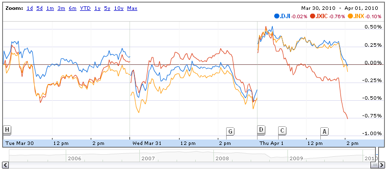
First Check out this sweet google finance graph/chart:
http://www.google.com/finance?q=INDEXDJX:.DJI,INDEXSP:.INX,INDEXNASDAQ:.IXIC
Hover your mouse over the chart. See how it gives the values of every channel at that x point, updating quickly based on mouse position?
I want to create a chart control that I can use for any future VI that can do that and I have no idea how to create this in LabVIEW and so I challenge you tallented members of our UI Interest Group. I would like it to do the same multi-channel hover functionality as that chart. As far as the cool dots that follow the lines... well... a 1-pixel vertical line at the hovered x-point would be fine. It needs to be able to accept data live (chart) as well so that during a test the operator can hover over points to review peaks and dips in the data. I would really like this control to be as versatile as possible so that it can be something that can be put into a pallette and used when a sweet chart was needed.
Extras: A graph version would be cool as well. Enabling and disabling some of the features would be cool so you could use it for a variety of applicaitons and system requirements. Eventually maybe for the graph version highlighting and labeling peaks and dips in the data would be cool too. Check out the event flags (labeled A, B...) at the bottom of the google chart. Each one links to an article (like test notes) based on a position in the graph.
There is no doubt this would be sweet in LabVIEW and would be a great addition to the UI pallettes.
I seem to remember Jonathan Cohn demonstrated a graph like this at NI Week during his "Build Eye-Catching VI's" presentation and it just blew everyone's mind, lol. I remember he used X-Controls but I don't believe his was expandable to different channel counts. I would really be surprized if someone hasn't already accompleshed this in labVIEW so I know we can figure this out.
04-05-2010 02:11 PM
... so ... no one else knows how to do this either huh?
Ok, then pretend it's possible. How would we do it? 
04-05-2010 02:28 PM
Hi,
you should use the event structure...
Catch the mouse events for the graph, get the mouse position, calculate the x scale position to get the corresponding y scale value. It's doable in LabView, but requires some work 🙂
04-06-2010 07:40 AM
It's definitely possible, but it looks like a lot of work to do it with a chart. I would recommend starting with the graph. You can use either the cursors or plot images (see "Drawing to the Graph Plot Area" in the link) to achieve the desired effect. I think if you used plot images you could update the text in the same way. If you want it to be modular, an xcontrol will be the way to go. This link shows you how to get started to create the effect you want.. you'll have to do more digging to see how to create an xcontrol.
http://zone.ni.com/reference/en-XX/help/371361F-01/lvconcepts/customizing_graphs_and_charts/
Chris
04-06-2010 11:23 AM
Rex,
Did you actually take a look at Jonathan's presentation here? I haven't looked at it recently, but I do recall that graph. At the very least, that would give a starting point.
Cheers, Matt
04-06-2010 02:12 PM
What do you think about the look of this?
http://screencast.com/t/NjFkOTFi
It's an XControl implementation. The Data is a Waveform Chart and all the drawing work is done in a Panel:Mouse Move Event in the Facade. Pretty much a collection of feedback from the other posts on this thread.
04-07-2010 02:04 AM
hi,
i like this x-control, do you mind sharing the code for it?
regards
Tobias
04-07-2010 02:02 PM
Very cool Pie. I the functionality is what I am looking for I think. Could this chart and X-control to be used during a test to preview live data as it changes in a while loop?
As far as the look, also sweet. You even did the little dots to follow the lines  . I would lighten up the gridlines with a light grey or light blue like they did in the google graph. Is there a way to get away from the typical labview pixelated lines to smoother lines using a line style property or something? Are the colors customizable?
That link to all the properties to customize graphs and charts is great. However, "dig deeper to find out how to do the x-control" doesn't really help much. Does anyone have a couple links to some good places to start to learn X-Controls to be able to do this?
Pie that's really a great job. Can you post the x-control and code?
Rex
04-07-2010 03:52 PM
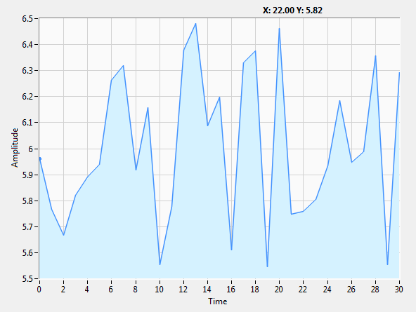
I've put up this one, with only one plot, but I think that goes along the lines of Google Finance graphs.
04-07-2010 03:59 PM
Tip: If you enable "Anti-Aliased" setting from the Plot Legend context menu, it will look a lot better.