- Subscribe to RSS Feed
- Mark Topic as New
- Mark Topic as Read
- Float this Topic for Current User
- Bookmark
- Subscribe
- Mute
- Printer Friendly Page
Updating bar char color with changing temperature values
Solved!08-30-2013 01:50 AM
- Mark as New
- Bookmark
- Subscribe
- Mute
- Subscribe to RSS Feed
- Permalink
- Report to a Moderator
hello everyone. I am actually reading a temperature sensor and plotting the data as a bar chart. I am acquiring the data every second and present them in a bar chart. the challenge is to show different color on the bar chart as the temperature goes from safe to dangerous.when the reading are safe the chart should be red, when fair the chart should be orange and when dangerous red.I am using Labview 2012.I need to get started as I am actually learning the software.
looking forward for hearing from you guys.
Yannstephen
Solved! Go to Solution.
08-30-2013 02:00 AM
- Mark as New
- Bookmark
- Subscribe
- Mute
- Subscribe to RSS Feed
- Permalink
- Report to a Moderator
08-30-2013 04:01 AM
- Mark as New
- Bookmark
- Subscribe
- Mute
- Subscribe to RSS Feed
- Permalink
- Report to a Moderator
Hi Yannstephen,
You can cuomize your graph/chart as you want. It is little trickey.
You can get such charts in NI discussion forums. (UI Design Community etc.)
Attached is the one I made it for you.
Right click the graph and look into the properties.
Regards,
Yogesh Redemptor
Yogesh Redemptor
08-30-2013 09:16 AM
- Mark as New
- Bookmark
- Subscribe
- Mute
- Subscribe to RSS Feed
- Permalink
- Report to a Moderator
thank you for you answere Yogesh_Redemptor. but what i need is a bar graph where each bar represent a specific sensor reading which color changes as the value display is safe(green), close to dangerous(orange),dangerous(red).
i have attached a picture of what i am trying to explain. thank you for looking at it.
Yannstephen.
08-30-2013 04:09 PM
- Mark as New
- Bookmark
- Subscribe
- Mute
- Subscribe to RSS Feed
- Permalink
- Report to a Moderator
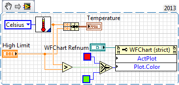
The code below is an example of changing the line color on a graph. The High Limit control is the max value that is set on the Front Panel, but can easily be replaced by a constant of your choice. The other input - Temperature - is where your data comes in. The comparison determines the color to apply to the Temperature plot by using a Property Node with a selector function.
This snippet can be directly imported into your project if you're running LabVIEW 2013 by clicking and dragging it into your block diagram.
For more information on property nodes, visit our help at ni.com/support or click here.
-Nate
09-03-2013 05:21 AM
- Mark as New
- Bookmark
- Subscribe
- Mute
- Subscribe to RSS Feed
- Permalink
- Report to a Moderator
thank you Sir for taking that much time to answer. i was working arounf the code you posted and was able to simulate a signal that i converted to array on compare each value to limit and then assign the color to it.nut i would to use three different color. i thinking i using a range instead of a value but i am not quit sure on how to implement it on labview. what is something like (if(temp >0 and temp < 25; then safe graph shows green);(else if temp >25 and temp < 70 acceptable,show graph orange) else(temp> 70, danger , show graph red).
i have attached the piece of code i manage to get correct.
thank you for taking a look
Yannstephen
09-03-2013 10:10 AM
- Mark as New
- Bookmark
- Subscribe
- Mute
- Subscribe to RSS Feed
- Permalink
- Report to a Moderator
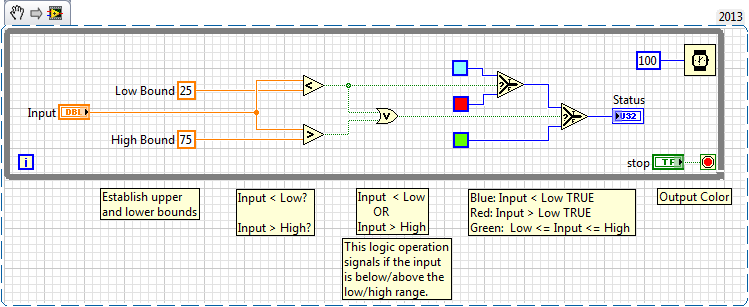
Using a range to define a set value is something that comes up fairly often. Below are two solutions that can apply to you. The first uses logic operators and will work as intended.
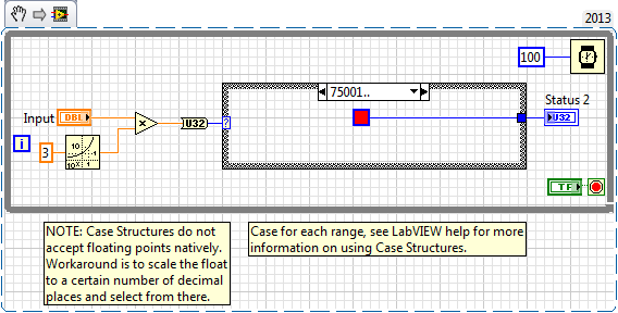
However there are downsides to consider: What happens if you decide to add more ranges that have different meanings? This solution does not scale well, and will become very cumbersome to maintain. The second solution addresses this issue by using a Case Structure. Note that the case structure only accepts integer values in the selector terminal. You can read up on the implemented workaround here.
Hope this helps!
-Nate
09-04-2013 09:02 AM
- Mark as New
- Bookmark
- Subscribe
- Mute
- Subscribe to RSS Feed
- Permalink
- Report to a Moderator
Thank you for this post. the first method was actually fine to implement and i was able to get right. however i dont really understand what is going on in second method though i want to give it a try can be more explicit.i actually get something working yesterday using formula node(i could code the condition as in C) and case structure.i have attachthe code i have.sorry for this question again, i considered you have answered my question.
YannStephen![]()
![]()
09-04-2013 10:40 AM
- Mark as New
- Bookmark
- Subscribe
- Mute
- Subscribe to RSS Feed
- Permalink
- Report to a Moderator
In the second method Nathan is using a case structure to specify the ranges. This means you can add more specific statuses (word?) in future by simply creating a new case. In the example shown, "75001..", the dots mean "this value and anything greater". Similarly having the dots before means less than, and between two values will execute the case for any value in between.
He also scales by 1000 as the case selector only accepts integer values, so scaling preserves your decimal places.
09-05-2013 04:59 AM
- Mark as New
- Bookmark
- Subscribe
- Mute
- Subscribe to RSS Feed
- Permalink
- Report to a Moderator
thank you very much for the Add ons man. i use the property node to update the color of the graph using this method.and got it right.
thanks everyone for the assist i can now think of adding more channel reading to the graphs.![]()


